


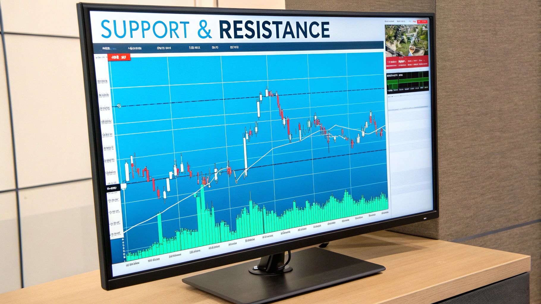
If you've ever looked at a stock chart, you've probably noticed that prices don't move in a straight line. They zig and zag, hitting invisible floors and ceilings along the way. These "invisible" barriers are what traders call support and resistance.
Think of support as a price floor that a stock struggles to fall below. On the flip side, resistance is a price ceiling that a stock has a hard time breaking through.
To really get what's happening here, picture the stock market as a constant tug-of-war between buyers (the bulls) and sellers (the bears). Support and resistance levels are simply the battlegrounds where one side temporarily overpowers the other.
These aren't just random lines on a chart. They're critical psychological zones where the market's mood shifts, giving you a peek into where the price might be headed next.
Support is the price point where demand gets strong enough to stop a stock from dropping any lower. Let's say a stock is in a downtrend. As it gets cheaper and cheaper, it eventually hits a price that buyers find too good to pass up. They start scooping up shares.
This sudden rush of buying soaks up all the selling pressure, putting a "floor" under the price. The more times a stock hits this floor and bounces back, the more significant that support level becomes.
You can spot a support level by looking for these traits:
Resistance is the exact opposite. It's the price level where selling pressure becomes so intense it prevents the price from climbing any higher. As a stock's price rises, it eventually reaches a point where sellers think it's overvalued or it’s simply a great time to cash in.
They start selling off their shares, flooding the market and pushing the price back down. This creates a "ceiling." Just like support, a resistance level gets stronger every time the price hits it and fails to push through.
Here's a simple way to think about it: Support is where the fear of missing a bargain kicks in. Resistance is where the desire to lock in profits takes over.
This push-and-pull creates a predictable range. For example, a stock might consistently find buyers around $50 (support) but run into a wall of sellers every time it gets close to $60 (resistance).
Understanding this basic dynamic is the first step. Once you can spot these levels, you can start making smarter decisions, like buying near support or selling near resistance, and begin to anticipate the market’s next move with more confidence.
Spotting support and resistance on a chart isn't about drawing perfect, razor-thin lines. It's more like identifying zones—battlegrounds where buyers and sellers have really dug in their heels. You're essentially looking for the key price areas where the market's momentum has hit a wall or completely turned around in the past.
The most direct way to do this is by scanning the chart for major peaks and troughs. These are the obvious turning points where a stock's rally ran out of steam or a sell-off finally found its footing. By drawing horizontal lines to connect these historic highs and lows, you can start to see the hidden structure of the chart.
First, pull up a candlestick chart for any stock you're watching. The daily timeframe is a great place to start because it gives you a solid, big-picture view. Look for at least two major peaks (highs) that top out at roughly the same price. A simple horizontal line connecting them gives you your first potential resistance zone.
Now, do the same for the lows. Find two or more significant bottoms (troughs) that formed around a similar price point. Connect them with another horizontal line, and you've just marked a potential support zone. Here’s the key: the more times the price has bounced off these areas, the stronger and more reliable that level is considered to be.
Think of these zones as "price memory." The market has a memory of where big fights between buyers and sellers happened before. When the price gets back to one of those old battlegrounds, traders start watching closely, expecting a similar fight to break out.
This simple act of connecting the dots is the bedrock of technical analysis. It’s a visual shortcut that instantly shows you where the power struggle between bulls and bears is most likely to heat up again.
Sometimes, the most powerful levels are created when the market does something dramatic. When a price finally smashes through a tough resistance level, that old ceiling often becomes the new floor. This switch is a classic technical analysis concept known as role reversal or polarity.
So, why does this happen? Once the price breaks out, traders who were previously selling at that level might regret it and now see it as a good entry point. At the same time, buyers who missed the initial move often see a pullback to that old resistance level as a second chance to jump in. All this new buying interest is what turns the old ceiling into a new support foundation.
Here’s how to spot these flipped levels:
The same idea works in reverse when a support level gives way and turns into a new resistance ceiling. Learning to spot these role reversals gives you a huge edge in anticipating where the price might go next. The skill is a lot like drawing trendlines; for more on that, check out our guide on how to draw a trendline.
Volume is your conviction meter. It tells you how much muscle is behind a price move. A support or resistance level that forms on high trading volume is a whole lot more meaningful than one that forms on a quiet, low-volume day.
Think about it: high volume means a ton of shares changed hands, showing that a large number of traders—including the big institutions—were actively making a stand at that price. That makes the level much more significant.
As you scan your chart, always glance down at the volume bars. Do you see a huge spike in volume as the price bounces off a support level? That's a massive clue that big-money buyers stepped in, making that floor much more solid. On the flip side, a volume surge as the price gets rejected from a resistance level signals heavy selling pressure, reinforcing that ceiling.
Those lines we draw on charts for stock support and resistance levels? They're much more than just marks on a screen. Think of them as a map of human emotion. These levels only exist because they are fueled by the collective memories, hopes, and fears of millions of traders. At the end of the day, it all boils down to fear, greed, and regret.
Let's say a price is dropping and nearing a known support level. What you're really seeing is a battle of wills playing out. Traders remember that price as the "bargain bin" where the stock bounced back last time. That memory kicks in a powerful emotion: the fear of missing out (FOMO).
Buyers who sat on the sidelines before now see a second chance to jump in at what they believe is a great price. This surge of buying interest creates a floor, often preventing the price from dropping any lower. It’s a self-fulfilling prophecy, all because everyone collectively believes that specific price is "cheap."
Resistance levels work in the opposite way, driven by a totally different set of feelings: regret and the simple desire to get your money back. Picture a trader who bought a stock right at its peak, just before it took a nosedive. As the price slowly crawls back up to their original purchase price, what's their main goal? To sell and break even.
This is a classic case of "buyer's remorse." All those regretful buyers create a wave of sell orders, forming a ceiling that the price really struggles to push through. At the same time, smarter traders who bought down at the support level see this resistance line as the perfect spot to cash in and take their profits, which adds even more selling pressure.
At its heart, a resistance level is a point of collective regret. It represents the price where a significant number of past buyers are desperate to exit their positions, creating a wall of sellers.
This is why history tends to repeat itself in the markets. Support and resistance have been cornerstones of technical analysis for decades, allowing traders to anticipate future moves based on these predictable psychological tripwires. For instance, pivot points for the S&P 500 are calculated every single day to pinpoint these key levels where trader psychology is likely to take over. You can find more on this by exploring insights on using historical data for market analysis.
The real power of stock support and resistance levels comes from herd mentality. When thousands of traders all look at the same chart and identify the same price as being important, their combined actions make it so. This creates a powerful feedback loop.
This collective behavior is what turns a simple price point into a solid barrier. It's not magic. It’s just the predictable, and often irrational, way we humans react to making and losing money.
Getting a grip on this psychological backdrop is what separates the traders who just draw lines from those who can actually read the market's mood. When you understand the emotions driving the price, you can better judge how strong a level really is and trade with more confidence.
Spotting potential stock support and resistance levels on a chart is a great start, but trading on those lines alone is a bit like sailing with only half a map. You can see the coastline, but you have no idea if a storm's brewing just over the horizon. To get real conviction behind your trades, you need confirmation.
This is where technical indicators are your best friend. Think of them as getting a second opinion on your chart analysis. When an indicator’s signal lines up with a key support or resistance level, you get something traders call confluence. It’s a powerful concept where multiple, separate signals all point to the same outcome, which can seriously stack the odds in your favor.
Volume is one of the most honest indicators out there. It’s simple, powerful, and shows you the conviction behind a price move. A price hitting a support level is interesting, sure. But that same price hitting support on a huge spike in buying volume? That's a signal you can't ignore.
That surge in volume tells you that a ton of traders are jumping in to defend that price, making the level far more credible. On the flip side, if a stock limps toward a resistance level on weak, dying volume, it suggests the buyers are running out of steam, and a reversal is probably just around the corner.
Here’s a quick way to think about it:
Momentum oscillators, like the well-known Relative Strength Index (RSI), measure the speed and strength of price moves. The RSI gives you a score between 0 and 100 to help spot overbought (usually above 70) and oversold (usually below 30) conditions. When you pair this with your S/R levels, things get really interesting.
Let's say a stock is climbing toward a solid resistance level you've marked. At the exact same time, you notice the RSI pushes above 70 into overbought territory. Now you have two independent reasons to believe the price might turn around. The resistance level is the price ceiling, and the overbought RSI suggests the buying momentum is completely gassed out. That’s a much stronger signal to sell than either one would be on its own.
Confluence is all about stacking the odds. When price hits a key level and a momentum indicator is screaming "overbought," it’s like getting a green light from two different traffic signals. It's just a whole lot safer to proceed.
The same logic works for support. A stock dropping to a major support level while its RSI dives below 30 into oversold territory can be a fantastic buy signal. To really get a handle on this, it's worth taking a deeper look into how to use the RSI indicator and its nuances.
Moving averages smooth out the choppiness of price action and help you see the bigger trend. But they also act as dynamic support and resistance levels that move with the price. A really powerful strategy is to watch what happens when one of your static, horizontal levels crosses paths with a key moving average, like the 50-day or 200-day MA.
Imagine a stock’s price falls to a horizontal support line that also happens to be right where the 200-day moving average is sitting. That area suddenly becomes a fortress of support. The convergence of two different types of support creates a point of major technical strength. A bounce from a level like that is often much more reliable and powerful. By layering indicators like this, you stop just drawing lines and start understanding where the real market battles are being fought.
Alright, knowing what stock support and resistance levels are is one thing. Actually using them to make money is another game entirely. Let’s connect those dots.
Here, we'll break down two of the most common and effective strategies that traders use every single day. These aren't just abstract theories; they are practical game plans for turning what you see on a chart into a real trade with a clear entry, exit, and risk management plan.
Think of a stock that’s stuck in a rut, bouncing between a solid floor (support) and a stubborn ceiling (resistance). This is what we call a ranging market. For traders, this isn't boring—it's an opportunity.
The plan here is incredibly straightforward: buy at the floor and sell at the ceiling. You're essentially playing the bounce, banking on the idea that these levels will hold, just as they have before.
Here's how it works in practice:
While the bounce strategy profits from predictability, the breakout strategy is all about capturing the chaos. A breakout happens when the price finally gathers enough force to smash through a major support or resistance level, often with a big spike in trading volume.
This is a huge deal. It signals a major shift in the balance between buyers and sellers and can be the very start of a powerful new trend. Instead of selling at the ceiling, breakout traders are waiting to buy the moment the price shatters it.
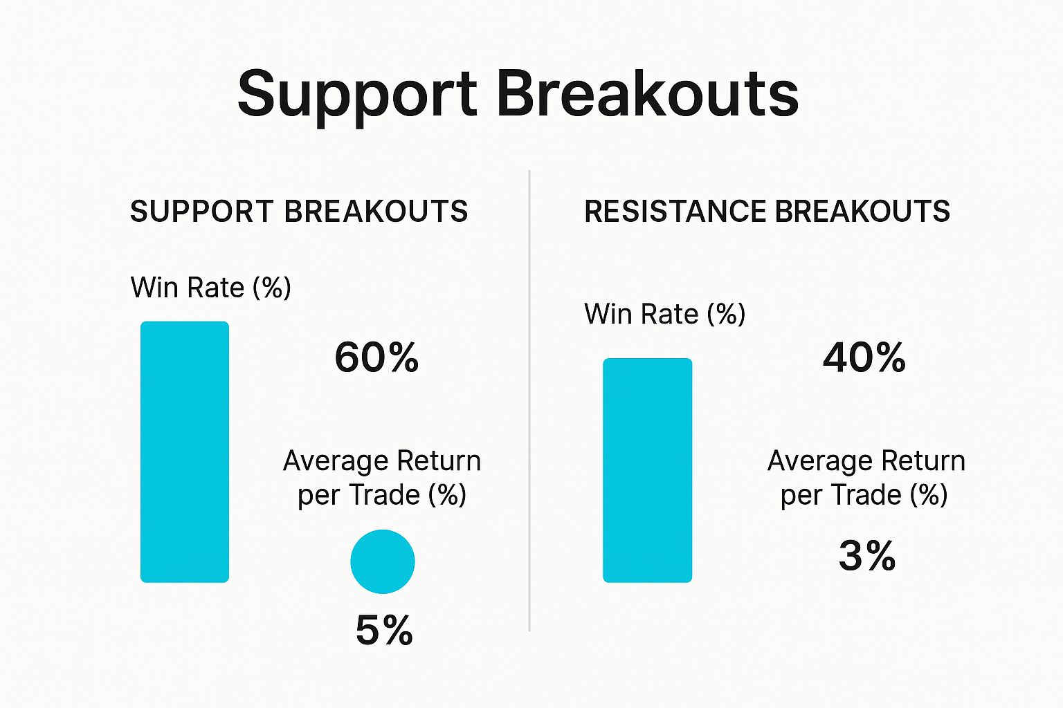
This data shows us something interesting. While breaking through resistance might happen less often, those trades tend to deliver a bigger punch in terms of average returns. It speaks to the explosive power of a true breakout.
Here’s the game plan for trading a breakout:
So, which approach is right for you? It really depends on the market conditions and your personal trading style. A sideways, choppy market is perfect for a bounce strategy, while a market that's building up pressure for a big move is a breakout trader's dream.
Here’s a quick comparison to help you see the difference.
Ultimately, both strategies are powerful because they're based on proven market behavior. Data shows that a stock hitting a key support level will bounce higher 65-75% of the time. Resistance levels tend to stop price rallies about 60-70% of the time. You can dig deeper into these market dynamics and statistical tendencies.
This underlying reliability is precisely why support and resistance remain a cornerstone of technical trading.

Even after you get the hang of the basics, the market has a funny way of throwing curveballs. You'll run into specific situations that bring up new questions about stock support and resistance levels. This is where the clean lines on a chart meet the messy reality of live trading.
Let's dive into some of the most common questions I hear from both new and seasoned traders. Think of this as your field guide for those tricky moments, helping you build confidence and sidestep the usual traps.
Not all levels are created equal. Some are like flimsy fences, while others are solid brick walls. Figuring out the strength of a support or resistance level is a huge part of the game, and you can get a good read on it by looking at three things.
First, count the number of touches. A price level that has been tested over and over again—and held—is far more significant than one that's only been hit once. Every time the price is rejected, it’s like another brick being added to the wall.
Second, the timeframe is a game-changer. A support level that has held up for six months on a weekly chart carries way more weight than a level that just formed on a five-minute chart. The longer-term levels reflect the collective opinion of a much bigger crowd of traders.
Finally, pay close attention to trading volume.
Knowing the difference between a simple "test" and a genuine "break" is one of the most vital skills you can develop. If you get this wrong, you'll find yourself jumping into trades too early or getting shaken out by fake moves.
A test is when the price action moves up to a level, touches it (or even pokes through slightly), and then reverses. This just confirms the level is still in play and that someone is defending it.
A break is much more decisive. This happens when the price pushes completely through the level, and—this is the important part—a full candlestick closes on the other side. Waiting for that candle to close is a simple discipline that saves traders from countless "false breakouts," where the price briefly stabs through a level only to snap right back.
Waiting for a candle to close beyond a key level is a simple but powerful filter. It separates the real moves from the market noise and can save you from countless losing trades.
When a strong support level finally cracks, it doesn't just vanish. It often goes through a fascinating transformation that traders call "role reversal" or "polarity." Basically, the old floor becomes the new ceiling.
Why does this happen? It all comes down to market psychology.
Think about all the traders who bought at that old support level, expecting a bounce. Now, they're sitting on a losing position. If the price manages to rally back up to that same level, what do they do? They often sell to get out of their trade at breakeven. This sudden surge of selling pressure creates resistance right where there used to be support.
The same thing happens in reverse, of course. When a major resistance level is broken, it often turns into a new support level as traders start buying on any dips back to that old ceiling.
You bet they do. The concepts of support and resistance are universal because they’re based on human psychology—fear and greed. That means you'll see them play out whether you're a day trader glued to a 1-minute chart or an investor looking at a monthly chart.
But here’s the key: their significance changes dramatically with the time frame.
Once you start understanding these nuances, you'll be able to read the market with much greater clarity and make your analysis of support and resistance truly effective.
Ready to stop guessing and start seeing key levels automatically? EzAlgo plots dynamic support and resistance zones directly on your TradingView charts, powered by AI that analyzes market structure in real-time. Eliminate the manual work and trade with institutional-grade clarity.


%201.svg)