


At its core, drawing a trendline is about connecting at least two significant price points to get a visual read on the market's momentum. For an uptrend, you're looking for higher lows; for a downtrend, you're connecting lower highs.
This simple line becomes a powerful diagonal guide, mapping out potential support or resistance zones and helping you get ahead of where the price might go next.
Before you even think about drawing a line on your chart, it’s crucial to get what a trendline really represents. It’s more than just geometry; it's a visual story of the ongoing battle between buyers and sellers. It takes abstract market data and makes it tangible, showing you the direction and speed of price movement.
An uptrend line connects a series of higher lows. This tells you that every time the price pulls back, buyers are jumping in sooner and at higher prices than before. That's a classic sign of growing confidence.
On the flip side, a downtrend line connects lower highs, which shows that sellers are gaining the upper hand at progressively lower prices. It’s a clear signal of weakening market sentiment.
To make sure we're on the same page, here’s a quick rundown of the core ideas.
Getting these basics down is the first step to using trendlines effectively in your own analysis.
Trendlines are a cornerstone of technical analysis for a reason. Their strength lies in how simple they are to draw and how clearly they can signal a shift in market behavior. History shows us that once a trend gets going, it's more likely to keep going.
One of the oldest and most reliable tools in a trader's toolkit, trendlines have been used since the early 20th century. Markets with clear trendlines often continue that trend 70-75% of the time. A clean break of a major trendline can signal a reversal with about 60% reliability.
This means a well-drawn line isn't just a reactive tool; it can be an incredibly effective forward-looking indicator.
Understanding this principle is fundamental to smart trading. It helps you anticipate what might happen next instead of just reacting to what already did. When you can spot these patterns, the market gives you clear visual cues about where the next fight between buyers and sellers is likely to happen. By truly grasping the 'why' behind this technique, you can start applying it with much more confidence and precision.
A trendline is only as strong as the points you use to draw it. Your first job, before you even think about drawing a line, is to find solid anchor points. These are the significant swing highs and lows on your chart—the real turning points where the market changed direction.
A classic mistake I see all the time is traders connecting tiny, meaningless price wiggles. This just leads to weak trendlines that break constantly and don't tell you anything useful. You need to train your eye to see past the noise and spot the major pivots.
Charts can look like a chaotic jumble of peaks and valleys at first glance. The trick is to filter out that noise and focus on what matters. A real swing high is a clear peak with lower highs on either side. Likewise, a true swing low is a distinct valley with higher lows next to it.
You need at least two of these points to even start drawing a line. But the magic really happens on the third touch.
A trendline with just two points is really just a guess. It's that third touch—where price comes down, respects the line, and bounces off—that truly validates it. That's when your line goes from a simple observation to a powerful trading tool.
After you've connected your first two points, extend that line forward into the future. This is where you'll watch to see how price behaves. The more times price tests that line and holds, the more significant that trendline becomes. Mastering how to draw a trendline really begins with mastering the art of picking these anchor points.
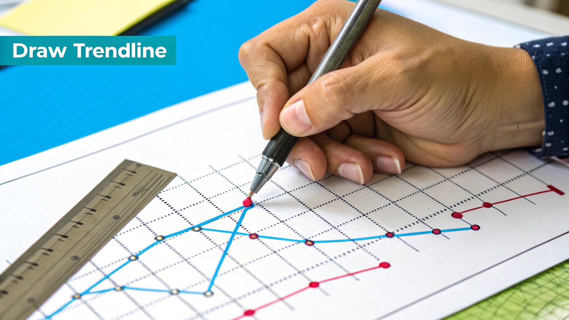
Once you've spotted your anchor points, it's time to connect the dots. This is where your analysis really starts to take shape. Every charting platform has a "trend line" tool, usually sitting in a drawing toolbar, that makes this part easy.
Let’s start with an uptrend. Find your first major swing low—that’s your starting point. Now, look for the next significant higher low and draw a line connecting the two. Extend that line out to the right, into the future. That projected line is your potential future support zone.
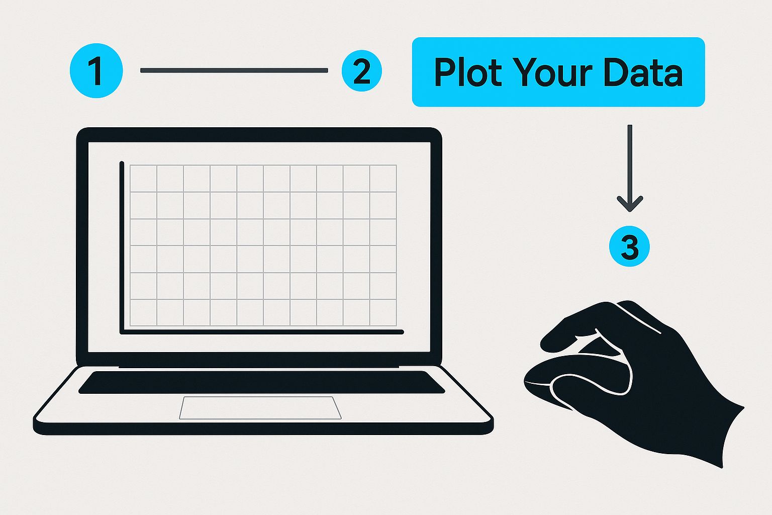
As you can see, it all begins with plotting those anchor points on the chart before you even think about drawing the line itself.
For a downtrend, you just flip the logic. Find a key swing high, connect it to the next clear lower high, and extend it forward. This line now acts as a potential ceiling, or resistance, where you might expect sellers to step in.
Here's a critical rule I learned the hard way: for a trendline to be valid, the price action cannot slice through the line between your two anchor points. If it does, you've probably picked the wrong points. You're looking for a clean, uninterrupted connection that respects the price movement.
A trendline isn't truly confirmed until you get a "third touch." When the price comes back to test that extended line for a third time and respects it, that's the magic moment. It turns your line from a simple observation into a high-probability trading level.
Think of it this way: the first two points are you forming a theory. The third touch is the market telling you, "Yep, you're onto something." Each touch after that just adds more weight and significance to the line, proving that other traders see the same thing you do.
That third touch is a game-changer because it gives you:
If you want to go deeper on this, our complete guide on how to draw trend lines is packed with more examples and advanced tips. Getting this right just takes a bit of screen time and practice, but focusing on clean connections and waiting for that third-touch validation will make a huge difference in your trading.
Let's be blunt: a poorly drawn trendline is worse than no trendline at all. It doesn't just fail to help; it can actively trick you into making bad trades based on faulty information. Getting this right means first understanding where most traders go wrong.
One of the biggest traps is forcing the line to fit a narrative. We've all been there. You want the market to go up, so you start connecting dots that aren't really there, ignoring a major swing high just to make your line point in the direction you're hoping for. A real trendline reflects what the market is doing, not what you wish it were.
Another classic mistake is drawing lines that are way too steep. If your trendline looks like it's going vertical at a 70 or 80-degree angle, it’s not going to last. Markets can't sustain that kind of momentum. Price will almost always snap back violently, leaving your steep trendline broken and useless as a guide for future price action.
Ah, the age-old question. Do you connect the wicks (the absolute highs and lows) or the bodies (the open and close prices)? You'll find passionate arguments on both sides, but the key isn't which one is "right"—it's about being consistent.
My advice? Don’t get dogmatic about it. I’ve seen both work. The crucial thing is to pick a method and stick with it for that particular chart or analysis. If you start mixing and matching—using wicks on one uptrend and bodies on the next downtrend—you'll get messy, unreliable signals every time.
Here's a practical tip from my own experience: The best trendline is the one that gets the most valid touches without price slicing right through the middle of it. Sometimes that line will connect wicks perfectly. Other times, it will line up with the bodies. Let the price action tell you where the line should go.
Ultimately, learning to draw a trendline is just as much about learning what not to do. Avoid these common blunders, and your lines will become a genuinely reliable tool in your trading toolkit.
Learning to draw a solid trendline is a fundamental skill, but it's just the starting point. A single line on a chart rarely gives you the full picture. The real magic happens when you start combining your trendlines with other technical indicators, creating what traders call "confluence." This is where simple line-drawing evolves into a proper trading strategy.
Think of it this way: when multiple, independent signals all point to the same conclusion, your confidence in a potential trade goes way up.
A moving average is essentially a dynamic, ever-adapting trendline. When you plot a key moving average, like the 50 or 200 SMA, and notice it's running parallel to a trendline you've drawn yourself, that's a powerful confirmation.
If the price pulls back and bounces right off the spot where your trendline and that moving average intersect, it's a much stronger signal than a bounce off the trendline alone. It tells you that both long-term and short-term market participants see that area as a key level.
Oscillators like the Relative Strength Index (RSI) are fantastic for gauging momentum, making them a perfect partner for your trendline analysis.
Let's say the price is dropping toward a clear uptrend line you've identified. You're watching to see if it will hold. If, at the same moment, the RSI dips into oversold territory (usually below 30), it’s a strong hint that the selling pressure is running out of steam. This seriously increases the odds that the price will bounce off your trendline.
This combination lets you anticipate a potential reversal instead of just reacting after it happens. It gives you crucial context for the price action occurring at your line.
One of the most common and effective strategies is to create a trend channel. You simply draw a second line that runs parallel to your main trendline, effectively "channeling" the price action between the two. This creates clear upper and lower boundaries, which are incredibly useful for identifying profit targets or planning entries.
Don't just take my word for it. Research shows that trading strategies combining trendlines with moving averages can boost win rates by 10-15% compared to using either tool by itself. Tossing an oscillator like the RSI into the mix helps you pinpoint reversals with much better accuracy by confirming when the market is overbought or oversold right as the price hits your line.
If you want to go deeper on this, you can discover more insights on mastering trend analysis from Number Analytics.
Even when you know the basics, a few questions always pop up when you're learning to draw trendlines. Nailing these details can be the difference between a good trade and a bad one, so let’s clear up some of the most common points.
A trendline is only as good as the respect it gets from the market. The real test? It needs at least three distinct touches.
Think of it this way: the first two points just establish the line. The third touch is the market's way of saying, "Yes, we see this line, and we're reacting to it." That’s your confirmation.
A stronger, more reliable line will also usually have:
Three touches make a trendline valid, but more is almost always better. When you see a line that has held up through four, five, or even six tests, you know you've found a level that big players are watching. Each successful touch reinforces the trend.
But there's a flip side. If you see a ton of touches happening in a very short amount of time, it could be a warning sign. It often means the trend is losing steam and might be ready to break.
A quick word of caution: A trendline break isn't a guaranteed trend reversal. It's simply the first clue that momentum is shifting. Sometimes, it just leads to a sideways chop or a small pullback before the original trend kicks back in. Always wait for other confirming signals before you jump to conclusions.
This process is becoming less subjective every day, thanks to algorithmic tools. In fact, it's projected that by 2025, about 80% of professional trading desks will use some form of computerized trendline detection to guide their strategies. You can read more about this shift over at S&P Global.
Stop drawing lines based on guesswork. EzAlgo gives you AI-driven signals and dynamic support and resistance levels, bringing the clarity you need to trade with confidence. Upgrade your trading toolkit today at EzAlgo.ai.


%201.svg)