


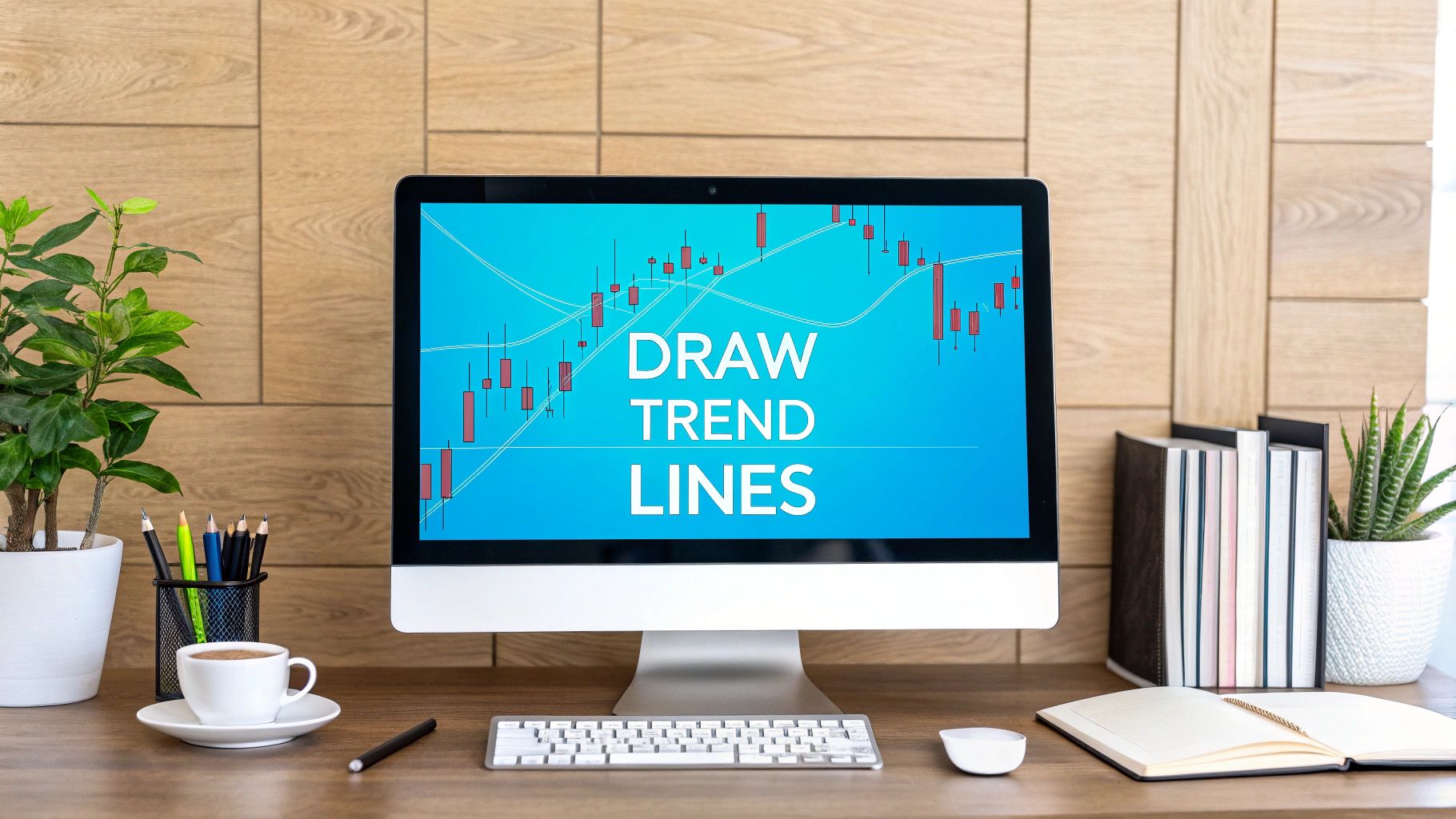
Drawing a trend line sounds simple enough, right? You just connect two points on a chart. For an uptrend, you link the bottoms of the pullbacks—the higher lows. For a downtrend, you connect the tops of the rallies—the lower highs. But this simple line is one of the most powerful tools you can have. It turns a messy chart into a clear visual guide for potential support or resistance.

Before we get into the nitty-gritty of drawing these lines, let's talk about why they're so fundamental. A trend line is more than just a diagonal mark on your screen; it’s a direct window into market psychology. At its heart, it shows you the ongoing tug-of-war between buyers (demand) and sellers (supply).
When you sketch an upward-sloping trend line, you're seeing proof that buyers are stepping in at progressively higher prices. That’s confidence. That’s momentum. On the flip side, a descending trend line tells you sellers are taking control, capping every rally at a lower point. It’s a beautifully simple way to see who’s winning the battle for the market.
The whole idea of following trends isn't new; it's a core principle of Dow Theory, one of the original pillars of technical analysis. A single line gives you a roadmap of where the price might be headed, helping you make smarter, more confident decisions. The real magic happens when the price repeatedly respects your line. Each touch adds more weight and credibility to it.
Once a price action tests a trend line three or more times, that trend is considered confirmed and much more reliable. In fact, some analysis suggests that after the third touch, the probability of the trend continuing can jump to over 70%. That’s a real statistical edge. You can dive deeper into how trend analysis has shaped trading by checking out this research on currency markets.
A well-drawn trend line doesn't just show you where the price has been; it provides a high-probability forecast of where it might go next. It turns a chaotic chart into a clear map of potential opportunities.
Getting good at drawing trend lines gives you a massive leg up. It helps you define clear zones for entering a trade, taking profits, and setting your stop-loss. It’s all about learning to trade with the market's flow instead of fighting against it.
By mastering this skill, you can:
To really nail this down, it helps to be crystal clear on the terminology. Here’s a quick reference table to keep the core ideas straight.
This table breaks down the fundamental concepts you'll encounter when working with trend lines and what they signal about market behavior.
Having these definitions handy will make it much easier to read the charts and apply what you're learning. Think of them as the basic vocabulary for understanding market structure.
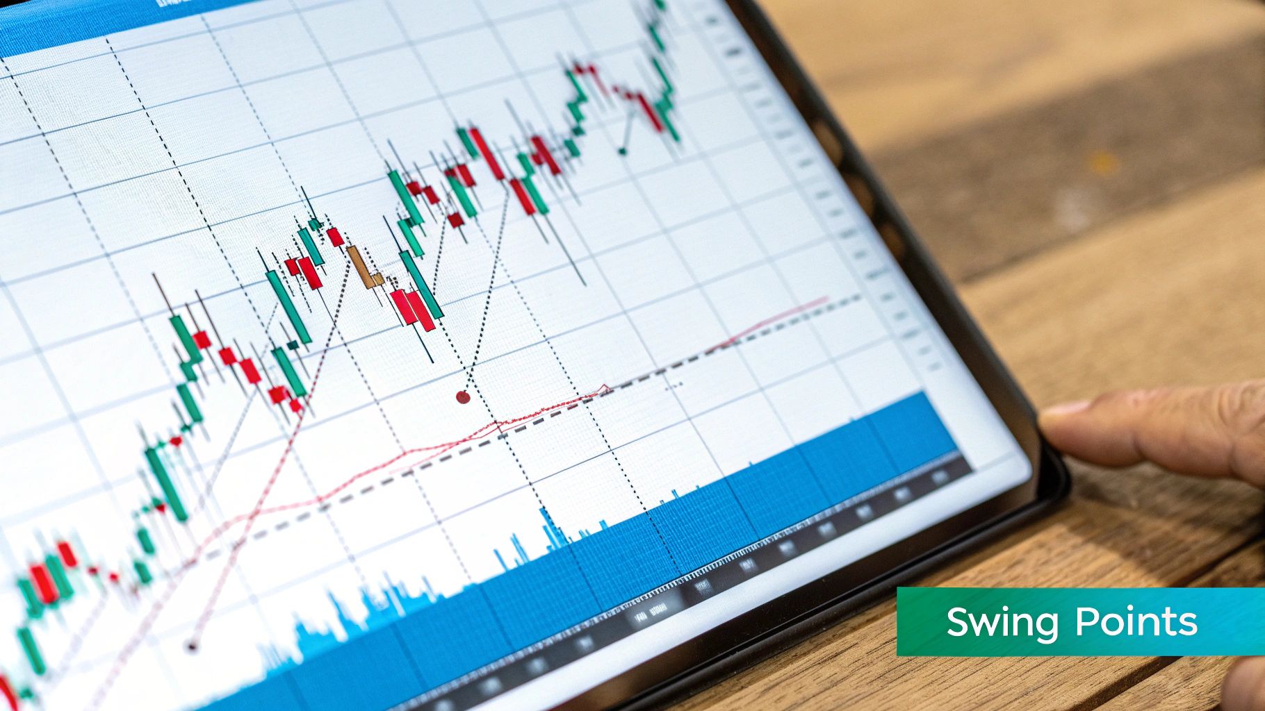
The accuracy of your trend line all comes down to one thing: picking the right spots to connect. A line is only as good as its anchors, and this is exactly where many traders stumble. You can't just connect any two points; you need to find the most significant pivots—what we call swing points—to draw a line the market will actually respect.
A swing point is simply a peak or valley where you can see the price momentum change direction. It’s not a subtle wiggle; it's a clear, decisive turn. Learning to see the difference between a minor price fluctuation and a true structural pivot is the core skill you need for drawing trend lines that work.
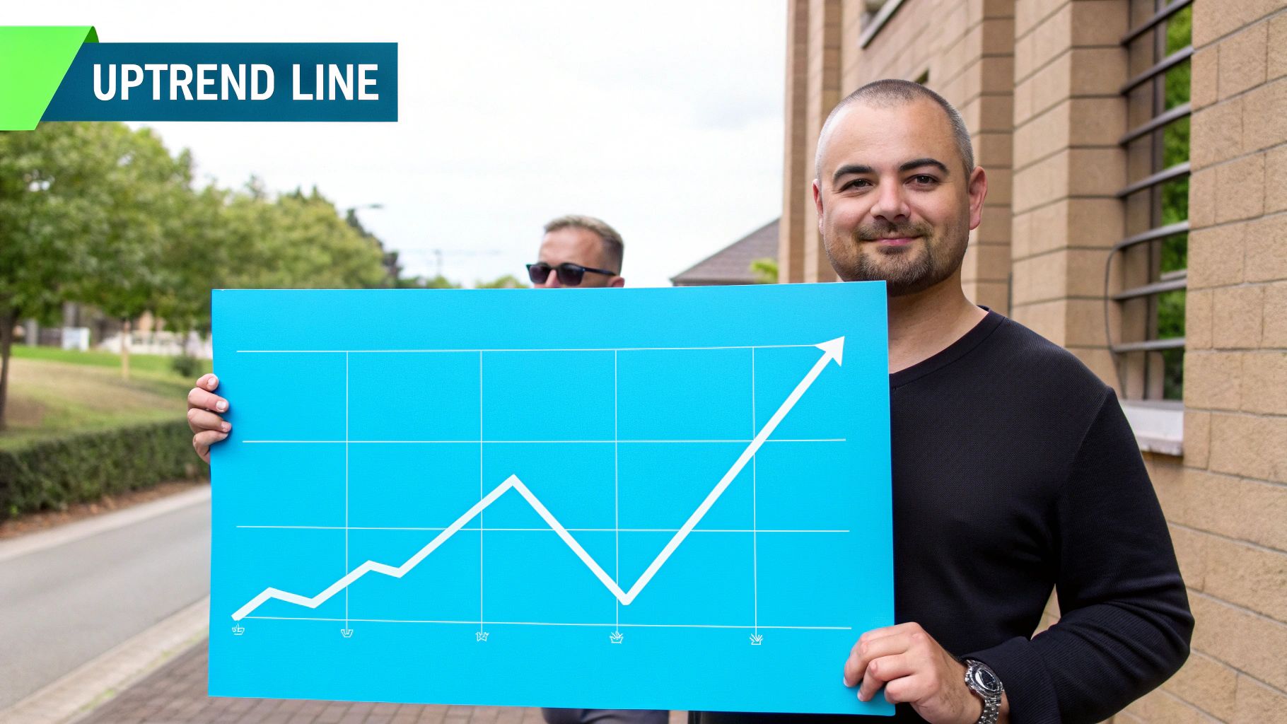
When you're looking at an asset that's climbing, you need to connect a series of higher lows. This might sound basic, but the real trick is spotting the most important "valleys" on your chart. Look for clear pullbacks where the price dips, finds support, and then powerfully bounces to continue its upward journey.
Think of it like climbing a set of stairs. Each flat step where you plant your foot is a swing low. You're looking for these distinct, solid steps, not the little scuffs and chips along the edges. The goal is to connect at least two of these major lows. A third touch is the gold standard—it provides powerful confirmation that your trend is legitimate.
For a downtrend, you just flip the logic. Here, you're hunting for lower highs. These are the most obvious "peaks" that form when the price tries to rally, smacks into a ceiling of selling pressure, and gets shoved back down. For the downtrend to be valid, each new peak has to be lower than the one before it.
Connecting these swing highs creates a powerful diagonal resistance line. Every time the price comes up to this line and gets rejected, it reinforces the bearish control. Just like with an uptrend, you need two points to draw the line, but it’s the third and fourth touches that really give it analytical weight. Getting a feel for these highs and lows is critical, and you can sharpen your skills by practicing how to read trading charts in general.
My rule of thumb: The best swing points are obvious. If you have to squint or second-guess whether a point is a true swing high or low, it probably isn't. Move on and look for the clear, undisputable turning points that jump right off the screen.
So, how do you train your eye to separate a real, structural swing point from insignificant market noise? I’ve found a few things really help.
Look at the depth of the pullback. A major swing low almost always comes after a significant retracement. If the price only dips by a few ticks before heading back up, that’s probably just noise. A real swing point involves a much deeper move against the primary trend.
Pay attention to the candles. Big turning points are often marked by powerful reversal candles. Look for hammers or bullish engulfing patterns at a swing low, or shooting stars at a swing high. These patterns show you a clear battle was won and lost, leading to the shift in momentum.
Zoom out for perspective. This is a big one. What looks like a major swing on a 5-minute chart might be a tiny blip on a 4-hour chart. I always check the higher timeframes to make sure the swing points I'm choosing are part of the bigger market picture, not just random short-term volatility.
By focusing on these clear, validated swing points, you build a solid foundation. This ensures your trend lines aren't just random lines on a chart, but truly meaningful tools that reflect market behavior and can guide your trading decisions.
Alright, you’ve learned to spot swing points. Now comes the fun part: actually drawing your trend lines on a chart. We'll be using TradingView for this, since it’s what most traders I know use. Getting the hang of it here will make the whole process feel like second nature in no time.
First things first, look over to the left-hand toolbar on your TradingView screen. You’ll see a diagonal line icon near the top—that's the Trend Line tool. Give it a click. Your cursor will change, letting you know it's ready to go.
Now, find that first key swing low if you're looking at an uptrend, or a swing high for a downtrend. Click on that pivot point, hold, and drag your cursor to the next major swing point. Click again to set the line. And that's it—you've just drawn your first trend line.
Drawing that first line is easy, but making it right is where the skill comes in. The real art is adjusting it to perfectly match the price action. One of the biggest debates you'll hear among traders is whether to connect the candle wicks or the bodies.
Honestly, there's no single right answer, but consistency is everything.
My advice? Start by connecting the wicks. They represent the true test of a price level. If that line ends up slicing through too many candle bodies, you can always adjust or even draw a parallel line on the bodies. This creates a "trend channel" and gives you a zone rather than a hard line. Just pick a method and stick with it across your charts for consistent analysis.
The best, most reliable trend lines are the ones that get the most "touches" without being broken by significant candle closes. Think of it like a tailor fitting a suit—you want the line to hug the price action snugly, not cut through it.
This process is all about validation. You need to see the market react to your line multiple times.
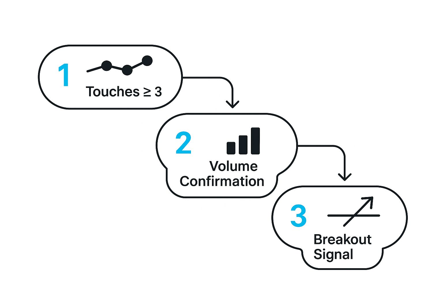
As the image shows, a strong trend line is confirmed by multiple touches and often by an increase in volume when the price tests it. The real signal comes when the price finally breaks through with conviction.
Getting comfortable with this is all about practice. Seriously. Open up a chart, find a trend, and start connecting the dots. Draw lines, adjust them, delete them, and start over. The more you repeat this process, the quicker your eyes will get at spotting the most important levels on any chart, making this a foundational skill in your trading arsenal.
Okay, you’ve drawn a trend line connecting a couple of swing points. So what now? At this stage, it’s really just a hypothesis—an educated guess. Your next job is to see if the market agrees with you. This is where you transform that rough sketch into a sharp, reliable level you can actually trade from.
The goal is to find the "best fit." This is more of an art than a science. You're trying to gently adjust the angle of your line so it gets the most touches possible without slicing through the bodies of the candles. Imagine nudging it just right, so it rests cleanly against the wicks, forming a clear boundary that price respects.
A solid trend line acts almost like a magnet. You'll see the market come back to test it again and again. Each time the price touches your line and bounces off, your line gains credibility. It stops being just a line you drew and starts becoming a dynamic support or resistance zone that a lot of other traders are clearly watching.
For a long time, finding that "best fit" was a purely subjective skill, relying entirely on a trader's experience and a good eye. But things have changed. A 2018 survey found that 85% of retail traders use trend lines as a primary analysis tool, and modern platforms have evolved to meet that demand. Today's tools can do a lot of the heavy lifting, with regression-based lines sometimes explaining up to 80% of price movement in a strong trend. You can learn more about how historical data has influenced modern trend analysis on imarticus.org.
This data-first approach is exactly what powers tools like EzAlgo. Instead of you trying to eyeball the perfect angle, our algorithms analyze the underlying market structure to plot dynamic support and resistance levels for you. This saves a ton of time and, more importantly, helps keep emotion out of your analysis.
A key takeaway: When an algorithm validates your hand-drawn line, it’s no longer just your line. It becomes a statistically significant level. This confirms your manual analysis aligns with important market zones, which should give you much more confidence in your trade setups.
When you're fine-tuning your trend lines by hand, a few practical habits can make a huge difference in their accuracy.
Here's what I always keep in mind:
Ultimately, refining trend lines is about listening to the market. When you combine your own careful charting with the objective validation of data-driven tools, you build your trading strategy on a much more solid and reliable foundation.
Knowing how to draw a solid trend line is a great start, but it's only half the story. What’s just as important is understanding the common pitfalls that can trip up even experienced traders.
Most of the time, especially when you're just getting the hang of it, you might make a few classic mistakes. These can make your analysis pretty useless, or worse, lead you straight into a bad trade. The good news? They're easy to fix once you see them. Let's break down the most common errors I see and how to get them right.
This is, without a doubt, the number one mistake. You're eager to find a trend, so you start connecting dots on a chart that's just moving sideways. If the swing points aren't making a clear pattern of higher lows (for an uptrend) or lower highs (for a downtrend), you simply don't have a trend.
Stop trying to force a diagonal line onto a choppy, range-bound market. The right move here is to identify it as consolidation. Instead of a trend line, draw horizontal support and resistance levels to define the range. Don't invent a narrative the chart isn't telling you.
Ever drawn a trend line that's practically vertical? It usually happens during those crazy parabolic runs where price goes straight up. It looks impressive on the chart, but those super-steep lines are built on pure hype and are almost guaranteed to break—and break hard.
A healthy, sustainable trend line has a much more reasonable slope, something in the ballpark of 30 to 45 degrees. If your line looks more like a rocket launch, it’s not tracking a real trend; it's just capturing a moment of speculative fever. It's better to wait for a pullback and for the price to establish a more stable angle before you draw a line you can actually trust.
A trend line is only useful if the market can realistically pull back and test it. If the angle is so steep that any pullback would break it, the line has no real analytical value.
It’s easy to get tunnel vision. You might draw a beautiful-looking trend line on a 5-minute chart, but if it’s pointing up while the daily chart is screaming "downtrend," you're setting yourself up for failure. That small uptrend is likely just a minor bounce in a much larger move down. Fighting the main trend is a quick way to lose money.
Always, always start your analysis on a higher timeframe. Check the daily or 4-hour chart first to get your bearings and understand the primary market direction. Then, you can use trend lines on smaller timeframes to pinpoint entries that go with that bigger trend, not against it.
A trend line is only as strong as the points it connects. A frequent misstep is drawing lines between tiny, insignificant wiggles on the chart instead of major, obvious turning points. My rule of thumb is this: if you have to squint to see the pivot, the rest of the market probably doesn't see it either.
Your line should connect the most prominent swing highs or lows—the points that jump right off the screen. These are the levels that matter. Major pivots are also more likely to line up with other technical signals, creating what traders call confluence. For example, a trend line that also happens to align with a major support zone is a far more powerful signal. To see this in action, it's worth learning to master Fibonacci retracement levels, as they often create these exact kinds of high-probability zones.

Even after you get the hang of drawing trend lines, certain questions always seem to surface when you're staring at a live chart. It's one thing to learn the theory, but it's another to apply it when real money is on the line. Getting solid answers to these common sticking points is what really builds the confidence to trust your analysis.
So, let's dive into the most frequent questions I hear from traders and clear up that confusion for good.
This is the big one. I get asked this all the time, and the answer is fundamental to using trend lines effectively.
Technically, you only need two points to draw a line. But in the world of trading, a line connecting just two swing points is merely a potential trend line. It's a "what if" scenario, not a confirmed market structure.
The magic really happens on the third touch. When price comes back to your line a third time and bounces off, that's your confirmation. This is the market telling you that other traders see this level too. It’s no longer just your line; it's a level that has proven its significance.
From there, every additional touch—a fourth, a fifth—just adds more weight. A trend line that has been respected multiple times is a serious barrier that you can bet a lot of traders are watching.
Ah, the classic debate. The truth is, there’s no single "right" way to do it. The most important rule is be consistent. Pick a method and stick with it across your charts to ensure your analysis is uniform.
Here’s how I think about the two approaches:
A great little trick is to draw your main line on the wicks and then see if you can draw a parallel line that connects the bodies. This often creates a "trend channel" or a zone of support/resistance, which can be far more practical in live trading than a single razor-thin line.
My Personal Tip: I always begin by drawing on the wicks. If that trend line starts slicing through multiple candle bodies as the trend progresses, I take that as an early warning. It often signals that momentum is fading and the trend might be getting exhausted.
Trend lines are a fractal concept, meaning they work on any timeframe you can pull up. From a one-minute chart to a monthly one, the principles are the same. The "best" timeframe really just depends on your trading style.
But here’s the most important piece of advice: always check the higher timeframe. A clean trend line on the daily chart is infinitely more powerful than one on the 5-minute chart. Make sure the short-term trend you're playing is in sync with the dominant, higher-timeframe trend. Trading against that larger current is a tough game.
A broken trend line is a huge clue. It’s a signal that the balance of power between buyers and sellers might be shifting.
When an uptrend line snaps and price closes below it, it suggests sellers are gaining control. When a downtrend line is breached and price closes above it, it tells you buyers are stepping in with force.
However, a break isn't an automatic signal to jump into a reversal trade. Whipsaws and "false breaks" are common. This is where patience pays off.
Many experienced traders wait for more confirmation. A classic pattern is the "break and retest." This is where price breaks the line, pulls back to test the other side of that same line, and then continues in the new direction. That retest is a much higher-probability entry signal. At a minimum, wait for a full candle to close decisively beyond the line to avoid getting faked out by a quick wick.
Ready to stop guessing and start using data-driven levels in your trading? EzAlgo provides AI-powered support and resistance zones, automated signals, and multi-timeframe insights directly on your TradingView charts. Take the subjectivity out of your analysis and gain a technical edge by visiting https://www.ezalgo.ai.


%201.svg)