


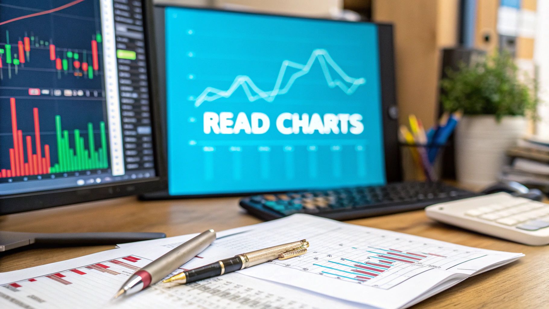
Learning how to read a trading chart is like learning to read the market's mind. You're looking at a visual story of price, time, and—most importantly—human emotion. At the end of the day, it's all about finding patterns in how an asset's price moves so you can make an educated guess about where it's headed next. This skill turns what looks like total chaos into a structured narrative of buyers and sellers battling it out.
Jumping into a trading chart for the first time can feel overwhelming, a lot like trying to decipher a foreign language. But don't worry. Every complicated chart you see is built from just a handful of simple, core pieces. Think of it as a map that chronicles an asset's price journey over a specific period.
The two main axes give you your bearings. The vertical axis running up the right side of your screen is the price. The horizontal axis along the bottom is time. When you plot price against time, you get a visual diary of an asset's performance, making it much easier to spot what’s going on.
When you're starting, the key is to focus on the absolute essentials. It's tempting to jump into flashy, complex indicators, but mastering the basics first is what will set you up for success. This initial orientation is your first real step toward building a solid foundation in chart analysis.
Here are the main players you’ll see on almost any chart:
A chart is simply a visual record of the battle between buyers and sellers. Every line, bar, and color represents the collective decisions of thousands of market participants, providing clues about who is winning.
To help you get your bearings quickly, here's a simple table breaking down these core elements.
This table gives you a quick rundown of the fundamental elements on a trading chart.
With these four components, you have everything you need to start interpreting what the market is doing.
It’s amazing how accessible these tools are now. I remember a time when traders had to work with printed or even hand-drawn charts. Today's interactive platforms, like TradingView, which tracks data for over 1,357,880 instruments worldwide, have completely changed the game.
Getting comfortable with these foundational elements is non-negotiable before you move on. Every advanced strategy you’ll ever learn is built on this basic understanding of how price moves over time. For a deeper look at how these pieces fit into the bigger picture, check out our guide on technical analysis for trading.
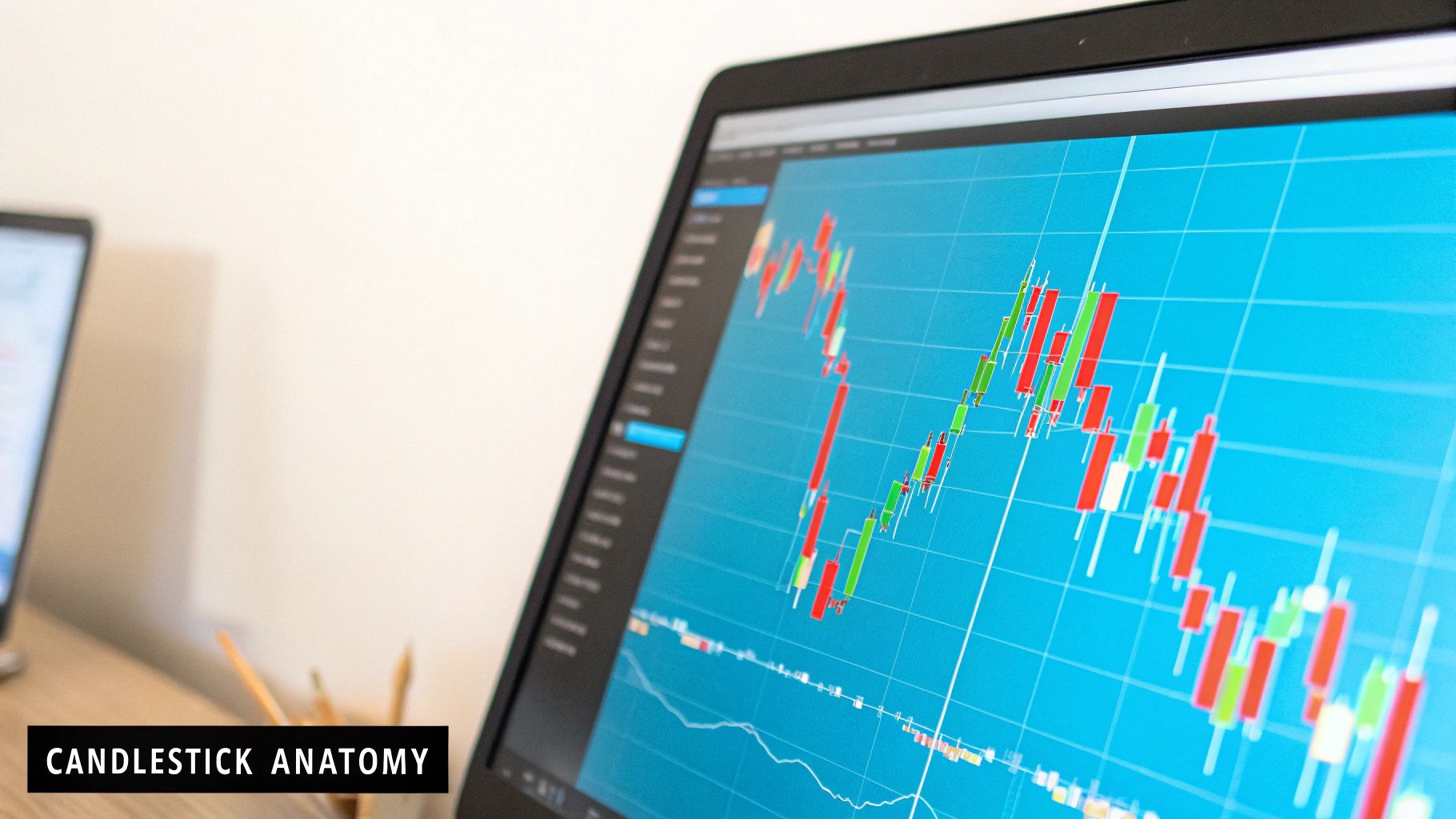
Forget about just seeing price go up or down. A candlestick chart tells you a story—a blow-by-blow account of the fight between buyers and sellers in a specific timeframe. Learning to read these little stories is your first real step toward understanding what the market is actually doing.
Every single candle has two key parts: the body and the wicks (some call them shadows). The thick part, the body, shows you where the price opened and where it closed. The thin lines sticking out, the wicks, show you the highest and lowest points the price hit during that period.
It's this simple combination of open, high, low, and close that makes candlesticks so powerful. This charting method has been around since 18th-century Japan, but it really took off in the 1990s when trading went digital. It’s no surprise that today, over 70% of traders use them for technical analysis. They just work. If you're curious about their reach, you can check out the data coverage on TradingView.com to see how universal these tools have become.
The color of the candle is your quickest tell. It’s an instant snapshot of who won the session.
A long green body screams strong buying pressure. On the flip side, a long red body shows you sellers were coming out in force. The wicks then add the crucial context, showing you the levels where the price was pushed back.
Don't get bogged down trying to memorize dozens of fancy patterns with weird names. It's far more useful to just understand the psychology behind the candle's shape. What does it tell you about the battle between bulls and bears? That’s the practical skill you need when the market is moving.
A single candlestick is the whole story of a trading session. The body shows you how confident the winners were, and the wicks show you the skirmishes that happened along the way.
Let's look at two basic, but powerful, opposing patterns.
1. The Marubozu Candle
A Marubozu is a candlestick with no wicks at all—just a solid body. This is a sign of complete and utter dominance.
2. The Doji Candle
The Doji is the polar opposite. It has a tiny, almost non-existent body, meaning the opening and closing prices were virtually the same. It often has long wicks sticking out. This pattern screams indecision. It’s a sign of a stalemate where neither buyers nor sellers could land a decisive blow, often signaling that a trend might be about to reverse.
When you start seeing the story in each candle—from the brute force of a Marubozu to the hesitation of a Doji—you're no longer just looking at a chart. You're reading the market's mind. And that, right there, is the foundation of good chart analysis.
Here’s a secret that trips up a lot of new traders: a chart's story can completely flip depending on the timeframe you’re looking at. The very same stock might look like it’s headed to the moon on a daily chart, but on a 5-minute chart, it could be in a nosedive.
This isn’t the chart lying to you. It's all about perspective. Learning to pick the right one for your goals is a huge part of reading charts like a pro.
Your ideal timeframe really comes down to your personal trading style. If you're a long-term investor, you probably only need to glance at a daily or weekly chart to keep an eye on the big picture. But if you're a day trader, you're living on the fast-paced charts—like the 1-minute, 5-minute, or even 15-minute—hunting for quick entries and exits.
Think of it this way: longer timeframes are like a world map. They show you the major trends, the continents and oceans of the market. Shorter timeframes are your detailed city maps, showing the individual streets where you’ll actually make your moves.
One of the most powerful techniques I’ve learned is using multiple timeframes in sync. I’ll start with the daily chart to get a feel for the market's main direction. Once I have that, I can zoom into an hourly or 15-minute chart to pinpoint a much more precise entry, waiting for a setup that flows with that larger trend.
Pro Tip: Try the "rule of four." It's a simple guideline that works wonders. If you're executing trades on the 15-minute chart, use the 1-hour chart (15 minutes x 4) to understand the broader context. This keeps you trading with the current, not against it.
Now, let's talk about one of the most underrated tools on your chart: volume. Those vertical bars at the bottom aren't just for decoration; they represent the total number of shares or contracts that changed hands in that period.
Volume is your truth-teller. It reveals the conviction behind a price move.
Ever see a stock break out to a new high and wonder if it's the real deal or just a head fake? Volume has the answer.
A price surge on massive volume screams genuine buying excitement. On the flip side, a price drop on huge volume signals real panic selling. Any move on thin volume? It's often just market noise you can safely ignore.
Make it a habit. Every time you analyze a pattern or a trend, always glance down at the volume. It adds a layer of confirmation that helps you tell a high-quality setup from a trap. This one simple check can dramatically improve your decision-making and give you a real sense of what the market is truly thinking.
Okay, so you've got a handle on what individual candlesticks mean and how different timeframes tell their own story. Now, let's zoom out. This is where you start seeing the big picture—the market's overall direction and the price levels that matter. Getting good at spotting these is when you move from just looking at a chart to actually reading it.
The first thing I always look for is the trend. Is the price generally climbing, or is it sliding down? The trend is the most powerful force in the market, and you want it on your side.
One of the simplest and most effective tools in any trader's kit is the humble trend line. It's just a straight line connecting key points on your chart, but it gives you a powerful visual on the market's momentum.
Here's how I think about it:
I like to think of a trend line as the path of least resistance. As long as the price is respecting that line, the trend is your friend. But a clean break of that line? That’s my first signal that the trend might be running out of gas or even getting ready to reverse.
The chart below highlights some of the key things you'll see when a trend has real strength behind it.
Notice how things like higher volume often show up alongside strong momentum signals. This is a great way to confirm that a move has real conviction behind it.
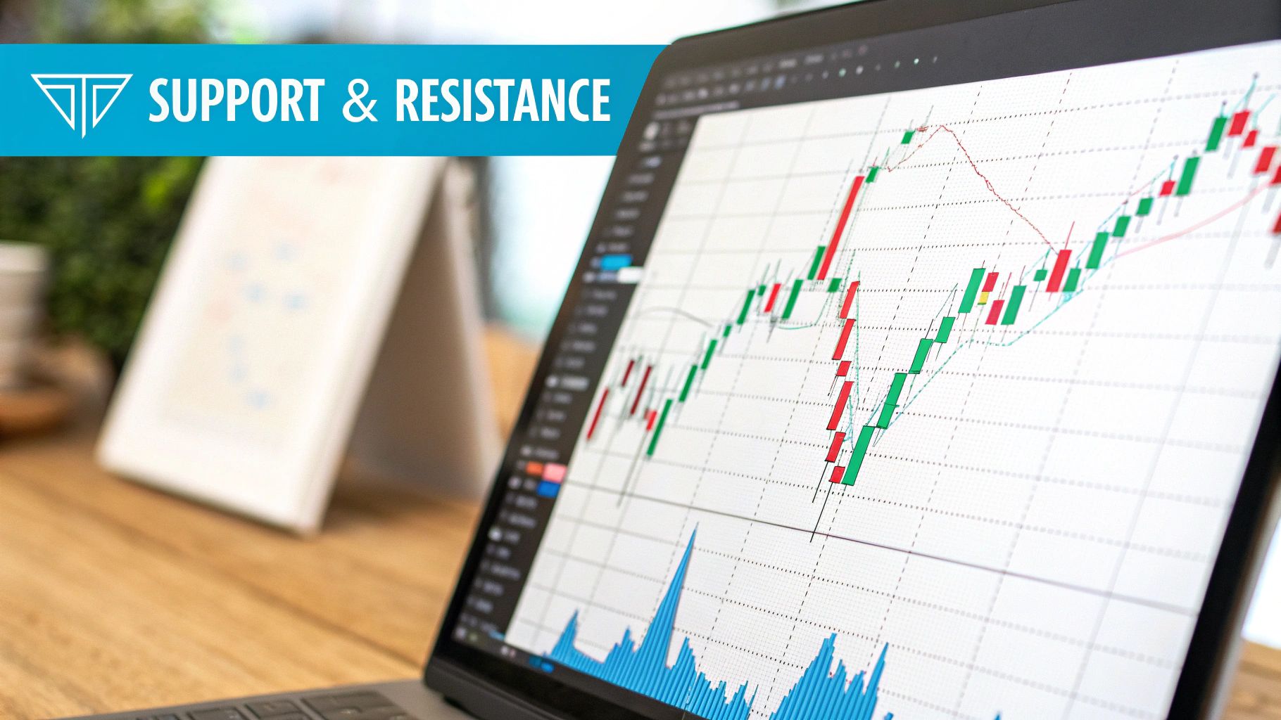
While trend lines follow the price and are dynamic, support and resistance are fixed, horizontal levels. These are specific price zones where the market has hit a wall or found a floor in the past. They're like the market's memory.
Support is a price level where buyers have previously stepped in with enough force to stop a decline and push the price back up. Think of it as a floor. I find these by looking for previous lows where the price turned around.
Resistance is the flip side—a price ceiling where sellers have historically taken over and pushed the price back down. To find resistance, I look for previous peaks where the price got rejected.
Key Takeaway: Support and resistance levels are all about market psychology. They represent areas where traders collectively decided a price was a "bargain" (support) or "overpriced" (resistance). People tend to remember these levels and act on them again.
To help clarify the difference between these two core concepts, here's a quick breakdown:
Mastering both of these concepts is crucial. Trend lines tell you which way the river is flowing, while support and resistance levels show you where the rocks and eddies are.
These levels are incredibly powerful because they give you practical, logical places to make decisions. If you buy a stock as it bounces off a strong support level, the next area of resistance is a natural place to think about taking profits. They also help you set much smarter stop-losses. We have a full guide that goes much deeper, and you can learn more about how to identify support and resistance here.
When you can put trend analysis and support/resistance together, you’re no longer just guessing. You're reading the map the market gives you and identifying high-probability zones for your trades.
So you've drawn your trend lines and mapped out your key levels. What now? This is where technical indicators come into play. But a word of caution: think of them as a second opinion, not a crystal ball. They're mathematical tools that help you confirm what the price action is already hinting at.
A common mistake I see new traders make is plastering their charts with a dozen different indicators. This almost always leads to "analysis paralysis"—too many conflicting signals and zero clarity. The trick is to keep it simple. By picking just a couple of reliable indicators, you can add a powerful layer of confirmation to your trading ideas without getting lost in the noise.
Let’s focus on two of the most trusted types: one to track the trend and another to measure momentum.
One of the first and most useful indicators you'll ever learn is the Moving Average (MA). Its job is brilliantly simple: it calculates the average closing price over a set number of candles and plots that data as a smooth, single line right over your price chart.
This smoothing effect is incredibly helpful because it filters out the minor, day-to-day price jitters, giving you a much clearer view of the underlying trend. A 50-period moving average, for instance, is just the average price of the last 50 candles.
From my own experience, I use MAs in two main ways:
You'll come across many different settings, but the 20, 50, and 200-period MAs are incredibly popular for a reason—so many traders are watching them, which can make them more reliable.
Remember, the price crossing a moving average isn't a buy or sell signal on its own. It's a clue that the market's character might be changing, prompting you to pay closer attention to the price action.
While MAs help you see the trend’s direction, the Relative Strength Index (RSI) helps you understand its strength—or lack thereof. The RSI is an oscillator, which just means it’s a tool that moves between 0 and 100 in a separate window below your price chart. Its whole purpose is to signal when a stock might be overbought or oversold.
The real power of the RSI is using it as an early warning system. If a stock is in a clear uptrend but the RSI is creeping above 70, that’s not necessarily a signal to sell everything. Instead, it’s a heads-up to be more cautious. Maybe you tighten your stop-loss or start watching for signs of weakness. It helps you stay in a winning trade without getting spooked by every little dip.
These tools aren't just theory; their influence is well-documented. Studies have shown that over 80% of retail traders use chart patterns to anticipate price moves. Furthermore, tools like the Moving Average Convergence Divergence (MACD), another popular momentum indicator, have been shown to improve signal accuracy by 15-20%. You can explore more about these economic tools and their impact by reviewing market data and analysis on TradingEconomics.com.
As you begin connecting the dots between candlesticks, trends, and indicators, you're bound to run into some questions. It's a completely normal part of the process. Getting straight answers to these common sticking points is the fastest way to build real confidence.
Let's walk through some of the questions I hear most often from traders who are just starting out.
I almost always tell new traders to start with candlestick charts. A simple line chart is fine, but it only shows you one thing: the closing price. Candlesticks, on the other hand, tell a much richer story at a single glance.
Each candle gives you the open, high, low, and close for that period. This immediately helps you gauge market psychology. Was it a day where buyers were in complete control? Or was it a tug-of-war with no clear winner? This visual depth is what helps you learn to read price action in a way no other chart type can.
This is where so many new traders get tripped up. It's tempting to load up your chart with five or six different indicators, thinking more data means better decisions. In my experience, it almost always does the opposite—it leads to "analysis paralysis." You get so many conflicting signals that you can't pull the trigger on anything.
Remember, the most important thing on your chart is the price itself. Everything else—trends, patterns, support and resistance—comes from price. Indicators are just there to confirm what you're already seeing in the price action, not to be the sole reason for a trade.
My advice? Keep it simple. Start with one or two that complement each other. A great starting point is a Moving Average to get a feel for the trend, paired with an oscillator like the RSI to understand momentum. This setup gives you a balanced perspective without cluttering your chart or your mind.
There's no magic answer here. The best timeframe for you is completely tied to your personal trading style and how much time you can dedicate to the markets.
One of the most powerful techniques you can learn is multi-timeframe analysis. For instance, you could spot a strong uptrend on the 4-hour chart, then zoom into the 15-minute chart to pinpoint a low-risk entry that aligns with that bigger move. This helps you make sure you're swimming with the current, not fighting against it.
Ready to stop guessing and start confirming your chart analysis with precision tools? The EzAlgo indicator suite for TradingView provides automated buy/sell signals, dynamic support and resistance levels, and real-time momentum alerts to give you a clear edge. Upgrade your trading today at EzAlgo.ai.


%201.svg)