


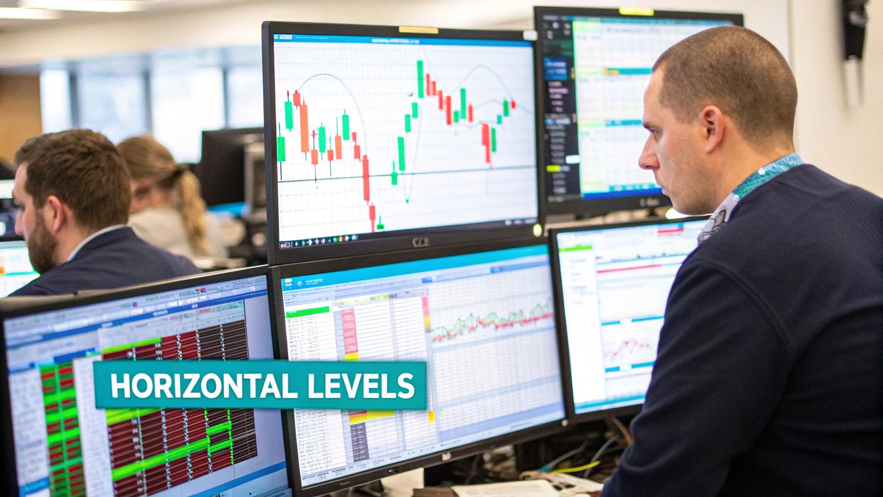
Alright, let's cut through the noise. Support and resistance are just price levels where the market tends to hit a wall. Think of support as a floor where buyers usually show up, and resistance as a ceiling where sellers take over. To really get a handle on how to identify support and resistance, you have three main paths: doing it by hand, using indicators, or leaning on smart tools like EzAlgo for an automated edge.
At the end of the day, finding these levels is all about understanding the market's memory. Prices don't just move randomly; they often react at the same spots where big moves happened before. These are the places where the balance between buyers and sellers shifted dramatically, creating a floor (support) or a ceiling (resistance). Getting this right is what turns trading from a guessing game into a calculated strategy.
It’s more than just drawing lines on a chart—it’s about getting inside the heads of other traders. When the price drops to a point where it bounced hard before, traders remember that "deal" and start buying again, which reinforces that support level. The same thing happens at the top. As the price approaches a previous peak, sellers who got out too early or buyers looking to cash in start to sell, strengthening that resistance.
This infographic lays out the core ideas beautifully, showing how these levels form and what the trading volume tells you.

The real takeaway here is watching how traders behave at these key levels. If you see volume picking up as the price hits support, that’s a strong sign that buyers are defending it. On the other hand, if volume dries up as price drifts toward resistance, it could mean the sellers are losing steam.
So, how do you actually find these all-important levels? Your method will probably come down to your trading style and how much time you want to spend staring at charts. Let's start with a high-level comparison of the three main ways traders do it before we dive deep into each one.
The table below breaks down the pros, cons, and best uses for each approach, giving you a clear picture of what might work best for you.
Each of these methods gives you a different lens for viewing the market. There's no single "best" way—it's about finding what clicks with your personality and strategy. Many experienced traders actually blend elements from all three to build a more robust and reliable picture of what the market is likely to do next.
By mastering these techniques, you move from simply looking at a chart to truly understanding the story it tells. Each method offers a different lens through which to view market structure, and combining them can build a powerful analytical edge.
Before algorithms and fancy indicators took over, traders had to rely on their own two eyes and a solid feel for the market. This classic, manual approach is where most of us start, and for good reason—it builds an intuition for price action that you just can't get from a tool. In essence, you’re just looking at historical charts and drawing lines to mark where the market made a decisive turn.
But it’s not just about connecting dots. It's about finding the exact price points where a crowd of traders all made the same decision. When you spot a level where a stock or currency pair repeatedly stopped falling and bounced back up, you’ve found support. On the flip side, a price ceiling that the asset just can't seem to break through is your resistance.
The real power here is that you're basing your decisions on what the market actually did, not what some formula thinks it might do next.
First things first: zoom out. Before you even think about where to enter a trade, pull up a daily or even a weekly chart. You're looking for the most obvious peaks and valleys over the past six months or a year. These are the major battlegrounds—the spots where huge waves of buying or selling pressure showed up.
Connect these points with horizontal lines. While angled trend lines have their uses, horizontal levels are often far more reliable, especially when you're starting out. They represent clean, objective price points that everyone in the market can see and react to.
So, how many touches does it take to make a level legitimate? There’s no magic number, but a good rule of thumb is to look for at least two or three clear tests of a level. A single high or low could just be a random fluke. Multiple rejections, however, tell you that the level has real psychological and financial significance for many traders.
This is one of the most statistically sound ways to find support and resistance. For example, looking at the S&P 500 between 2020 and 2023, the index found powerful support in the 3,600–3,800 range on at least four separate occasions before it continued its climb. Each test makes the level stronger and increases the statistical chance of another reaction. To dig deeper into historical chart analysis, resources like StockCharts offer some great examples.
Here’s a concept that, once you get it, will change how you see charts: the role reversal, or support-resistance flip. This is what happens when a broken level completely changes its personality.
This principle is a cornerstone of price action trading. It shows that old battlegrounds are not forgotten; they simply change which side has the upper hand. Spotting these flips can give you some incredibly high-probability areas to watch for trades.
Finally, the real secret to making manual analysis work is to use multiple timeframes. A level that looks important on a 1-hour chart might be nothing but noise on the daily chart. The strongest, most reliable levels are the ones you can see clearly on different time horizons.
Always start your analysis on a higher timeframe, like the daily or weekly, to map out the major structural levels. These are your "big picture" zones. Once you have those drawn, you can zoom into a lower timeframe, like the 4-hour or 1-hour, to hunt for precise entry signals as the price approaches one of your major zones.
This top-down approach keeps you from getting faked out by short-term market chatter and helps you focus on the levels that truly matter. Building this skill is crucial, and you can take it a step further by reading our guide on building a complete trading support and resistance strategy, where we blend manual analysis with other powerful techniques.

Drawing lines on a chart by hand is a fantastic way to develop a real feel for market behavior. But let's be honest—it takes time, and your lines might look different from the next trader's. This is where technical indicators can give you a serious edge.
Instead of hunting for levels yourself, you can let these tools do the heavy lifting. They use math, crunching historical price and volume data to automatically plot objective support and resistance levels right on your chart. This frees you up to focus less on drawing and more on what really matters: your trading strategy.
The real power here is objectivity. When you and I draw trend lines, we might end up with slightly different placements. An indicator, however, shows the exact same level for everyone using it. In a fast-moving market where every second counts, that kind of clarity is invaluable.
One of the first tools most traders learn is the Moving Average (MA). Unlike the static, horizontal lines you draw yourself, moving averages are dynamic. They flow with the price, creating a constantly adjusting floor or ceiling.
Think of an MA as a smoothed-out version of the price, calculated over a set number of periods. Traders everywhere, from big institutions to at-home speculators, keep a close eye on a few key ones:
When a stock is trending up, it will often pull back to these moving averages, treat them as support, and then bounce higher. In a downtrend, they act as resistance, putting a lid on any attempts to rally.
Pro Tip: Keep a close eye on how the price reacts when it meets a key moving average. A decisive, high-volume bounce off the 200-day SMA can be an incredibly strong signal that the long-term bulls are still in control.
If you're a day trader or even a short-term swing trader, you need to know about Pivot Points. This tool is a day trader's best friend because it uses the previous day's high, low, and close to map out a fresh set of potential support and resistance levels for the current session.
Every morning, before the market even opens, you get a roadmap. The calculation gives you a central pivot point (PP), with several resistance levels (R1, R2, R3) above it and support levels (S1, S2, S3) below it.
The beauty of pivot points lies in their predictive nature. They aren't lagging; they’re ready to go from the opening bell. Traders use them to anticipate where the price might turn, set realistic profit targets, and place smarter stop-losses.
Another classic tool you'll see on almost any professional's chart is the Fibonacci Retracement. It's built on a simple, yet powerful, observation: after a big move, the price tends to pull back a predictable amount before continuing on its way.
To use it, you just find a clear swing in price—from a low point to a high point in an uptrend, for example. The tool then automatically draws horizontal lines at key Fibonacci percentages: 23.6%, 38.2%, 50%, 61.8%, and 78.6%.
These levels are potential turning points where a pullback might run out of steam. The 61.8% level, often called the "golden ratio," is especially powerful and watched by traders globally. For those looking to work smarter, advanced platforms like EzAlgo can even auto-plot these crucial "golden pocket" levels, giving you pinpoint accuracy without any of the manual work.
To help you decide which indicator might fit your style, here's a quick look at how they stack up.
This table gives a data-driven look at these common indicators, what they do, and how you can interpret them in a practical way.
Of course, no indicator is a crystal ball. In choppy, sideways markets, they can sometimes give conflicting signals. The key is to use them not as standalone buy or sell signals, but as a way to add data-driven evidence to your trading ideas. By doing so, you move a step closer to consistently finding those high-probability zones where the action is likely to happen.

This chart shows a perfect real-world example of support getting tested. Notice that huge volume spike right at the bottom? That's not a coincidence. It's the market screaming that buyers have shown up in force, leading to that powerful bounce you see immediately after. This is what separates a meaningful level from mere noise on the chart.
Finding potential support and resistance zones is only half the battle. The real trick is knowing which ones will actually hold up under pressure. This is where trading volume becomes your best friend, acting like a truth serum for market sentiment. It shows you the conviction behind a price move, helping you distinguish between flimsy levels and the real institutional battlegrounds.
Think of it this way: a support level that gets a brief tap on low, sleepy volume is just a suggestion. But when that same level stands firm against a tidal wave of selling—backed by a massive spike on your volume indicator—that’s a five-alarm signal. It tells you big players with deep pockets have drawn a line in the sand, making that price point far more significant.
The concept itself is refreshingly simple. High volume means high interest.
When price pushes up to a key resistance area and you see volume surge, you're witnessing a major clash between buyers and sellers. If the price gets smacked down from that level on heavy volume, it's a clear sign that sellers have won the fight. That ceiling is solid.
On the flip side, imagine the price is tumbling toward a known support zone. If the volume bar suddenly explodes as the price hits that level—and the decline screeches to a halt—you've just seen buyers absorb every last sell order. This high-volume defense makes the support level a much more reliable launchpad for a bounce.
The bottom line is this: Volume validates price action. A level tested with significant volume is a level the market actually cares about. Anything else could just be random market chatter.
Not all volume spikes are created equal. Learning to read the nuance can give you a serious edge in figuring out how to identify support and resistance strength.
Here’s what I look for:
Confirmation Volume: This is that classic spike in volume happening right at your support or resistance line. It confirms a battle is underway. A rejection from resistance on high volume or a defense of support on high volume is a powerful, textbook confirmation.
Exhaustion Volume: This is a bit more subtle but incredibly powerful. Sometimes you’ll see a massive, climactic volume spike at the end of a long, sustained trend, often just before it reaches a key level. This can signal the move is out of gas. For example, a huge green volume bar after a long rally that stalls at resistance often means the last of the "FOMO" buyers just piled in, leaving no one left to push the price higher.
Adding volume analysis to your charts provides an essential layer of context. If you want to simplify this, our guide on the best support and resistance indicator covers tools that can help map out these high-interest zones for you.
The link between price levels and volume isn't just theory; it's backed by data. History shows that zones with higher-than-average trading volume are far more likely to act as strong barriers.
Take the tech sell-off in March 2022. The NASDAQ found a bottom right around the 12,500 level on a day when over 450 million shares were traded. That high-volume defense sparked a rally of more than 10% in the weeks that followed. In fact, some studies have shown that support or resistance zones with at least 20% above-average volume are 68% more likely to hold over the next three months. You can find more detail on volume's role on Investopedia.
This isn't just an interesting fact; it's something you can use. By watching how volume behaves as price approaches your levels, you can dramatically improve your trade timing and confidence. It helps you filter out the weak, low-probability setups and focus on the A+ opportunities where the "smart money" is clearly making its move.
Knowing the theory is one thing, but applying it to a live chart with real money on the line is a completely different ballgame. This is where we connect the dots—blending manual analysis, indicators, and volume into a framework you can actually use to find and take trades. The whole point is to build a repeatable routine that helps you make clear, confident decisions without second-guessing yourself.
A solid framework takes the guesswork out of trading. Instead of just staring at a chart and feeling lost, you'll have a clear process. You'll know how to identify the big levels, wait for the price to get there, and then look for a specific trigger to pull. It’s all about patience—letting the A+ setups come to you instead of chasing every little price wiggle.
The best way to get a feel for any market is to start with the big picture and work your way down. This top-down approach means you begin on a higher timeframe to understand the major trend before you even think about finding an entry on a smaller chart. Trying to trade on a 15-minute chart without knowing what’s happening on the daily is like trying to navigate a forest by only looking at your feet. You're going to get lost.
Here’s a simple, effective routine I’ve used for years:
Map Major Zones on the Daily Chart: Before the week even starts, I pull up a daily chart. Using the manual techniques we talked about, I draw clean horizontal lines at the most obvious swing highs and lows from the last six to twelve months. These are the major support and resistance zones—the areas where the big institutions are likely making their moves.
Refine on the 4-Hour Chart: With the daily levels marked, I’ll drop down to the 4-hour chart. Here, I can often spot more immediate levels that weren't as clear on the daily. I'll add these to my chart, sometimes using a different color or line style to keep them separate from the major daily zones.
Execute on the 1-Hour Chart: The 1-hour chart is where I'll spend most of my time during the week, watching price action unfold as it approaches my pre-drawn levels. The key here is that you don't just blindly trade because the price touches your line. You have to wait for clear confirmation that the level is holding.
Following this process ensures you're always trading with the broader market context in mind, which can seriously stack the odds in your favor.
Once the price finally arrives at one of your key zones, it's showtime. Now you’re on the hunt for a specific reason to enter a trade. This could be a classic candlestick pattern, like a sharp pin bar or a powerful engulfing candle, signaling a strong rejection of the level.
But here's the crucial part: you must check the volume. Did that pin bar at resistance form on a huge spike in selling volume? Now that's an A+ confirmation. A price signal without supporting volume is just noise, and it's far less reliable.
This brings us to the most important part of any trade: managing your risk. Your support and resistance levels give you a perfectly logical place to define exactly how much you're willing to lose.
Setting Your Stop-Loss: If you're buying at a support level, your stop-loss should sit just below that level. If you're selling at resistance, it goes just above it. This gives the trade a little bit of room to breathe without exposing you to a massive loss if you're wrong.
Setting Your Take-Profit: Your profit target should be the next logical hurdle. If you bought at support, your target is the next major resistance zone. Aim to take profits just before the price gets there, since you can't assume it will hit it to the exact penny.
A trader's job isn't to be right all the time. It's to have a plan for when they're wrong. Your stop-loss is that plan, and support and resistance levels provide the most logical place to implement it.
Let's walk through a real-world scenario to see how this all comes together.
First, we do our homework. On the daily chart, we spot a clear resistance level at $150, an area where the price got smacked down hard twice in the last three months. We mark this as a major zone to watch.
Next, we wait. Switching to the 4-hour chart, we see the price steadily grinding its way up toward our $150 zone. There's nothing to do yet. We just sit on our hands and let the market come to us.
Finally, we look for our signal. As the price tags $149.80, the 1-hour chart prints a massive bearish engulfing candle. This is the trigger we were waiting for. A quick glance at the volume indicator shows a huge spike, confirming that sellers have stepped in with force.
Now, we can execute the trade with a clear plan:
This kind of systematic process turns trading from a chaotic, emotional rollercoaster into a structured business. It forces you to be selective and only take the trades that give you a real, quantifiable edge. For traders who want to make this even more efficient, tools like EzAlgo can automatically plot these key levels and send real-time alerts, which helps reinforce this disciplined approach and saves a ton of screen time.
Once you start trying to identify support and resistance on a real, live chart, you'll quickly realize that theory doesn't always translate perfectly. The clean examples in textbooks get messy fast when real money is on the line.
Let’s dig into some of the most common questions and roadblocks that trip up traders. I'll give you direct, practical answers to clear up that confusion.
This is the million-dollar question, isn't it? While there’s no crystal ball, you can learn to spot clues that a level is losing its strength and might be ready to snap. It's less about the level itself and more about how the price reacts when it gets there.
A strong level tends to cause a sharp, immediate rejection. Think of it like a hot stove—price touches it and recoils quickly. But if you start seeing the price linger, making several weak bounces before slumping back to test support again, that's a major red flag. This price action, sometimes called "coiling" or "building pressure," tells you that the buyers are getting exhausted and sellers are growing more confident.
The key is to watch for a change in character. If a level that used to produce powerful bounces now only musters a weak, shallow reaction, it’s probably living on borrowed time.
This is one of the biggest myths in trading: that support and resistance are razor-thin, exact lines. In my experience, they are almost always zones.
Think about why. Thousands of traders are looking at the same chart, but they're all placing orders at slightly different prices. This creates a cluster of buying or selling interest, not a single price point. Drawing just one line often leads to frustration when the price reverses just a few ticks before or after your mark.
My advice? Always think in zones. Here are two easy ways to do this:
This small shift in perspective gives your trades more breathing room and helps you avoid getting stopped out just because the market didn't hit your line to the exact penny.
Your support and resistance levels are not a "set it and forget it" part of your analysis. The market is dynamic, and your charts need to reflect that. How often you adjust them really comes down to your trading style.
Here’s a simple breakdown based on timeframe:
The goal is to keep your charts clean and relevant to what's happening now. An old support line that hasn't been touched in six months is just noise.
Ready to stop guessing and start trading with precision? EzAlgo gives you a serious edge by automatically plotting dynamic support and resistance zones, momentum signals, and clear buy/sell alerts directly on your TradingView chart. Take the emotional bias and manual labor out of your analysis by visiting the EzAlgo website to see how our AI-driven tools can sharpen your trading framework today.


%201.svg)