


Learning how to read a stock market chart is a lot like learning a new language. At first, it’s just a jumble of lines and colors, but once you understand the basic grammar, a clear story starts to unfold. The goal is to interpret a stock's past performance to get a feel for where it might be headed next.
Every chart tells its story using a few core elements: the price axis, the time axis, and some kind of visual for the price itself, usually lines or candlesticks. Getting comfortable with these basics is the absolute first step before you can even think about making a trade.

Let's be honest—the first time you pull up a stock chart, it can look pretty intimidating. There’s a lot going on. But don't let it scare you off. Once you know what you're looking at, it all clicks into place pretty quickly.
Think of the chart as a simple grid. The vertical line (the Y-axis) tracks the price, and the horizontal line at the bottom (the X-axis) tracks time. You can set that time frame to anything from a single minute to an entire decade, depending on what you’re trying to analyze.
You'll also always see a ticker symbol somewhere prominent, which is just the company's unique stock market code, like AAPL for Apple or TSLA for Tesla.
While the axes give you the basic framework, the real story is in how the price movement is drawn. There are a few different styles, but you'll almost always run into one of these three.
To make it easier to see the differences at a glance, here’s a quick breakdown of the main chart types.
As you can see, each chart type tells a slightly different story.
Line charts are the simplest and give you a bird's-eye view, but they leave out a ton of detail about what happened during the day.
Bar charts and candlestick charts are much more informative because they show four key data points for each period: the opening price, the highest price, the lowest price, and the closing price (often called OHLC).
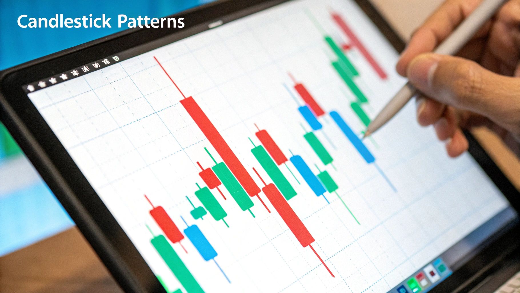
Most traders I know, myself included, stick with candlestick charts. Why? Because the colored bodies give you an instant read on market sentiment. A green candle means the price closed higher than it opened (bullish), and a red one means it closed lower (bearish). Those visual cues make spotting patterns much, much easier.
Expert Tip: Understanding historical context is everything. For instance, when the US500 index hits an all-time high, it's not just a number—it’s the culmination of months or years of price action. You learn to spot these major trends by analyzing closing values over long periods. You can dig into this kind of historical market data on TradingEconomics.com to see for yourself.
Every single candlestick on a chart tells a story—a miniature tug-of-war between buyers and sellers. Once you learn to read this language, you're no longer just looking at prices; you're seeing market psychology in action. The size of a candle's body and the length of its wicks are packed with clues about who's winning that battle.
A big, bold green candle with tiny wicks? That’s a classic sign of bullish conviction. It tells you buyers were in complete control from the open to the close. On the flip side, a long red candle signals that sellers dominated the session, pushing the price down with force. It’s this simple, visual storytelling that makes candlesticks a favorite among traders.
To get started, you only need to focus on two parts of a candlestick: its body and its wicks (sometimes called shadows).
Long wicks often scream volatility and indecision. For instance, if you see a candle with a long wick on top and a small body, it means buyers tried to rally the price higher, but sellers shoved it right back down before the session ended. That can be a huge red flag that an uptrend is losing steam.
Once you get the hang of reading individual candles, you'll start noticing they form patterns that veteran traders have been watching for decades. These patterns can give you a heads-up about where the market might be heading next—whether a trend is likely to continue or reverse.
A classic and powerful pattern is the "Engulfing" candle. A bullish engulfing pattern forms when a large green candle’s body completely swallows, or "engulfs," the previous red candle. This is often a sign that buyers have wrestled control from sellers, and an upward reversal could be on the way.
Another critical pattern to know is the Doji. A Doji looks like a cross or a plus sign because the open and close prices are almost identical, leaving it with a tiny body. This pattern signals a stalemate—neither buyers nor sellers could take charge. When a Doji shows up after a long run-up or a steep decline, it's often a warning that the trend is tired and a reversal might be coming.
Here are a couple of other key patterns to keep an eye out for:
These are just a handful of the stories candles can tell. To really dig in and see more chart examples, our guide on understanding candlestick patterns is the perfect place to go next. Getting comfortable with these formations will add a powerful tool to your analysis toolkit.
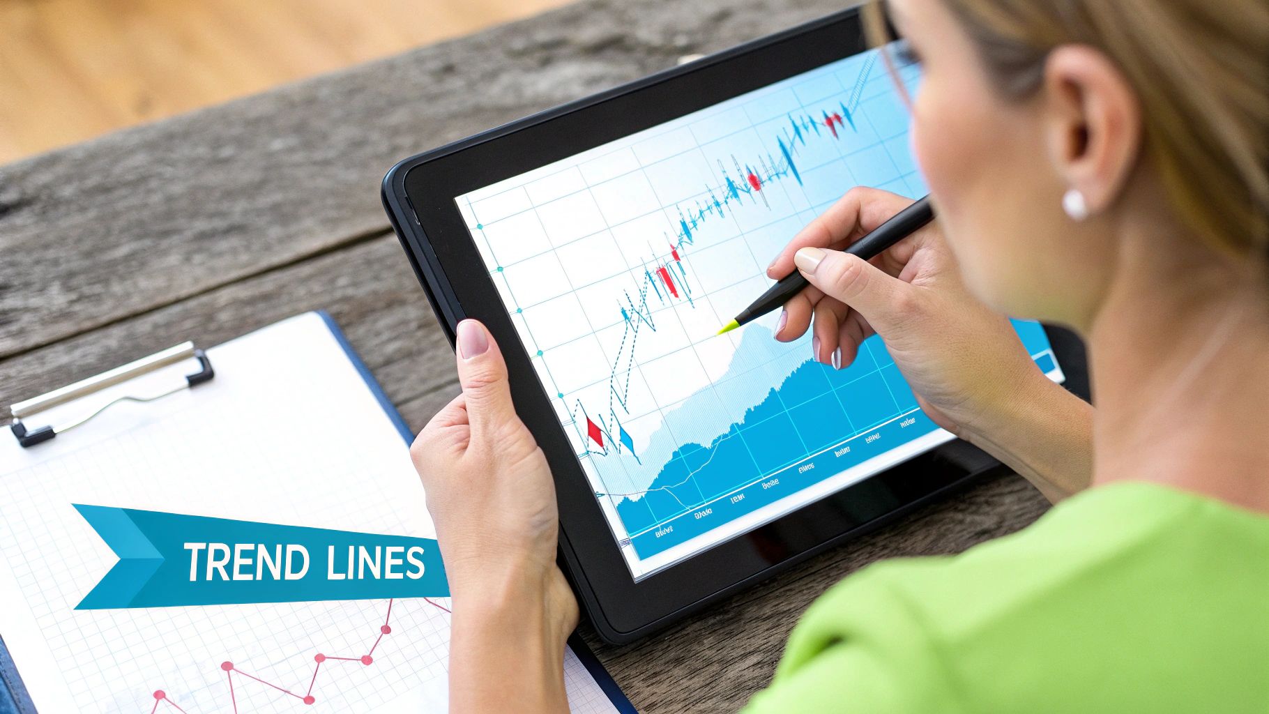
You’ve probably heard the old saying, "the trend is your friend." It’s more than just a catchy phrase; it's the bedrock of technical analysis. The first thing any seasoned trader learns is how to read the overall direction of the market—it’s the foundation for everything else.
Trends reveal who's in control: the buyers or the sellers. Your job is to figure out which way the tide is flowing and swim with it, not against it.
At its core, a stock is always doing one of three things. Pinpointing which one gives you the context you need to make smart decisions.
The easiest way to see these movements is by drawing trendlines right on your chart. For an uptrend, you simply connect two or more of the major lows. For a downtrend, you connect the major highs. That simple line instantly gives you a visual boundary for the current trend.
Trader's Insight: Watch the price like a hawk when it gets near your trendline. If it bounces off, that’s a solid confirmation the trend is still in play. But if it slices right through? That could be your first warning that the trend is about to reverse.
Smart traders always look back to see the bigger picture. Most charting platforms offer decades of data, letting you see how trends have played out through bull markets, bear markets, and everything in between. Looking at these long-term charts is how you start to spot classic reversal patterns like the 'head and shoulders' or a 'double bottom.' You can find historical charts for major indexes going back to the early 1900s and learn more about historical market indexes on StockCharts.com.
Here's a key takeaway: the longer a trendline holds, the more important it becomes. A line that has been tested and respected multiple times is far more significant than one you just drew this morning. When a long-term, established trendline finally breaks, it’s a signal you need to take seriously.
If you want to go deeper, our full guide on how to identify market trends covers more advanced strategies.
If you think of price as the what, then trading volume is the why. It’s the raw conviction behind a move. I like to think of it as the roar of the crowd at a game—a huge cheer confirms a spectacular play, but a golf clap tells you nobody's really buying it.
Volume is simply the number of shares traded over a set period. You'll see it as those vertical bars at the bottom of your chart, usually colored green or red to correspond with the price action. Getting a feel for volume adds a whole new dimension to your analysis.
The single most powerful way to use volume is for confirmation. When you spot a big price move, a quick peek at the volume bars tells you whether that move has real muscle behind it or if it’s just a head fake.
Let's walk through a common scenario. A stock has been trading flat, stuck in a range for weeks. Then, one day, it finally pops, breaking above that stubborn resistance level.
Scenario A: The breakout is accompanied by a massive surge in volume, way above the recent average. This is exactly what you want to see. It screams that big players are piling in with conviction, making the breakout far more likely to stick.
Scenario B: The price squeaks above resistance, but the volume is pathetic—lower than average, even. This is a major red flag. It suggests there's no real buying power behind the move, and the stock could easily get swatted back down into its old range.
This simple concept applies to everything, from chart patterns to candlestick signals. A bullish engulfing candle is interesting, but a bullish engulfing candle on a huge volume spike? Now that gets my attention.
Volume and trade data add crucial context to price action, uncovering what's really happening under the surface. A rising price on rising volume is the sign of a healthy, confirmed trend. But if the price is climbing while volume is drying up, it could signal a weak rally that's about to fizzle out. You can dig into years of US equities data and find more insights about historical market volume on CBOE.com.
Volume is also your best friend for spotting a trend that's running out of steam.
In a healthy uptrend, you should see volume pick up on the moves higher and shrink during the pullbacks. This shows excitement on the way up and a lack of interest in selling on the dips.
But if you start seeing the reverse, it’s time to pay close attention. A stock hitting new highs on progressively weaker volume is a classic warning sign. This "divergence" tells you that fewer and fewer buyers are willing to chase the price higher, making the trend fragile and ripe for a reversal. Learning to spot these subtle clues can be the difference between locking in profits and riding a trend all the way back down.
So, you've got a handle on trendlines and volume, which is a fantastic start. Think of those as the foundation of your analysis. Now, let's add another layer: technical indicators. These aren't magic crystal balls, but they are incredibly useful for getting a "second opinion" on what the price action is telling you.
Indicators are basically just mathematical formulas that crunch historical price and volume data into a visual format. They help cut through the noise and highlight market conditions that you might otherwise miss just by staring at candlestick patterns. I'm going to walk you through a couple of the most reliable indicators that you can start using right away.
One of the first indicators any trader learns is the Moving Average (MA). Its purpose is simple: to smooth out the jagged, day-to-day price movements so you can see the real, underlying trend more clearly. It works by plotting the average closing price over a set period.
If you only add two MAs to your charts, make them these:
Watch how a stock behaves around these lines. In a healthy uptrend, you’ll often see the price pull back and "bounce" right off the 50-day MA, which acts as a moving support level.
While Moving Averages define the trend, the Relative Strength Index (RSI) tells you about the momentum behind it. Is the trend running out of steam or just getting started? The RSI is an oscillator, which means it moves back and forth within a set range, in this case, between 0 and 100.
Its main job is to flag potential overbought and oversold situations.
Think of it this way: An RSI reading above 70 suggests a stock has gotten ahead of itself and might be due for a breather (a pullback). On the flip side, a reading below 30 is considered oversold, hinting that the sellers are getting exhausted and a bounce could be on the horizon.
This isn't just theory. Take a look at how these signals have played out historically.
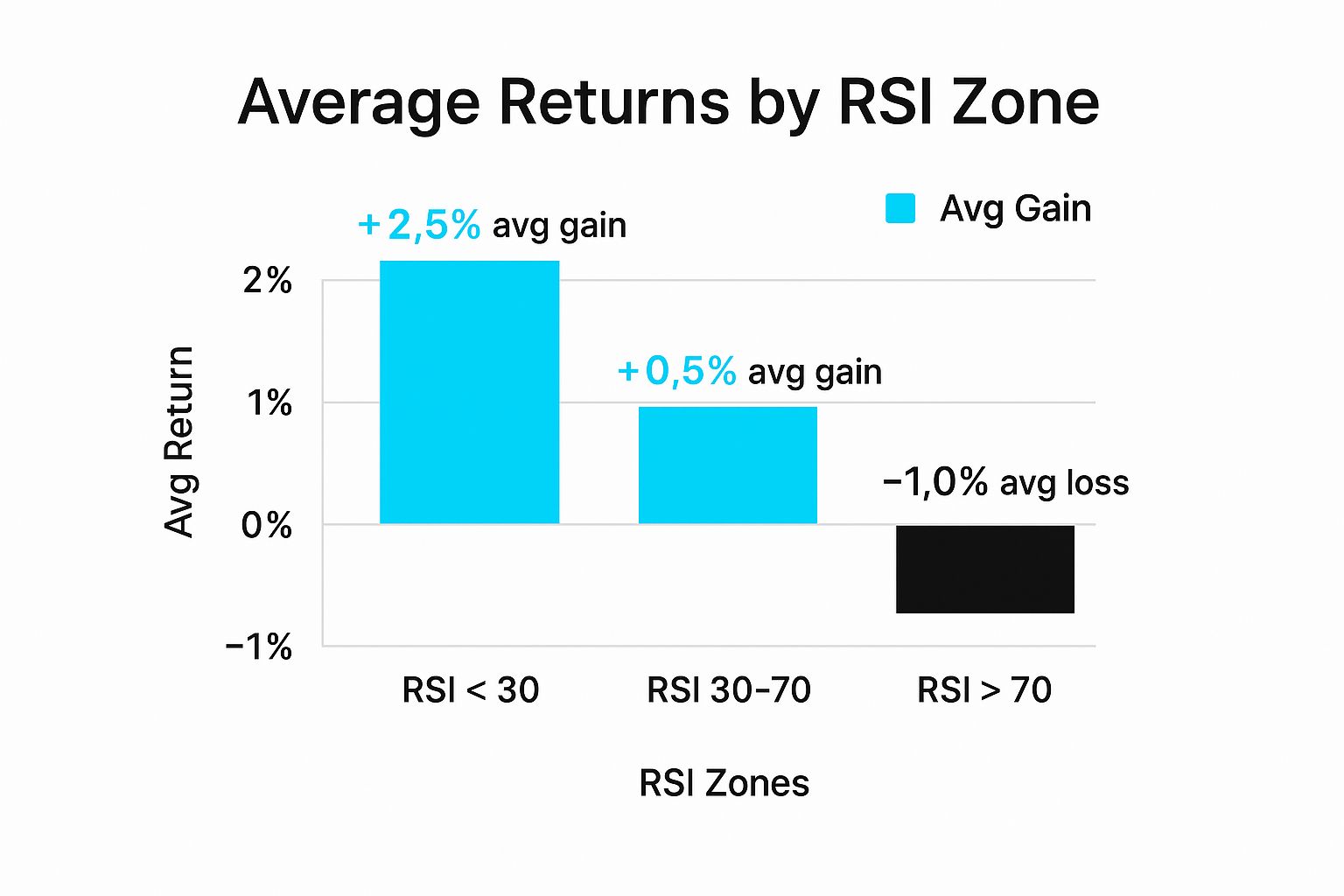
The numbers don't lie. Buying when a stock is oversold (RSI below 30) has historically produced much better returns than chasing a stock that's already flying high in overbought territory.
Moving Averages and the RSI are just the tip of the iceberg. As you get more comfortable, you'll find other indicators that fit your style. Each one offers a different perspective on the market's psychology.
Here’s a quick rundown of some other popular indicators you'll frequently see on platforms like TradingView:
The real power comes from combining these tools. A stock bouncing off its 200-day MA while the RSI is just starting to climb out of oversold territory? That's a much more compelling signal than either event happening alone. Using indicators to confirm what you see is a huge part of learning how to read a stock market chart like a pro.
Alright, let's stop talking theory and look at how this plays out in the real world. Individual signals are one thing, but the real art of chart reading is weaving them together to see the full story a stock is telling you. Let's walk through a setup you might see on any given day.
Imagine we're watching a stock—we'll call it XYZ—that's been in a nasty downtrend for months. It just keeps grinding lower, setting new lows, and staying stubbornly below its 200-day moving average. It’s the kind of chart most people would write off as dead money. But then, something starts to shift.
The first thing you notice is that the selling pressure seems to be drying up. Instead of making a new low, the stock bounces off the same price level it hit a few weeks back. This immediately puts a potential double bottom on your radar.
It's a classic reversal pattern, but it’s just a hint. You're not buying yet. You need more proof that the bulls are actually waking up.
So, you zoom in on the candlesticks forming that second low. And there it is: a big, bullish hammer candle. This is huge. It shows that sellers tried to slam the price down, but buyers stormed in with enough force to push the price all the way back up to close near the day's high. That’s a powerful rejection of lower prices.
My Take: A single indicator or pattern is just noise. The magic happens when you get a "confluence" of signals—a chart pattern, a strong candlestick, and a volume surge all pointing in the same direction. That’s when you have a high-conviction idea.
Now we start looking for confirmation. We pull up the volume bars and see that on the day the hammer formed, trading volume was 50% higher than the recent average. This isn't just a half-hearted bounce; that spike in volume tells you big money is likely getting involved. There's real conviction behind that move.
Finally, you glance at your indicators. The Relative Strength Index (RSI) had been buried in oversold territory (below 30) for a while. Now, it has popped back above that level. But here's the kicker: as the stock price made that equal low to form the double bottom, the RSI actually made a higher low.
That's a textbook bullish divergence, one of the most reliable signals that downside momentum is exhausted.
So, let's piece this narrative together:
Suddenly, you have a complete story. Each piece confirms the others. Now, a trader has a well-supported, logical reason to take a long position. They even have a clear-cut spot for a stop-loss just below the lows of that double bottom.
This is what it means to truly read a chart. You’re not just looking at lines; you’re piecing together a story.
Even after you get the hang of the basics, some questions always pop up. It’s totally normal. Here are a few of the most common ones I hear from new traders, along with some straight-to-the-point answers.
There's no magic answer here. The "best" timeframe is the one that matches your trading style. A long-term investor looking at a 5-minute chart would be completely lost, and a day trader using a weekly chart would miss everything.
The trick is to sync your chart's timeframe with how long you actually plan to be in a trade.
Think of candlestick patterns as clues, not crystal balls. They're all about probabilities, not certainties. When you see a bullish engulfing pattern, it’s a sign that the odds of an upward move have increased—but it's never a guarantee.
The real magic happens when you get confirmation. A pattern’s reliability goes through the roof when other signals point in the same direction.
A bullish pattern is a good start. But a bullish pattern at a major support level, backed by a big spike in volume and a rising RSI? Now you're talking. That's a high-probability setup. Never trade a pattern in a vacuum.
Absolutely not. Thank goodness for modern charting software! While indicators like the RSI or Moving Averages are built on formulas, the platform does all the number-crunching for you.
Your job isn't to be a mathematician; it's to be an interpreter. Reading charts is a visual skill, much like learning a new language. You’re training your eyes to recognize patterns, spot important price levels, and understand what the candlesticks are telling you about the fight between buyers and sellers.
This is a fantastic question, and the answer is... both. It depends on the indicator.
Most of the classic indicators, like Moving Averages, are lagging. They are built using past price data, so they only confirm a trend that's already in motion. A "Golden Cross," for example, doesn't happen until after the price has already been moving up for a while.
A few indicators, however, are considered leading because they try to predict what might happen next. The RSI is a classic example. When it shows an "overbought" condition, it’s hinting that a reversal might be coming. The catch? Leading indicators are notorious for giving false signals.
A good strategy is to use both: lagging indicators to confirm the main trend, and leading indicators to spot potential entry or exit points within that trend.
Ready to stop guessing and start seeing what the market is really doing? The tools from EzAlgo can help you confirm your analysis with AI-driven buy and sell alerts, real-time momentum signals, and automatic support and resistance levels. Eliminate emotional trading and gain a technical edge. Learn more and get instant access at EzAlgo.ai.


%201.svg)