


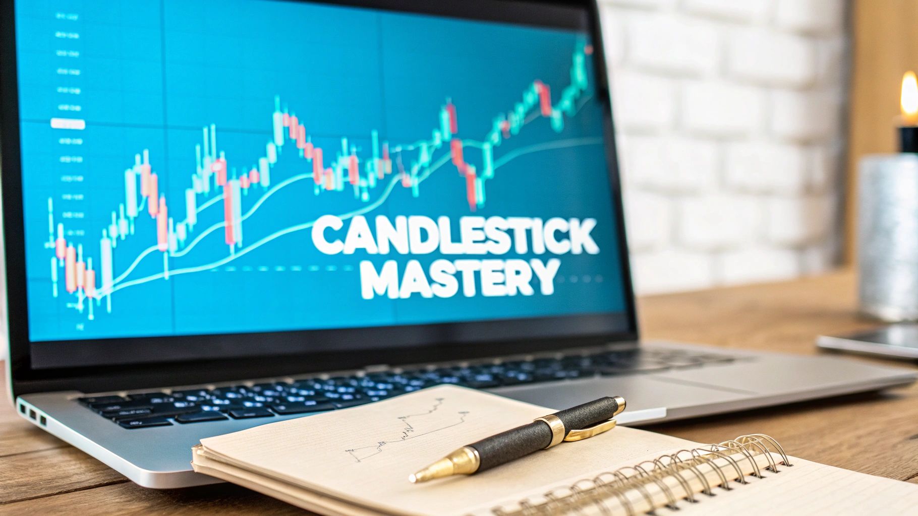
At its heart, understanding candlestick patterns is really about reading the story of a market's price action. Each "candle" you see on a chart is a visual snapshot, showing you the intense tug-of-war between buyers (the bulls) and sellers (the bears) over a specific period.
These patterns, built from just four key price points, are the language of the market. Learning to speak it is fundamental.
Looking at a trading chart without understanding candlesticks is like trying to read a book in a language you don't know. The shapes and colors might be there, but the meaning is lost. Each individual candle is a word, and when they form patterns, they create sentences that reveal the market's mood.
Getting fluent in this visual language is the first real step toward making smarter, more confident trading decisions.
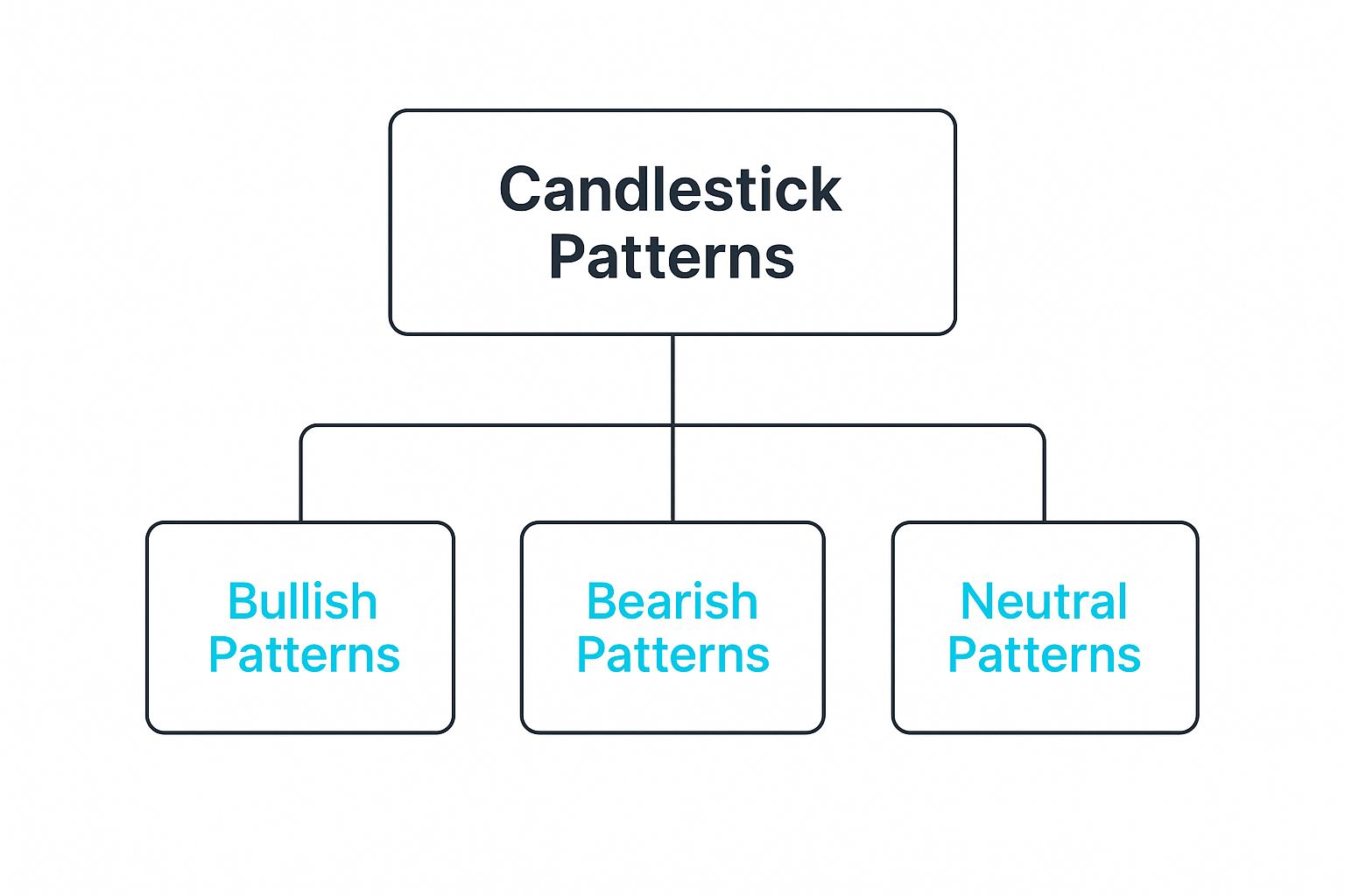
As you can see, every pattern falls into one of three main camps: bullish (signaling a potential rise), bearish (a potential fall), or neutral (signaling indecision).
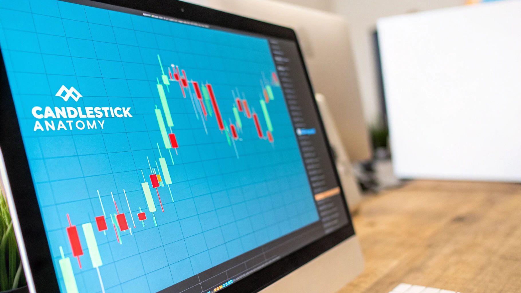
So, what makes up a single candle? Every candlestick is formed from four crucial pieces of information that tell you who won the battle for that session. Let's break it down.
These four points combine to create the candle's color and shape, giving you an instant read on market sentiment. A green candle means the price closed higher than it opened—a clear win for the buyers. A red candle tells you the opposite: sellers took control and pushed the price down.
A long, solid body suggests strong momentum and conviction from one side. In contrast, a small body points to indecision. The wicks are just as important; a long upper wick, for instance, shows that buyers tried to rally but sellers beat them back down before the session closed.
This is the ground floor. Before you can spot complex patterns involving multiple candles, you have to get comfortable reading the simple story told by each individual one. These are the essential building blocks for anyone learning how to read trading charts. Once you master these basics, you'll start seeing the subtle shifts in market psychology playing out right on your screen.
It’s easy to think of candlestick charts as a modern invention, a staple of our digital trading platforms. But their story actually begins centuries ago, not on Wall Street, but in the bustling rice markets of 17th-century Japan.
Back then, merchants needed a smarter way to track price fluctuations. More than that, they needed to see the emotion behind the numbers. They developed a brilliant method to visually map the open, high, low, and close prices for rice, giving them an instant read on market psychology. It was a masterclass in tracking fear and greed long before the term "technical analysis" ever existed.
This powerful technique is widely attributed to one man: a legendary rice trader named Munehisa Homma. He realized that by charting price movements, he could spot recurring patterns that often predicted where the market was headed next.
Homma’s genius was understanding that while supply and demand were key, the emotional tides of the market—the collective hope and panic of other traders—created patterns he could actually trade on.
Munehisa Homma's core insight was revolutionary for its time: the market has a memory. Past price action and the emotions tied to it directly influence future movements. This principle remains the bedrock of understanding candlestick patterns today.
This centuries-old Japanese wisdom hasn't just survived; it has become a cornerstone of modern trading. What Homma once meticulously tracked by hand, we can now see instantly on our screens, from a one-minute chart to a monthly one. The core principles of gauging buyer and seller conviction are identical, but today’s technology has magnified their power.
Now, we're seeing this rich history merge with the future. Recent studies are applying machine learning to historical candlestick data to forecast price direction. One groundbreaking study, which used convolutional neural networks (CNNs) to analyze Japanese candlestick charts, reached a stunning prediction accuracy of up to 99.3%.
This shows how today’s AI can validate and enhance these time-tested patterns with incredible precision. You can dive deeper into these findings by reading about the advanced application of machine learning to candlestick charts.
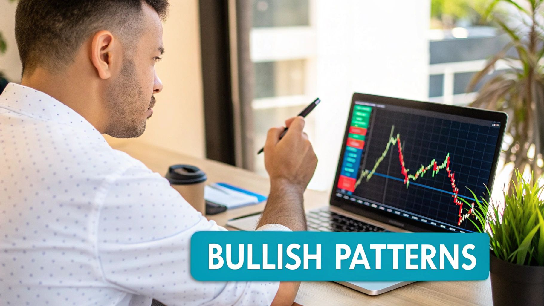
While a single candle gives you a snapshot of one trading session, the real magic happens when you see how they cluster together. Bullish candlestick patterns are specific formations that can signal a power shift in the market, from the bears (sellers) to the bulls (buyers).
Learning to spot these patterns is like recognizing the first signs of spring after a long winter. They provide clues that positive price movement might just be around the corner. These signals are especially potent when they pop up at the end of a downtrend, suggesting that the sellers are finally losing their grip.
Picture this: the market is in a freefall. Sellers have had full control, pushing the price down session after session. Suddenly, a Hammer candle appears. It’s a distinct shape—a small body perched at the top with a long wick dangling below it.
What story is it telling? During the trading period, sellers successfully shoved the price way down, creating that long lower shadow. But then, the buyers staged a comeback. Before the session closed, they charged in, driving the price all the way back up to finish near where it started.
This pattern is a powerful rejection of lower prices. It’s a visual signal that sellers tried to keep the downtrend going, but the buyers stepped in and "hammered" out a bottom, refusing to let the price fall further.
The Bullish Engulfing pattern is a two-candle formation that tells a dramatic story of a market takeover. You'll see a small red (bearish) candle followed immediately by a large green (bullish) one that completely swallows, or "engulfs," the one before it.
It plays out in two acts:
This pattern is a bold statement. It suggests that buyers haven't just shown up—they've arrived with overwhelming force, signaling that a strong reversal could be in the cards.
The Morning Star is a classic three-candle bullish reversal pattern. Think of it as a little three-act play that signals a new dawn for the asset's price.
The Morning Star isn't just a pretty picture; it has a solid track record. Studies on the statistical reliability of these candlestick formations show that the standard Morning Star pattern correctly predicts a bullish reversal about 65% of the time. When the middle candle is a Doji, that success rate climbs to 68%.
Just like a sunny day can show subtle signs of an approaching storm, a chart climbing upward can flash warnings of a potential reversal. For every bullish pattern hinting at a price rise, there’s a bearish counterpart that acts as a crucial red flag for traders. Learning to spot these formations is key to protecting your gains and managing risk.
Bearish patterns signal that sellers are starting to gain the upper hand over buyers. They usually pop up at the peak of an uptrend, serving as an early alert that the market's positive mood might be souring. Catching these signals early gives you time to prepare for a potential momentum shift from up to down.
Picture this: buyers have been pushing an asset's price higher with confidence. They make one last, aggressive push, sending the price soaring during the trading session. This action creates a long upper wick on the candle. But then, their strength gives out.
Before the session closes, sellers rush in with overwhelming force, shoving the price all the way back down. What's left is a small body at the bottom of the candle. This formation is the Shooting Star, and it’s a classic sign of a failed rally. It tells a clear story of buyers losing their final battle right at the top.
It's worth noting, however, that the reliability of a Shooting Star isn't always straightforward. A fascinating study that analyzed six decades of S&P 500 data found that its predictive power changes based on the data you focus on. Using closing prices alone offered little insight, but its accuracy shot up when the analysis focused on the highest price hit during the formation. You can dive into the detailed findings on candlestick reliability to see just how much data selection matters.
The Bearish Engulfing pattern is a dramatic, two-candle formation that screams "power shift." Think of it as a sunny day suddenly being swallowed by a massive storm cloud.
Here's how it plays out:
This pattern is a bold statement from the sellers. They didn't just stop the buyers; they completely overpowered them, wiping out the previous day's gains and then some. It’s one of the clearest signals you can get that a trend reversal could be right around the corner.
If the Morning Star is the sunrise of a new uptrend, the Evening Star is the twilight that precedes the night of a downtrend. This three-candle pattern is a more gradual, but no less powerful, sign of a potential market top. It tells a complete story of a trend's end over three trading sessions.
Together, these three candles paint a vivid picture of a market that has run out of steam. The upward momentum is gone, and the tide is starting to turn. It’s a critical warning that the party might be over.
Jumping into candlestick patterns is a huge step forward for any trader, but it’s easy to fall into a classic trap: treating them like a crystal ball. They're powerful, yes, but they aren't magic. The single biggest mistake I see traders make is getting tunnel vision and forgetting to look at the bigger market picture.
Think about it this way. You might spot a beautiful Hammer pattern, which usually signals a potential bottom. But if that Hammer forms during a massive, high-volume downtrend with no support levels in sight, acting on it is like trying to stop a freight train with a fishing net. Context is everything. A pattern’s signal is only as strong as the market environment it shows up in.
The most dangerous pitfall is forgetting that a single candlestick pattern is just one piece of a much larger puzzle. A pattern by itself is a hint, not a command to trade. To build a solid case for a trade, you absolutely need to get confirmation from other sources.
This is where a complete approach to technical analysis for trading comes into play. Successful traders are masters at combining candlestick signals with other data points to see if their idea holds up.
Here are a few critical factors to always check:
Another mistake is chasing perfection. No candlestick pattern works 100% of the time. Let me say that again: trading is a game of probabilities, not certainties. Your goal isn't to find some mythical, "never-fail" signal. It's to find high-probability setups where the odds are stacked in your favor.
Thinking of candlestick patterns as probabilistic signals rather than deterministic commands is a crucial mindset shift. Each pattern simply increases the chance of a particular outcome; it never guarantees it. Your job is to manage risk around that probability.
Forgetting this simple fact leads to overconfidence after a string of wins and, eventually, a painful loss when a "perfect" setup inevitably fails. The real key is to use these patterns to form a hypothesis, look for confirmation from your other tools, and always know your exit plan if the market proves you wrong.
So, what happens when you combine a centuries-old art form with cutting-edge technology? You get a seriously powerful new way to look at the markets. Manually scanning charts for patterns works, but let's be honest—it’s slow, and it's easy to make mistakes. You might miss a subtle signal or, even worse, talk yourself out of a perfectly good setup.
This is exactly where AI-powered tools are making a huge difference for traders today. Instead of spending hours staring at charts, you can use platforms that automatically scan the entire market in real-time. These systems are designed to spot high-probability candlestick patterns across thousands of different assets in a blink of an eye.
This immediately helps tackle two of the biggest demons in trading: emotional bias and analysis paralysis. The AI doesn’t feel greed or fear. It just executes its programming, identifying patterns and giving you a clean, objective starting point for your own analysis.
The real magic of using AI isn't just about finding patterns faster. It’s about getting much stronger confirmation on your trade ideas. A single candlestick pattern is a great clue, but it’s rarely enough to risk your capital on. This is where an AI-driven tool shines, as it can instantly cross-reference that pattern with a whole host of other critical indicators.
For instance, a platform like EzAlgo might spot a Bullish Engulfing pattern. But it doesn't stop there. It simultaneously checks if other key conditions line up:
When you see multiple, independent indicators all pointing in the same direction as a classic candlestick pattern, your confidence in that trade setup skyrockets. Think of the AI as your tireless analytical partner, a second set of eyes that validates what the candles are telling you with cold, hard data.
This partnership between classic chart reading and intelligent automation gives you a more reliable and efficient way to navigate the markets. It’s not about replacing your skill or judgment. It’s about enhancing it, giving you the ability to make quicker, more informed decisions while still appreciating the timeless stories told by the candlesticks themselves.
Even after you get the hang of the basics, a few practical questions always pop up when you start applying candlestick analysis in the real world. Let's tackle some of the most common ones to help you sharpen your chart-reading skills.
Absolutely, but with a big caveat: never use them in a vacuum. Candlestick patterns get their real power from context. Think of them less as a crystal ball and more as a strong hint about what might happen next.
A bullish pattern becomes far more convincing when other technical factors back it up. For example, imagine a bullish hammer forming right at a major support level that has held strong in the past. If it's also accompanied by a spike in trading volume and the RSI (Relative Strength Index) is climbing out of "oversold" territory, the signal is much stronger.
The more pieces of evidence you can gather to support the story the pattern is telling, the more you can trust its signal.
This is one of the most frequent questions, and the answer is simple: it completely depends on your trading style. Candlesticks show up on every timeframe, whether you're a scalper staring at a one-minute chart or a long-term investor analyzing a weekly one.
That said, there's a golden rule most traders follow: patterns on higher timeframes carry more weight. A Hammer pattern on a daily chart, for instance, represents the sentiment of an entire day's worth of trading. That's a much more significant event than a quick Hammer on a 5-minute chart, which could just be random market noise.
Ready to enhance your candlestick analysis with the power of AI? EzAlgo provides automated buy and sell signals, real-time momentum alerts, and AI-confirmed pattern detection right on your TradingView charts. Eliminate guesswork and trade with data-driven confidence. Get started with EzAlgo today.


%201.svg)