


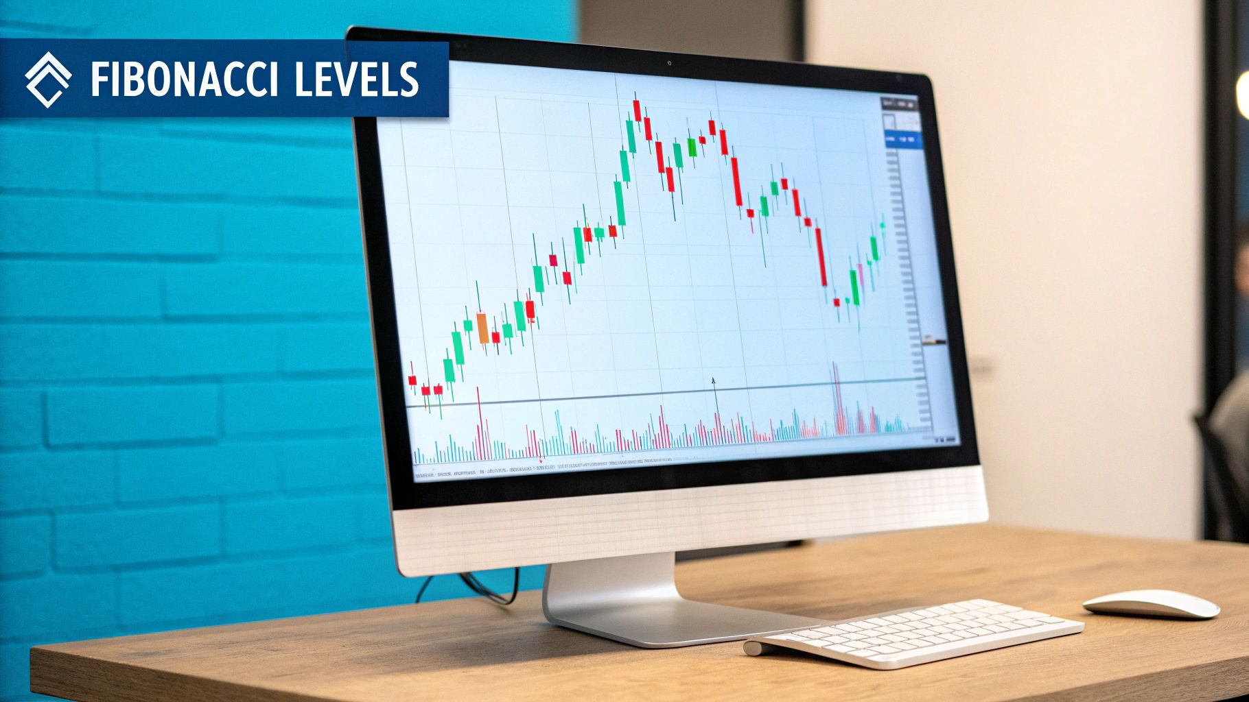
Ever wondered how seasoned traders seem to have a sixth sense for where a stock will pivot? It's not magic. More often than not, they're using Fibonacci retracements to map out potential support and resistance zones. It all starts with finding a significant price swing and letting these key ratios reveal where the market might take a breather before continuing its journey.
At its heart, the Fibonacci tool works because it respects a fundamental market truth: prices almost never travel in a straight line. Even in the strongest bull or bear run, the market needs to "breathe." These pullbacks, or retracements, aren't just random noise; they frequently pause at predictable levels derived from the famous Fibonacci sequence.
This mathematical sequence, which dates back to the 13th century, produces ratios that show up everywhere—from seashells to galaxies and, yes, even in the ebb and flow of financial markets.
So, why do these specific lines on a chart carry so much weight? A huge piece of the puzzle is trader psychology. When millions of traders around the globe are all watching and reacting to the same Fibonacci levels, it becomes a self-fulfilling prophecy.
Think about it: if enough people place buy orders at the 61.8% level, that collective action creates the support they were all expecting. This shared technical belief turns abstract mathematical lines into real-world zones where the market is likely to react. The basic idea is to connect two significant points on a chart—a swing high and a swing low—and the tool plots horizontal lines at key percentage levels. The big ones are 23.6%, 38.2%, 61.8%, and 78.6%. You can get a deeper dive into these ratios and their use from the experts over at RJ O'Brien's futures blog.
To get a better handle on these levels, here’s a quick breakdown of the most common ratios and what they typically signal to a trader.
These levels provide a framework, helping you anticipate where the action might happen instead of just reacting to it.
By learning to draw Fibonacci retracements, you're doing more than just putting lines on a chart. You’re building a roadmap of potential market turning points. This gives you a massive edge in planning your entries, setting smarter stop-losses, and identifying logical profit targets.
This screenshot shows a perfect example of an uptrend. Notice how the Fibonacci tool is anchored at the very bottom of the move (the swing low) and stretched to the highest peak (the swing high). This is the correct way to map out where price might pull back.
The accuracy of your Fibonacci levels all comes down to one thing: picking the right swing high and swing low. I’ve seen countless traders mess this up, and it’s the fastest way to get unreliable levels and make bad decisions. These two points are the anchors for your entire analysis, so they have to be right.
So what are we looking for? A proper swing high is a clear peak on the chart, with lower highs on either side of it. A swing low is the opposite—a distinct valley with higher lows next to it. You need to find the significant turning points that define an entire price leg, not just the little wiggles in between.
How you draw your Fibs depends entirely on the market's direction. It’s a simple rule, but it's absolutely critical for getting levels that actually mean something.
Mixing this up is like reading a map upside down. All the information is technically there, but it won't get you where you need to go. For a deeper dive with more examples, check out our complete guide on how to draw a Fibonacci retracement.
Key Takeaway: The whole point is to measure a retracement of a primary move. Drawing from high to low in an uptrend will show you extension levels, which is a different tool for a different job.
Let's be honest, charts are messy. One of the toughest parts is telling a real, significant price swing from all the random market noise.
Here’s a pro tip: zoom out. A tiny blip on the 5-minute chart might be the major swing low on the 4-hour chart.
Start by identifying the main trend on a higher timeframe, like the daily or weekly. This gives you the big-picture context. Once you know which way the current is flowing, you can zoom into a lower timeframe to nail down your swing points with precision. This multi-timeframe approach ensures you’re anchoring your Fibs to moves that actually matter.
Alright, you've got the theory down on swing points. Now it's time to get our hands dirty and actually draw some Fibonacci retracements on a TradingView chart. Don't worry, this part becomes muscle memory pretty fast.
To get started, look for the drawing tools panel on the left side of your screen. Click the third icon down (it looks like a pitchfork) to open up the menu of Gann and Fibonacci tools. From that list, you'll want to select ‘Fib Retracement’. Once you click it, your cursor will change, letting you know the tool is active.
This image lays out the entire process visually, from picking your points to analyzing the results.
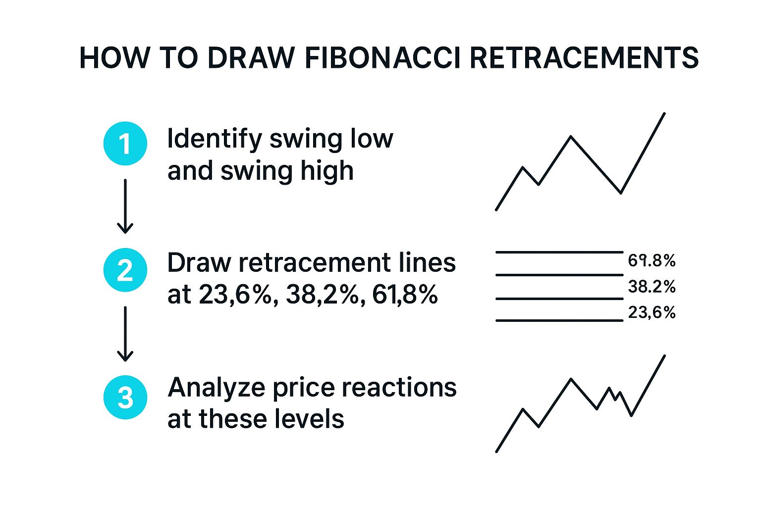
As you can see, it really boils down to three simple actions: find your swing, draw your levels, and watch how the price reacts.
This is where it all comes together. The placement of your tool is everything.
After that first click, just move your cursor over to the other end of the swing—the high in an uptrend or the low in a downtrend—and click a second time.
Instantly, the Fibonacci levels will populate your chart, showing you the most probable areas where price might pull back to find support or resistance.
Pro Tip: Want dead-on accuracy? Hold the Shift key while moving from your first click to your second. This snaps the tool to a perfectly straight horizontal line, making sure you nail the exact candle high or low without any guesswork.
Once your levels are on the chart, they aren't set in stone. Just double-click on any of the Fib lines, and a settings box will pop up.
From here, you can tweak just about anything. Change the colors and line thickness to match your chart's theme, or add and remove specific Fibonacci ratios to focus only on the levels you care about. This little bit of personalization goes a long way in making your analysis clean, quick, and effective.

Once you've got your Fibonacci levels on the chart, you're not just looking at candles anymore. You're looking at a roadmap, a series of potential decision points where the market might pivot. The real art is learning to read what these levels are telling you about the market's strength, weakness, and overall mood.
Every level has its own personality. Think about it: a shallow pullback that just kisses the 23.6% level before roaring back up is screaming strength. It tells you buyers are chomping at the bit and the underlying momentum is huge. You see this all the time in aggressive, fast-moving markets.
But when the price pulls back deeper, it signals a more even fight between buyers and sellers. This is where the most famous levels, the 61.8% and 38.2%, enter the picture. Traders worldwide watch these like a hawk, mostly because they're derived directly from the Golden Ratio. Funnily enough, the 50% level isn't a true Fibonacci number, but it's almost always included because classic Dow Theory pointed out that markets often retrace half of a big move. If you want to dive deeper into the math and history, StockCharts has a great guide on it.
To build a solid trading plan, you need to understand the context behind each zone. Don't think of them as laser-precise lines, but more as areas of interest where you need to watch price action closely.
Your job as a trader is to see how the price reacts at these levels. A swift rejection from the 61.8% on high volume tells a completely different story than a slow, grinding drift through the 38.2%.
The best part is you can tweak these levels in TradingView to fit your own strategy perfectly. Just double-click on any Fib line to pop open the settings menu.
From there, you can change colors to make key zones—like the golden pocket—really stand out. You can also add or remove ratios. For example, I like to add the 78.6% level to my charts to help me spot those really deep pullbacks that can offer great entry points. This kind of personalization turns a generic tool into a dashboard that's built for how you see the market.
Drawing Fibonacci retracement levels gives you a solid map of potential support and resistance, but trading with just one tool can be a recipe for disaster. The real edge comes from finding confluence—when different, unrelated technical indicators all point to the same price level.
This is the key to moving from just drawing lines on a chart to building a truly high-probability trading strategy. Picture this: a stock pulls back and the 61.8% Fibonacci level lines up perfectly with the 200-day moving average. That price zone is no longer just a Fib level; it’s a reinforced support area, confirmed by two completely different analytical methods. An alignment like this gives you a much stronger reason to feel confident in a trade.
Think of confluence as a filter. It helps you weed out the weaker, less reliable signals and focus only on the strongest ones. Instead of taking a trade at every single retracement level, you learn to be patient and wait for the ones that have extra confirmation.
Here are a few classic combinations that many traders swear by:
The goal is to build a compelling case for a trade. When your Fibonacci level, a key moving average, and an RSI divergence all agree, you have a much stronger reason to act.
This isn't just theory; this strategic layering of indicators has been studied. A quantitative study on energy markets, for example, found that trading strategies using Fibonacci retracements consistently outperformed a simple buy-and-hold approach, delivering better risk-adjusted returns. This just goes to show how robust these levels can be in major markets. You can read the full research on its findings.
While retracements are fantastic for pinpointing entries within a trend, you'll also need a plan for taking profits. Our guide on Fibonacci extension levels walks you through how to project potential price targets after you've caught a successful bounce.
Once you get the hang of drawing Fibonacci retracements, a few practical questions almost always come up. Nailing these down will help you trade with more confidence and make sure you're using the tool correctly when it counts.
Let's walk through some of the most common ones I hear from traders.
Honestly, there's no single "best" timeframe. It all boils down to your personal trading style and what you're trying to achieve. The real secret is to stay consistent.
A long-term investor might plot their Fibs on a weekly chart to find major support levels for a position they plan to hold for months. On the other hand, a day trader is going to live on the 15-minute or 1-hour charts, looking for quick intraday pullbacks.
What I find incredibly effective is using a multi-timeframe approach. For example, I'll start by identifying the main trend on the daily chart. Then, I'll drill down to the 4-hour chart to pinpoint a more precise entry at a specific Fibonacci level that lines up with that bigger trend. This way, you're swimming with the current, not against it.
Pretty much, yes. The core ideas work across stocks, forex, crypto, you name it. Why? Because these levels are based on market psychology—the ebb and flow of fear and greed that drives trends, which is universal human behavior.
But here's the catch: they work best in markets that are actually trending. If the price is just chopping around sideways with no clear direction, Fibonacci levels lose their magic. There’s no significant move for the price to "retrace" from, so the levels become random lines on your chart.
The whole point of Fibonacci is to map out potential pullbacks within an existing trend. If there's no trend, the tool has nothing to work with.
First things first, remember that Fibonacci levels are areas of probability, not concrete floors or ceilings. It's completely normal for the price to push through them.
If the price slices cleanly through one level, like the 38.2%, it's often a sign that it’s headed for the next one, such as the 50% or the 61.8%.
A decisive break below the 61.8% "golden ratio" is a major warning sign. This often signals that the original trend is running out of gas. You could be looking at a much deeper correction or even a full-blown trend reversal. This is exactly why you always need a stop-loss in place and never bet the farm on a single level holding.
Tired of manually drawing and redrawing key levels? EzAlgo plots the golden pocket and other critical Fibonacci zones right on your TradingView chart for you, giving you a huge analytical advantage without the manual work. See how our AI-driven tools can sharpen your trading strategy at https://www.ezalgo.ai.


%201.svg)