


Drawing a Fibonacci retracement is all about finding a significant price move and then overlaying a set of specific, predictive ratios onto it. You just need to spot a clear swing low and a swing high on your chart, connect them with the tool, and voilà—you've instantly mapped out potential support or resistance levels where the price might hesitate, bounce, or reverse.
Learning how to draw a fibonacci retracement is one of those core skills every technical trader should have in their back pocket. At its heart, it’s a visual, almost intuitive process. It all starts with you spotting a clear, decisive trend on your chart, whether that’s a strong push up or a sharp drop down. You’re essentially looking for the "story" of a trend, from where it started to where it ran out of steam.
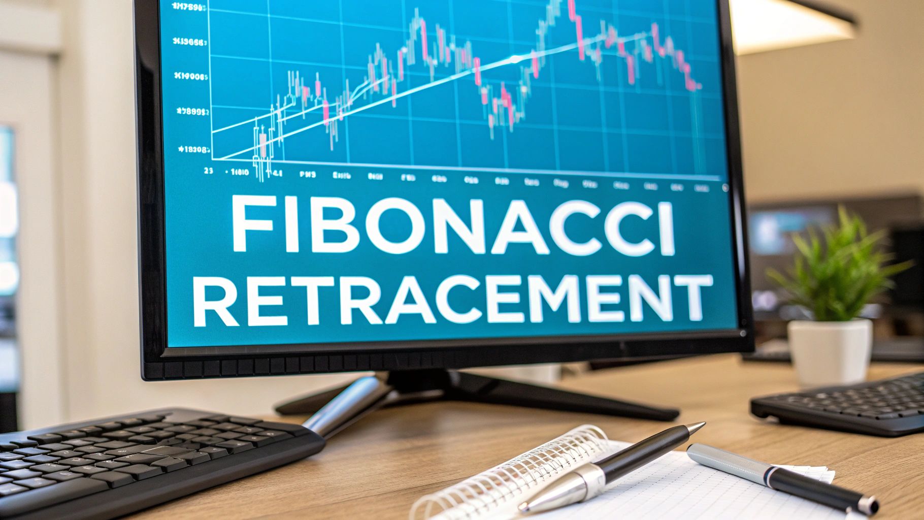
The math behind this comes from the famous Fibonacci sequence, which Leonardo of Pisa introduced to the West way back in his 1202 book, Liber Abaci. The way we use it in trading is by finding a major peak and trough on the chart and measuring the vertical distance between them. That distance is then multiplied by key Fibonacci ratios—23.6%, 38.2%, 61.8%, and so on—which pop up everywhere in nature and, as it turns out, financial markets. If you're curious, you can dive deeper into the mathematical basis of Fibonacci retracements to see how it all connects.
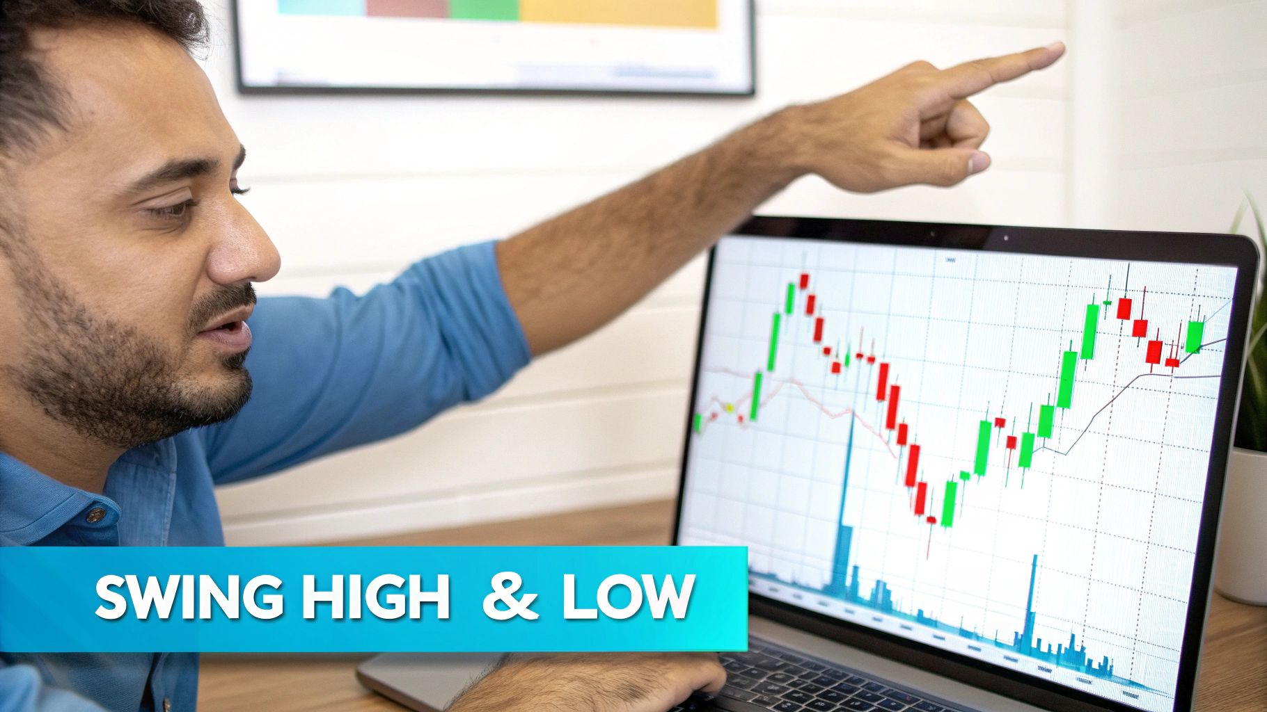
Your entire analysis lives or dies by picking the right start and end points for the trend. In trading lingo, we call these the swing low and the swing high.
For an uptrend: You're looking for the absolute bottom of the move (the swing low) and the very top where it peaked before pulling back (the swing high). You'll draw the tool from that low point up to the high point.
For a downtrend: Flip it. Find the highest peak where the decline began (the swing high) and the lowest point it hit before it tried to recover (the swing low). Here, you draw from the high down to the low.
The trick isn't just to find any low and high. You need the significant ones that truly define the main move you're analyzing. It's crucial to ignore the little, choppy fluctuations inside the bigger trend to get a clean and reliable set of levels.
This image shows a perfect example of an uptrend with the Fibonacci tool drawn from the swing low to the swing high.

See how the price pulled back from the peak? It found temporary support right around the 38.2% and 50% levels before deciding to resume its climb. That’s the tool in action.
Once you connect your two points, your chart will suddenly have several horizontal lines appear at specific percentage levels. These aren't just random lines; they represent the most-watched Fibonacci ratios where traders anticipate a market reaction.
The classic levels you’ll always see are 23.6%, 38.2%, 50%, and 61.8%.
Interestingly, the 50% level isn't an official Fibonacci number, but it's included because markets have a funny habit of reacting at the halfway point of a previous move. The 61.8% level, however, is the big one—often called the "golden ratio"—and is widely considered one of the most critical retracement levels. When the price pulls back into these zones, that's your cue to pay close attention and watch for signs of a bounce or a continuation of the original trend.
To make this crystal clear, here’s a quick-reference table breaking down the essential parts.
Getting these three components right—the high, the low, and the overall trend—is the foundation for using this tool effectively.
The Fibonacci tool is only as good as the points you anchor it to. This is where so many traders go wrong—they latch onto insignificant market noise instead of a real, substantial trend. Learning how to draw a fibonacci retracement is really about training your eye to spot the moves that actually matter.
A proper swing point isn't just any old peak or valley. It's the definitive beginning or end of a strong, directional move. Think of it as finding the exact spot where momentum clearly flipped. Your goal is to capture that entire impulse wave, not the little pullbacks and jitters along the way.
Let's say you're looking at a daily chart in an uptrend. You want to find the lowest low right before the sustained rally took off and the highest high just before a major correction began. It's crucial to ignore the small, one-day dips that occurred during the climb. Those are just minor fluctuations and will give you weak, unreliable levels.
On the other hand, a day trader on a 15-minute chart might be looking for the most powerful move within a single trading session. The principle is exactly the same, but the scale is different. The swing points you choose must always be relevant to the timeframe you're trading.
Trader's Tip: Here's a simple rule of thumb I live by: if you have to squint or second-guess whether a swing is significant, it probably isn't. The best ones are visually obvious.
One of the biggest mistakes I see is traders trying to force a Fibonacci retracement onto a ranging or sideways market. When the price is just chopping back and forth with no clear direction, the tool completely loses its predictive power.
There’s simply no "swing" to measure when a market is consolidating. Trying to draw a Fib grid here will do nothing but clutter your chart with meaningless lines. This tool was built for trending environments, where price is making a clear, determined move from point A to point B.
For a deeper dive into these core concepts, our guide on Fibonacci trading for beginners is a great place to build a solid foundation.
To really nail your accuracy, you need to focus on swings that have strong momentum candles and a clear structure. Here are a few practical tips from my own experience:
Sticking to these principles ensures the levels you generate are based on significant market action. This discipline is what turns a messy, confusing chart into a clean, actionable one. It takes practice, but getting your swing points right will make a world of difference in your analysis.
Alright, let's get down to the practical side of things. Theory is great, but drawing Fibonacci levels on a live chart is where the rubber meets the road. We'll walk through how to do this in TradingView, which is what most of us use for charting. I'll also show you how EzAlgo can help you feel more confident in your analysis.
This quick visual breaks down just how simple it is to get started.

As you can see, it's really just a two-click process: select the tool, click on your starting swing point, drag to the end point, and release. Let’s do it together.
First, you'll need to find the Fib tool itself. In TradingView, look at the drawing panel on the left-hand side of your chart. It's usually the third icon down (it looks like a little pitchfork). Click that, and a menu will pop out. From there, select "Fib Retracement" right at the top.
Now, let's draw it. If you're looking at an uptrend, find a clear swing low and a subsequent swing high. Click once on the body or wick of the swing low, then drag your cursor up to the swing high and click again. That's it. The levels will instantly populate on your chart, showing you potential support zones.
For a downtrend, you just do the opposite. Click the swing high first, drag down to the swing low, and release. Now you have a map of potential resistance levels.
As the price starts to pull back, each of these levels tells a slightly different story. Some suggest a shallow correction, while others signal a much deeper one. It's helpful to know what to look for at each key zone.
Understanding these nuances helps you anticipate how the market might react as it approaches each level, giving you a better feel for the trend's underlying strength.
One of the great things about TradingView is that you can tweak the tool to your liking. Just double-click on any of the Fibonacci lines you just drew, and a settings menu will pop up.
Here’s what you can do:
People always ask, "Do these levels actually work?" Nothing in trading is 100%, but the data is compelling. Studies have shown that strategies built around these levels, such as entering a trade after a bounce off the 61.8% level, can be statistically significant. You can dig into the research yourself to learn more about the statistical reliability of Fibonacci levels in trading.
This is where things get interesting. After you’ve drawn your manual levels, you can use EzAlgo as a second opinion to see if you're on the right track.
Imagine you've drawn your Fib levels on a chart, and you see that the 61.8% level lines up perfectly with a dynamic support level generated by our algorithm. This is called confluence, and it’s a powerful concept in trading. When two independent forms of analysis point to the exact same price zone, the probability of that level holding increases dramatically.
EzAlgo can also help you validate your swing points. If you're not entirely sure you picked the right swing low to start your drawing, seeing an EzAlgo "Buy" signal near that same point gives you an extra layer of confirmation. It tells you that the algorithm also recognized that spot as a meaningful market impulse.
Combining your manual analysis with algorithmic confirmation is a fantastic way to sharpen your edge and trade with more conviction.
So, you’ve learned how to draw a Fibonacci retracement. That’s the easy part. The real skill isn't just drawing lines on a chart; it's about understanding the story the market is telling you as price interacts with those lines. This is where you graduate from a chart artist to a true technical analyst.
Think of each Fibonacci level as a potential battleground between buyers and sellers. When price pulls back to the 38.2% level and then snaps back with a big, confident bullish candle, the market is screaming something at you. It’s a clear signal that buyers are stepping in with force, and the pullback was probably just a quick pit stop before the trend continues.
A shallow pullback that bounces off the 23.6% or 38.2% level usually points to a really strong, healthy trend. The market is in a hurry to keep moving, so it doesn't bother with a deep correction.
On the other hand, if price just slices through the 38.2% and 50% levels like they aren't even there, you know this pullback has some serious momentum behind it. It doesn't automatically mean the trend is dead, but it’s a warning sign that a deeper correction is happening. Now, all eyes turn to the 61.8% level—the famous "golden ratio." For many traders, this is the last line in the sand for the original trend.
This isn't just abstract theory. These levels have proven their worth time and again. One study of the Indian stock market revealed that about 70% of the time, stocks pull back to at least one of these key Fibonacci levels. A perfect real-world example was the massive market drop in March 2020, where the Nifty 50 index found its exact bottom at the 61.8% level before staging an incredible recovery. You can dig deeper into the historical success rate of Fibonacci retracements to see how they perform in different markets.
Here’s a pro tip: never, ever trade a Fibonacci level on its own. The lines give you the where, but candlestick patterns give you the when and the why. Combining the two adds a powerful layer of confirmation to your analysis.
Let’s look at a few classic setups you’ll see all the time:
When you start pairing your Fibonacci levels with what the candlesticks are telling you, you get a much richer understanding of market sentiment. It’s how you learn to spot the difference between a minor pause and a major reversal, turning those static lines into a truly dynamic part of your trading toolkit.
Knowing how to draw a fibonacci retracement is a great first step, but the real skill lies in avoiding the common blunders that can completely derail your analysis. It's easy to get the basics down, but many traders unintentionally sabotage their own charts with a few simple, fixable errors. The goal isn't just to draw lines that look good; it's to build a disciplined, repeatable process.
One of the biggest mistakes I see is trying to force Fibonacci levels onto a messy, non-trending chart. If the price is just chopping sideways with no clear direction, your levels will be practically meaningless. This tool is built to measure a pullback within a trend. No trend, nothing to measure.
Another classic pitfall is picking random highs and lows that don't actually represent a significant market move. If you find yourself squinting and hunting for swing points, they probably aren't strong enough to generate reliable levels. The most powerful swings should be obvious at a glance.
Here’s a debate that comes up all the time: should you draw from candle wicks or bodies? While some traders prefer the "cleaner" look of using the bodies, you're leaving critical price data on the table. Wicks show the absolute highest and lowest prices reached in that period.
Ignoring them means you aren't capturing the full story of the price swing, which can throw your levels off in a big way. For maximum accuracy, always draw from the very tip of the highest wick down to the very tip of the lowest wick (or vice-versa). This ensures your analysis is based on the complete picture.
It's tempting to get tunnel vision and lean entirely on Fibonacci levels to make your trading decisions. This is incredibly risky. A Fib level is just a potential area of interest—it's not a guaranteed green light for a trade. You should always look for confirmation from other indicators, price action patterns, or tools like EzAlgo to validate the setup.
Remember, confluence is key. A single indicator is just a hint; multiple signals pointing to the same conclusion build a high-probability trading case.
Finally, fight the urge to constantly redraw your levels to fit every little price movement. Once you've identified a significant, completed swing, let those levels be. If you're redrawing them all the time, it's a sign you're either analyzing market noise or trying to force a trade that just isn't there.
If you're ready to take these concepts a step further, check out our guide on Fibonacci extensions levels for a deeper perspective on projecting future price targets.
As you get the hang of drawing Fibonacci retracements, a few questions always seem to surface. It's totally normal to get stuck on the small details—they often make the biggest difference in your analysis. Let's tackle some of the most common sticking points so you can draw your levels with a lot more confidence.
Getting these little things right is what separates a sloppy chart from a sharp, professional one. The idea is to build a reliable process you can count on, every single time.
This is probably the most common debate among traders, and the answer is pretty straightforward. For the most accurate reading, you should always draw from the absolute highest point (the very tip of the upper wick) to the absolute lowest point (the tip of the lower wick) of the move you're analyzing.
Why the wicks? Because they show the full story of what price did. They mark the true extremes of buying and selling pressure in that period. If you ignore them, you're leaving out important data and might miss a key level just because your anchor points were a little off.
Some traders argue for using candle bodies to get a "cleaner" look, but that approach often ignores crucial price action. My advice? Stick with the wicks. Pick one method and be consistent with it on every single chart you draw.
The great thing about Fibonacci is that it's a fractal tool. That's just a fancy way of saying the principle works on any timeframe, whether you're looking at a 1-minute chart or a weekly one.
That said, the levels tend to be much more reliable on higher timeframes like the 4-hour, daily, or weekly charts.
There are a few solid reasons for this:
A good workflow is to draw your main Fibonacci levels on a higher timeframe to get the big picture. Once you've identified those key zones, you can zoom into a lower timeframe to pinpoint your entry.
This is a fantastic question because it gets right to the heart of trend invalidation. If the price moves back more than 100% of the original swing, the trend you were measuring is officially broken.
Let's walk through an example. Say you're in an uptrend and you draw your Fib levels from a swing low up to a new swing high. If the price then pulls back and drops below that original swing low (your starting point), that uptrend has failed.
This is a huge signal that the market may be reversing completely. Your original Fibonacci drawing is now invalid for that retracement, and it's time to take it off your chart. The market is telling you that the old story is over and a new one is about to begin.
Ready to stop guessing and start trading with algorithmic precision? EzAlgo provides automated Fibonacci levels, real-time buy/sell signals, and the confirmation you need to trade with confidence. Elevate your analysis by visiting https://www.ezalgo.ai and see what you've been missing.


%201.svg)