


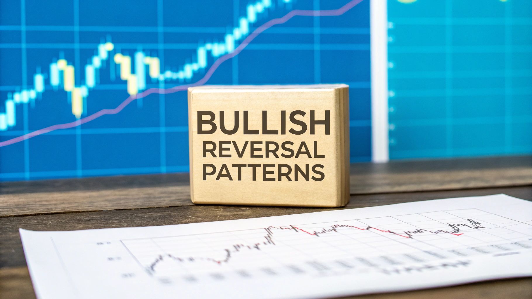
Bullish reversal patterns are specific formations on a price chart that hint at the end of a downtrend and the start of a fresh uptrend. Think of them as the first signs of spring after a long winter—a clear signal that selling pressure is fading and buyers are starting to step in.
Picture yourself watching the tide at the beach. After hours of the water pulling away from the shore (the downtrend), there's a quiet pause before it starts to creep back in (the uptrend). Bullish reversal patterns are the market's version of that turning tide.
These aren't just random squiggles on a chart. They tell a story about the shifting balance of power between sellers (bears) and buyers (bulls).
After a downtrend has been running its course, sellers eventually get tired. Prices drop to a point where they either aren't willing to sell anymore, or buyers see a bargain and start scooping up positions. This back-and-forth struggle creates unique shapes that traders have learned to recognize. These patterns tell us that the bearish momentum is fizzling out and a bullish move could be next.
At their heart, these patterns offer a window into market psychology. When you learn to spot them, you can start anticipating market shifts instead of just reacting to them.
Here's what they signal:
By learning to spot these formations, you're essentially learning to read the collective mind of the market. It’s about seeing the story behind the price action—the point where fear gives way to optimism.
In this guide, we'll dive into some of the most dependable bullish reversal patterns. Each one has its own distinct look and confirmation signals, but they all serve the same purpose: to help you spot the end of a downtrend.
If you want to understand how reversals fit into the bigger picture, check out our complete guide on trading reversal patterns.
To get you started, let’s look at the key patterns we’ll cover. The table below gives you a quick summary of what each pattern looks like and what it signals to a trader on the hunt for an opportunity.
This table summarizes the most common bullish reversal patterns, their key characteristics, and what they signal to traders.
Having this cheat sheet handy will make it much easier to recognize these powerful signals as we break them down one by one.
If you want to get good at spotting bullish reversal patterns, you need to see more than just lines and candles on a screen. You have to understand the human story playing out behind the price action. At its core, the market is a battlefield between buyers (the bulls) and sellers (the bears).
A downtrend isn't just a line pointing down; it's a story of fear. Sellers are firmly in charge, pushing the price lower and lower as pessimism takes hold. But here's the thing: that downward pressure can't last forever. Eventually, the bears run out of steam, and the last of the panic-sellers have finally thrown in the towel.
This moment is what traders call seller exhaustion or capitulation. It’s the point of maximum pain, where it feels like the asset is in a freefall with no end in sight. But ironically, this is often the very moment the tide begins to turn.
Just as the selling pressure dries up, a new group of traders steps onto the field: the smart-money buyers. They don’t see the plummeting prices as a crisis; they see a bargain. This is when they start scooping up assets from the worn-out sellers, a process known as accumulation.
This quiet, steady buying builds a support level, almost like a floor, preventing the price from dropping any further. The patterns we call bullish reversals are really just the visual footprints of this power struggle—and the eventual win for the bulls.
When you learn to spot these patterns, you’re basically reading the market's emotional diary. You're pinpointing the exact moment that widespread fear starts turning into calculated optimism. That’s a massive edge.
Once you grasp this psychological tug-of-war, you'll never look at a chart the same way again. You’re no longer just seeing shapes; you're reading the story.
So, how do you confirm this story is actually happening? One of the best clues is trading volume. Think of volume as the gas in a car's tank. A reversal pattern that forms on low volume might sputter a bit, but it’s probably not going anywhere meaningful.
Here’s how volume helps you read the room:
That surge in volume is your green light. It’s confirmation that a flood of committed buyers is stepping in, providing the horsepower needed to drive the price up. It signals the accumulation phase is likely over and a new uptrend is beginning.
When you combine the visual pattern with the confirmation from volume, your trading confidence goes through the roof. You're not just blindly following a pattern; you're aligning yourself with a real shift in market sentiment, from fear to hope.
When you're scanning the charts for signs that a downtrend is running out of steam, the Inverse Head and Shoulders is one of the most trusted signals you can find. It’s a classic for a reason. Think of it as the market's way of telling a story: sellers make one last, desperate push, but the buyers are finally stepping in with enough force to turn the tide.

This pattern shows up after a stock or asset has been falling for a while. It’s made up of three distinct dips, with the middle one being the deepest. The whole thing looks like a person standing on their head, which is where it gets its quirky name. To trade it well, you first need to understand its moving parts.
The Inverse Head and Shoulders is built from three core pieces that, together, paint a clear picture of the power shifting from sellers to buyers. Each part tells a specific chapter of the reversal story.
The Left Shoulder: After a steady downtrend, the price hits a low and bounces back. This first dip and recovery form the left shoulder. It’s the first hint that selling pressure might be letting up.
The Head: The sellers give it another go, pushing the price to an even lower low than the left shoulder. But this time, buyers rush in and push the price right back up to where the last rally fizzled out. This deep trough is the head.
The Right Shoulder: Now the sellers try one more time, but they’re clearly losing steam. They can't even push the price down to the low of the head. This third, shallower dip is the right shoulder, and it’s a huge red flag for anyone still shorting the asset.
Seeing this progression is key. The failure of the sellers to make a new low on the right shoulder shows that the bears are exhausted and the bulls are starting to take charge.
Once you have the three troughs, you can connect the high points of the two rallies in between them. That line you just drew is the neckline, and it’s the most important part of this whole setup. It’s the line in the sand—the resistance level that has been holding the price down.
The breakout above the neckline is the confirmation you've been waiting for. It’s the green light signaling the reversal is on and the bulls are now in control. Entering a trade before this happens is just guessing.
A solid, confident close above the neckline is the signal. This is where most traders jump in, because what was once a ceiling is now likely to become the new floor (support).
Imagine a rocket on the launchpad. It looks ready, but without fuel, it's just a fancy lawn ornament. In trading, volume is that fuel. A real Inverse Head and Shoulders pattern needs a big burst of volume to prove it’s the real deal.
Here’s what to watch for:
This pattern is well-respected because it works. The Inverse Head and Shoulders is widely recognized as a major bullish reversal signal with a success rate often cited above 80% when that volume surge is present. It has a long history in forex and commodity markets of calling major bottoms after long slides. For a deeper dive into its track record, you can explore more insights on this key bullish reversal pattern at Chartswatcher.
So, you’ve spotted the pattern and seen the volume confirmation. What now? It’s time to plan the trade.
Out of all the bullish reversal patterns you'll encounter, the Double Bottom is one of the clearest and most dependable. Traders often call it the 'W' pattern because, well, it looks like a "W" on the chart. Think of it as the market telling a story: it hits a solid floor, refuses to go lower, and starts coiling up for a big move higher.
It’s like a fighter getting knocked down, getting back up, taking another hit, but refusing to stay down. That’s a powerful sign of strength, and it’s exactly what this pattern shows.
The pattern takes shape after a solid downtrend. The price drops to a low, bounces, and then falls right back to test that same low again. Sellers try twice to push the price down, and they fail both times. This double failure is a huge clue that the bears are running out of steam and the bulls are digging in their heels.
To really get the Double Bottom, you need to know its parts. Each piece of the puzzle is crucial for confirming that a real reversal is underway.
Look, not every 'W' shape you see is a true Double Bottom. To avoid getting faked out, experienced traders look for a few specific details that add weight to the pattern.
Time is a big one. A 'W' that forms too quickly might just be random noise. You want to see a decent amount of time between the two bottoms—several weeks or even a few months on a daily chart gives the pattern more credibility. It shows that support level has been tested and has held firm over time.
Volume is the other key piece of the puzzle. You'll typically see higher volume as the price forms the first low, and then lighter volume on the way to the second. What you really want to see is a big surge in volume when the price breaks out above the neckline. That’s your sign that a flood of buyers is jumping in with conviction.
The infographic below shows how two other common reversal patterns, the Hammer and the Bullish Engulfing, perform. It's a good reminder of how different patterns have their own unique strengths.
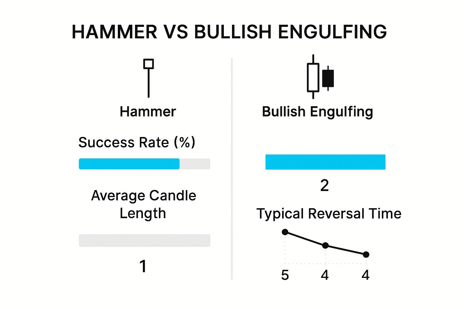
As you can see, a powerful buying candle like the Bullish Engulfing often has a higher success rate, which just goes to show how important strong buying pressure is for a reversal.
This pattern isn't just popular because it's easy to spot; it's backed by some serious historical data. Across global markets, the Double Bottom bullish reversal pattern has shown a success rate of about 78.55%.
One massive study, which looked at over 200,000 patterns for a decade, found that once a Double Bottom confirms with a breakout, it hits its target price roughly 79% of the time. This is why traders around the world rely on this pattern to catch major market turning points. For a deeper dive into the stats, you can discover more insights about price action patterns on samuraitradingacademy.com.
The Double Bottom is a testament to a market that has found its footing. When sellers can't break a support level on two separate, determined attempts, it’s a powerful message that the path of least resistance has shifted from down to up.
Trading this pattern well comes down to patience. You have to wait for that confirmed breakout above the peak. Once you get it, a smart move is to set your stop-loss just below the two lows to protect your downside. To figure out a profit target, just measure the height from the lows to the neckline and project that distance up from the breakout point. It’s a disciplined way to trade one of the most reliable patterns in technical analysis.

Big picture patterns like the Double Bottom can take weeks or even months to play out. But if you want the earliest hint that a trend might be turning, you need to zoom in on the candlesticks.
Think of these individual candle patterns as the market’s body language. They show the immediate, real-time struggle between buyers and sellers. By learning to read these subtle cues, you can spot a reversal right as it’s starting to form.
Let's dive into three of the most reliable bullish candlestick signals: the Hammer, the Bullish Engulfing, and the Morning Star. Each one tells a unique story about bears losing their grip and bulls starting to take charge.
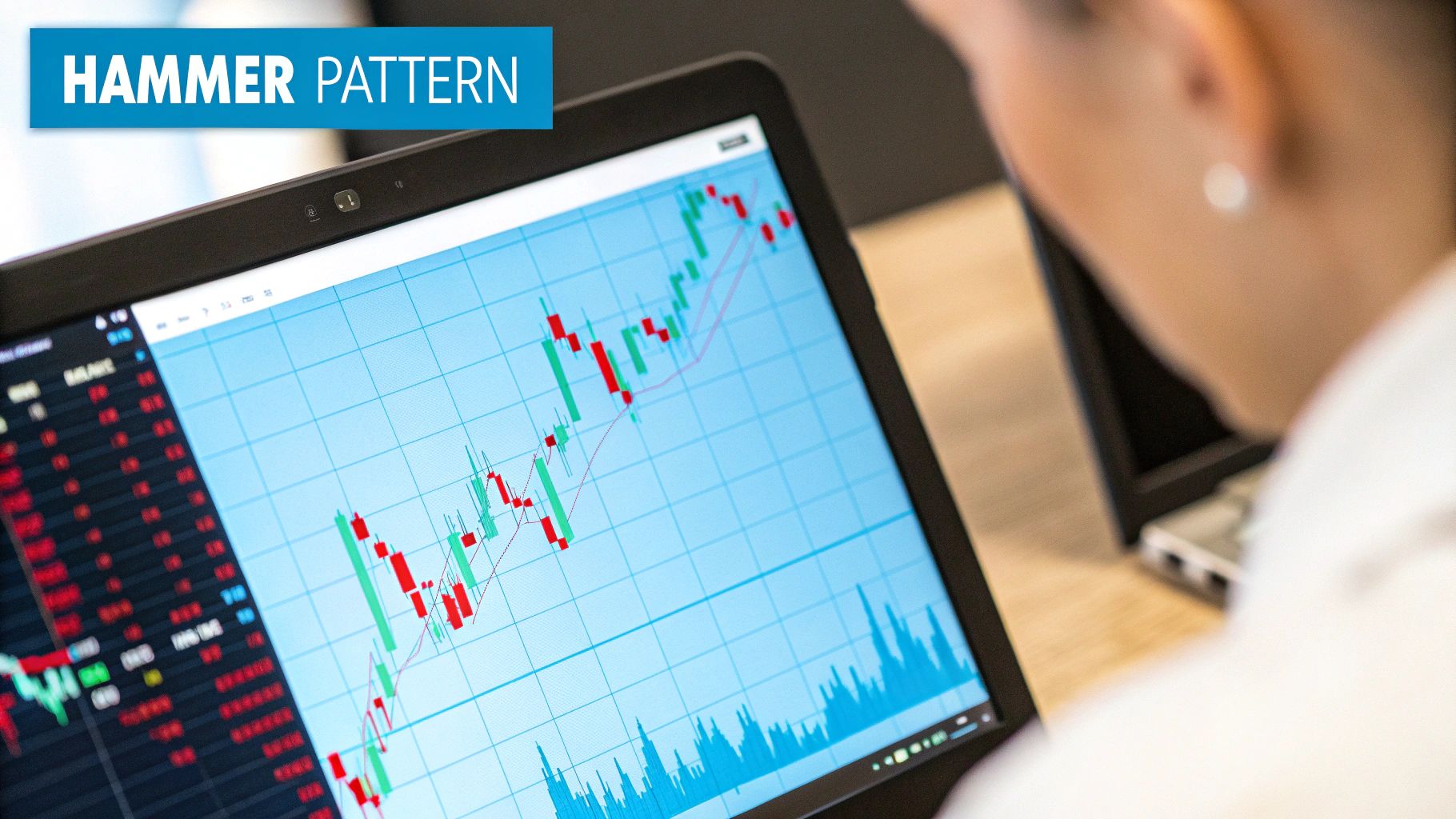
Just like its name suggests, the Hammer is a single-candle pattern that looks like, well, a hammer. It’s defined by a small body near the top of the candle and a long lower wick that’s at least twice the size of the body.
This pattern tells a very specific story. Imagine the market is in a downtrend. The session opens, and sellers immediately push the price way down. But just when it looks like another victory for the bears, buyers jump in aggressively. They drive the price all the way back up to close near where it opened.
That long lower wick is the key—it represents a failed attempt by sellers to push the market lower. It’s like the market is literally "hammering out a bottom" and building a new level of support.
The Bullish Engulfing is a two-candle pattern that signals a dramatic and sudden change in market sentiment. First, you see a small red (bearish) candle as the downtrend continues. But the very next candle is a massive green (bullish) one that completely "engulfs" the body of the previous red candle.
This isn't just a sign that the selling has stopped. It's a powerful statement that buyers have completely overwhelmed the sellers in a single trading session.
This pattern is especially meaningful after a long sell-off. The small red candle hints that the bears are running out of steam, and the huge green candle that follows is the confirmation that buyers have taken control with real conviction. For a deeper dive into these concepts, our guide on understanding candlestick patterns is a great place to start.
The Morning Star is a three-candle pattern that signals a more gradual, but often just as reliable, reversal. It shows up at the bottom of a downtrend and plays out in three steps:
The Morning Star tells a story of hope returning to a beaten-down market. The initial bearish momentum fades into uncertainty, which is then wiped out by a wave of buying pressure. It signals the potential dawn of a new uptrend.
And don't just take my word for it—the data backs this up. Backtesting done on the U.S. market from the 1990s into the 2010s showed some impressive results. For instance, the Three Outside Up pattern, a stronger version of the Bullish Engulfing, had an incredible 78% win ratio over 112 trades. Another pattern, the Bullish Harami, had a 76% win ratio across 306 trades, proving the statistical edge these signals offer.
Knowing what a bullish reversal pattern looks like is a great first step, but just spotting one on a chart is only half the battle. So many traders stumble over the same common, avoidable mistakes that can turn a beautiful setup into a painful loss. Learning to sidestep these traps is what separates traders who last from those who don't.
By far, the most common error is jumping the gun. You see what looks like an Inverse Head and Shoulders taking shape and rush into a long position before the price actually breaks the neckline. That’s not trading; it’s gambling. The pattern isn't real until it's confirmed.
Another classic mistake is getting so fixated on the pattern's shape that you forget to check the volume. A breakout on weak, pathetic volume is often just a "false breakout"—a trap waiting to spring. Think of it like a rocket engine sputtering to life without enough fuel to actually lift off. It’s a lot of noise that ultimately goes nowhere.
Patience is a trader's superpower, but it's often in short supply. The fear of missing out (FOMO) is a powerful and destructive emotion that has emptied countless trading accounts.
Many traders make the mistake of treating a pattern as a guarantee instead of what it is: a high-probability setup. Here's how to stay out of that trap:
A pattern without confirmation is just a pretty shape on your screen. A pattern with a confirmed breakout and heavy volume is a signal you can actually trade. Confirmation is the market's green light.
Even the most textbook-perfect reversal patterns can fail. The market does what it wants, and the sooner you accept that, the better. Trading without a stop-loss is like driving without a seatbelt—it feels fine until it suddenly isn't.
Failing to manage risk properly also means mistaking a simple pause in a downtrend for an actual reversal. Sometimes, a stock will just chop sideways for a bit to catch its breath before heading lower. This is exactly why waiting for a clean break of resistance is a rule you can't afford to break.
Here are two simple rules to tattoo on your brain:
By avoiding these common blunders—acting too soon, ignoring volume, and being lazy with risk management—you put the odds firmly back in your corner. This is the disciplined approach that separates consistently profitable traders from the crowd.
Even after you've got the patterns down, real-world trading always throws up some new questions. Let's tackle a few of the most common ones that pop up when you start putting these bullish reversal patterns to work.
Look, no chart pattern is a crystal ball. But some, like the Inverse Head and Shoulders or the Double Bottom, have earned a solid reputation for a reason. They paint a clear picture of a market's slow, deliberate shift from a seller's game to a buyer's market.
Their real power, though, comes with confirmation. A sudden spike in trading volume as the price breaks out? That's a huge vote of confidence in the pattern. In fact, studies show that when you get that kind of confirmation, success rates can climb as high as 75-80%.
The timeframe you're watching completely changes the story. Spotting a Double Bottom on a weekly chart is a big deal—it hints at a major trend change that could play out over months, or even years. It's a signal that the entire market mood is shifting.
Find that same pattern on a 5-minute chart, and you're probably just looking at a small bounce that might fizzle out in a few hours.
As a rule of thumb, patterns on higher timeframes (like daily or weekly charts) carry more weight. They're built from the decisions of more traders over a longer period, making them far more reliable and often leading to bigger moves.
That's a rookie move, and a risky one. The best traders I know always look for confluence—that's when several different, unrelated signals all point to the same conclusion. Think of a bullish reversal pattern as a strong piece of evidence, but you want to build a whole case before you risk your capital.
For instance, a Hammer candlestick appearing randomly doesn't mean much. But a Hammer that forms right on top of a major support level, just as the RSI indicator shows the market is oversold? Now that's a high-probability setup. The more evidence you can stack in your favor, the stronger your trade.
Stop trading on maybes. EzAlgo gives you AI-powered buy and sell signals, real-time momentum alerts, and dynamic support levels right on your TradingView charts. See how our tools can help confirm your analysis and give you a serious technical edge.


%201.svg)