


In the world of trading, a trend reversal indicator is your early warning system. Think of it as a tool that helps you spot when a strong market trend is running out of steam and might be about to flip. By looking at things like price momentum, these indicators signal a potential shift from an uptrend to a downtrend, or the other way around. This is absolutely critical for timing your entries and exits.
Imagine you're sailing. The sky is clear, and the wind is at your back. But then, an experienced sailor notices a subtle change in the wind's direction and the color of the clouds on the horizon. They know a storm might be coming and can adjust course long before it hits.
That's exactly what trend reversal indicators do for a trader. They help you see those subtle shifts in market momentum before the trend completely reverses.
Instead of just reacting after a big price drop has already wiped out your gains, these tools let you anticipate what's coming. By getting a read on the market's underlying strength, you can protect your capital and spot fantastic opportunities to open or close a trade.
To really get the most out of these tools, you have to know the two main types you'll be working with. It's a bit like the difference between a forecast and a news report.
The TradingView chart below shows how traders look at price action alongside an indicator. They’re searching for clues in how the two relate to each other.
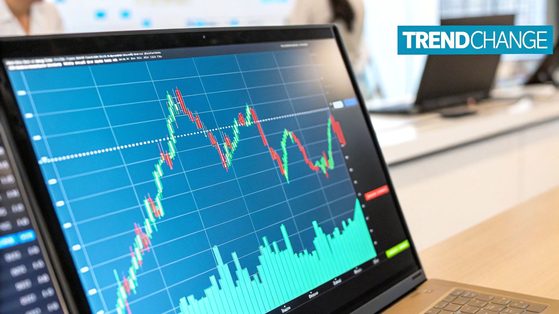
It’s in this relationship—between what the price is doing and what the indicator is telling you—that you'll find hints about a trend's health.
At the end of the day, using trend reversal indicators is all about shifting your mindset from being reactive to proactive. They aren't a magic crystal ball, but they give you a statistical edge.
By learning to read the signals, you stop guessing and start making informed decisions based on when a trend is showing clear signs of exhaustion. This is a cornerstone skill for any solid trading strategy.
While shiny new tools are always popping up, some of the most dependable trend reversal indicators are the classics. These are the trusted workhorses that have guided traders for decades, and they work by measuring one simple thing: momentum.
Think of momentum like a car driving up a steep hill. At the start, it rockets forward. But as it nears the crest, it starts to lose steam, even though it's still technically climbing. Classic indicators like the MACD and RSI are built to spot that slowdown, giving you a critical heads-up that the "hill" might be about to end.
The Moving Average Convergence Divergence, or MACD, is a staple for a reason. It shows you the relationship between two moving averages of an asset's price, making it a fantastic tool for tracking momentum. But for spotting reversals, its real strength isn't just watching lines cross.
The most powerful signal the MACD gives us is divergence. This is what happens when the price of an asset is heading one way, but the MACD indicator is starting to move in the opposite direction.
Divergence is such a potent early warning because it reveals a weakness (or strength) that you simply can't see by looking at the price alone. It’s a foundational concept for catching reversals before they really take hold.
Key Insight: Think of MACD divergence as a powerful non-confirmation signal. When the price and the indicator disagree, it’s often wise to trust the indicator—it’s showing you the underlying momentum that actually drives the price.
Next up is the Relative Strength Index (RSI), another momentum oscillator that measures the speed and force of price changes. Most traders know it for flagging overbought and oversold conditions.
Traditionally, an RSI reading above 70 is seen as overbought, suggesting the asset might be due for a pullback. A reading below 30 is considered oversold, hinting that a bounce might be coming. But just like with the MACD, the real magic for spotting trend reversals lies in divergence.
In fact, RSI divergence can give you an even earlier signal than standard overbought or oversold readings.
Here’s the thing: no single indicator is a crystal ball. Relying on just one can lead to a lot of false signals, especially when the market is choppy and unpredictable. A much smarter, more robust approach is to look for confluence—where multiple, different indicators all point to the same conclusion.
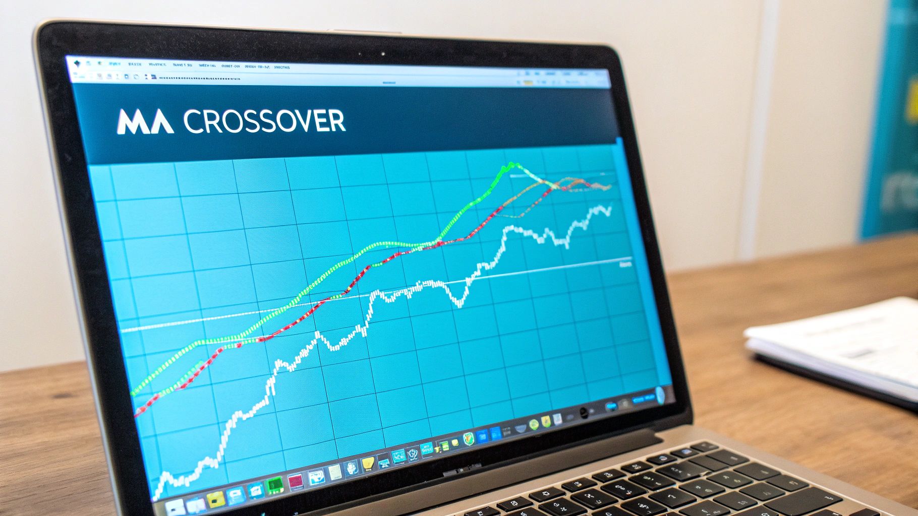
This is where you can bring in other classic signals, like moving average crossovers. By layering a momentum divergence signal from the MACD or RSI on top of a "golden cross" or "dead cross," you build a much stronger case for a reversal. This helps you nail your timing for both entries and exits.
Imagine you spot bearish MACD divergence. Instead of jumping in right away, you wait. A few candles later, you also see bearish RSI divergence, and the price gets firmly rejected at a key resistance level. Now you have three distinct signals all screaming the same thing. That's a high-probability setup. By waiting for that confirmation, you filter out the market noise and dramatically increase your odds of a successful trade.
Finding the right combination of tools is crucial, which is why we've put together a detailed guide. To discover more about building a complete trading system, check out our guide on the best entry and exit indicators.
While most traders are familiar with classic momentum indicators like RSI or MACD, which measure the speed of price changes, there’s another, more quantitative way to look for trend reversals. Think of statistical indicators as the market's in-house data scientist. They don't just look at momentum; they analyze how far a trend has stretched compared to its own history.
The core idea is refreshingly simple: every trend, no matter how strong, eventually runs out of gas. Statistical indicators use hard data—like standard deviation and probability—to figure out when a trend has reached an extreme point where a reversal becomes not just possible, but probable. This moves your analysis away from gut feelings and into the world of data-driven decisions.
This approach gives you a much more objective way to spot when a trend is exhausted, providing the confidence you need to act right when the market is most likely to pivot.
These tools are built around a concept you might remember from a high school math class: the normal distribution, or the "bell curve." Most of the time, the market's behavior—like how long a trend lasts—clusters around an average. It's normal. But when a trend pushes far beyond that average, it enters a zone where it becomes a statistical outlier, making it much harder for the trend to continue.
One of the newer statistical trend reversal indicators has shown it can predict these turning points with up to 99% probability. By focusing purely on trend duration and standard deviation, it offers a remarkably clear framework for spotting market tops and bottoms. In some cases, traders using it have reported win rates as high as 92%. You can see this advanced statistical tool in action to get a better feel for how it works.
This is where visual aids like histograms come in handy. By showing you how long the current trend has run compared to all the trends that came before it, these indicators give you an instant visual read on just how stretched the market has become.
Unlike an oscillator that gives you a vague "overbought" or "oversold" signal, statistical indicators are much more direct. They use clear probability lines to tell you when a trend is on its last legs.
Picture a histogram on your chart. The green bars show uptrends, and the red bars show downtrends. The taller the bar gets, the longer that trend has been active and the more statistically unusual it is. The real magic, though, comes from the horizontal lines drawn across the indicator. These lines aren't random; they represent key probability thresholds based on standard deviations.
Many of these tools also include a small table showing the real-time percentages, so you get both a quick visual and a hard number. It effectively turns the art of trend analysis into a science.
The biggest advantage of using a statistical indicator is that it strips emotion and guesswork out of the equation. You're no longer just feeling like a trend is overextended; you have a tool telling you there's a 98% statistical probability that it's about to reverse. That kind of clarity is a game-changer.
Let's say you're watching a powerful uptrend. At the same time, you see the statistical indicator’s bar push past the 98% line. Suddenly, you have a compelling, data-backed reason to start looking for a place to sell or to take profit on your long position.
This gives you a signal that isn't tied to price momentum, which can be a fantastic way to confirm what other tools, like a MACD or RSI divergence, might already be hinting at. By adding this quantitative layer to your strategy, you can filter out the market noise and focus on the highest-probability setups. It's an edge that can make all the difference between catching a major turning point and getting trapped in a fakeout.
Let's be honest—there's no magic crystal ball in trading. The real secret to success isn't finding one perfect indicator that nails every market move. Instead, the smartest strategies are built on confluence, which is just a fancy word for that powerful moment when several different indicators all start telling you the same story. This layered approach is your best filter against market noise, giving you the confidence to act.
Think of yourself as a detective building a case. You wouldn't go to court with just one blurry photo, right? You’d want fingerprints, witness statements, and a clear motive. When all that evidence lines up, the case is solid. In trading, using multiple trend reversal indicators works the exact same way.
Each tool gives you a unique peek into the market’s behavior. By combining them, you can build a much richer, more complete picture and seriously stack the odds in your favor.
Let's see how this plays out with a real-world example. Picture a stock that’s been on a tear for weeks, hitting new highs day after day. The temptation to jump in and ride the wave is huge. But a trader using a multi-indicator strategy holds back and sees something else entirely.
First, they spot a classic sign of weakness: bearish MACD divergence. Even as the price inches up to a new high, the MACD histogram is making a lower high. This is the first clue. It’s the market whispering that the momentum driving this train is starting to run out of steam.
But a single clue isn't enough to make a move. It's a warning, not a "sell now" signal. So, our trader looks for a second, totally independent confirmation.
Key Takeaway: Confluence is all about getting different, unrelated tools to agree. When a momentum indicator, a volume tool, and a statistical model all point to a reversal, you've got a high-conviction setup that’s way more reliable than any single signal.
Next, the trader pulls up a more modern statistical indicator, like the one we've been talking about. This tool couldn't care less about momentum the way the MACD does. It’s a cold, hard numbers cruncher focused on trend duration and probability.
Just as the price hits that new high, the statistical indicator’s histogram pushes deep into the 98% probability zone. This is the second, and critical, piece of evidence. It tells our trader that this uptrend has become a statistical freak—it has stretched so far beyond its normal behavior that a reversal is now highly probable.
Now we have two powerful, yet fundamentally different, indicators pointing to the exact same conclusion.
This confluence creates a high-conviction setup. The combination gives the trader the green light to start looking for a short entry, knowing that the probabilities have finally swung in their favor.
The chart below breaks down how three classic oscillator indicators—the RSI, MACD, and Stochastic—each signal overbought or oversold conditions in their own unique way.
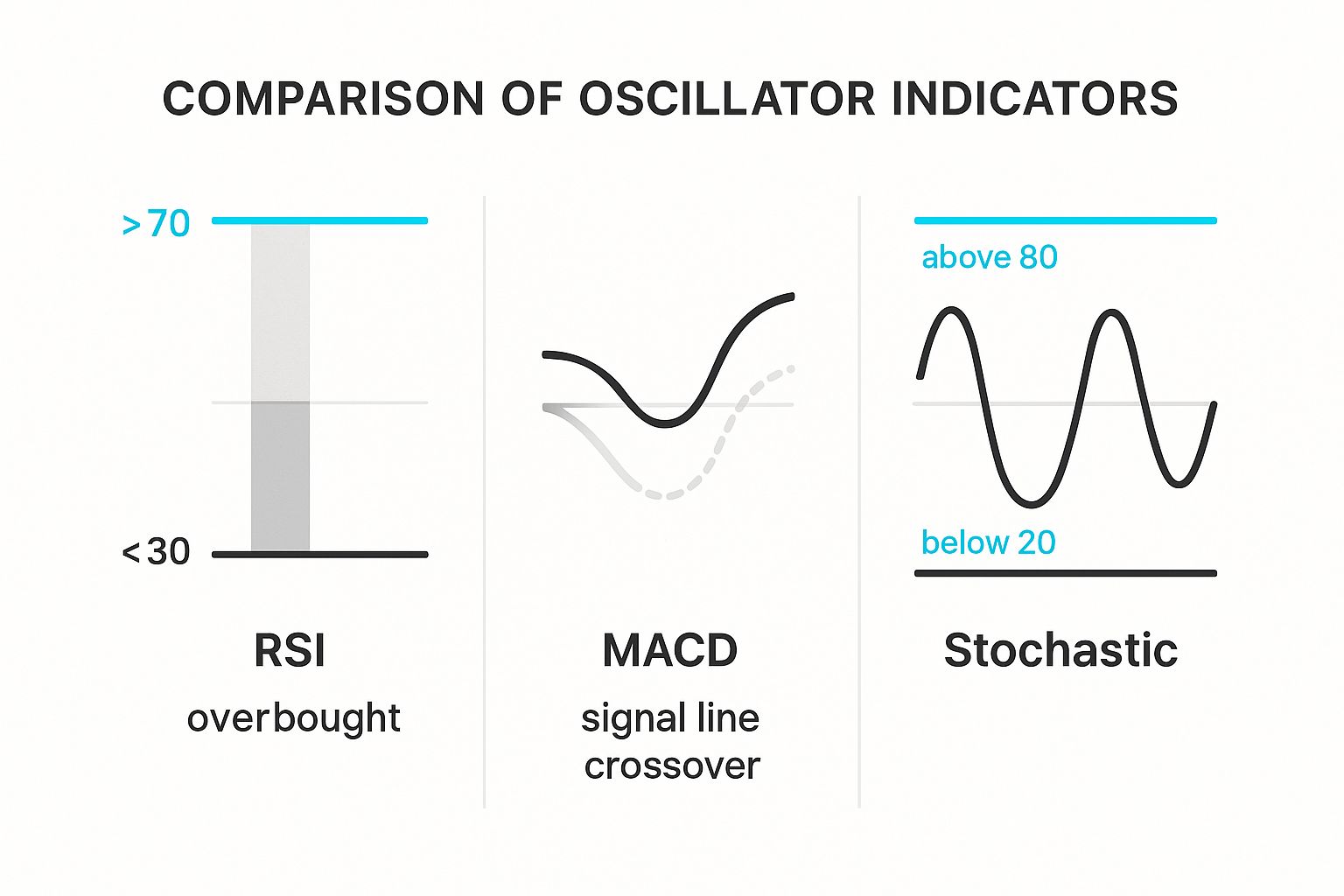
As you can see, each one offers a slightly different piece of the puzzle. Combining their signals gives you a much clearer picture than relying on just one.
To build a really effective multi-indicator strategy, you need to understand how different tools work together. It’s pointless to combine two indicators that measure the exact same thing—that’s not confirmation, it’s just an echo. The goal is to get validation from different analytical perspectives.
The table below contrasts classic momentum tools with modern statistical ones to show how they can complement each other perfectly.
By pairing a momentum indicator with a statistical one, you get the best of both worlds. The MACD might give you a hunch that a trend is losing steam, and the statistical tool can come in and confirm that the trend has truly reached a point of exhaustion. This two-pronged approach is the foundation of a much smarter and more robust way to spot high-probability reversals.
Alright, theory is one thing, but putting it into practice is where the rubber meets the road. Let's walk through a real-world scenario for spotting and trading a trend reversal using a few key trend reversal indicators. We’ll start with a market in a clear uptrend and break down the exact clues that tell us things might be about to flip.
This isn't about guesswork; it's about building a solid case for a trade. By following these steps, you’ll see how to methodically piece together the evidence for a reversal.
The very first thing you need to do is spot an early warning that the current trend is running out of steam. One of the most classic and reliable ways to do this is by looking for divergence on a momentum indicator like the Relative Strength Index (RSI).
Imagine the price is climbing, making a fresh new high on your chart. To the naked eye, everything looks great. But then you glance down at your RSI and see something different—it's actually making a lower high. That’s a textbook bearish divergence.
Bearish Divergence Explained: When price makes a new high but the RSI doesn't follow suit, it’s a big hint that the momentum driving the uptrend is fading. Think of it like a car still rolling uphill, but you can hear the engine sputtering. This disconnect between price and momentum is your first major clue that a reversal could be on the horizon.
This divergence doesn't mean you should slam the sell button just yet. It's simply the first piece of the puzzle—a critical red flag telling you to start paying very close attention.
One signal is just a hint; two signals are a real pattern. To build your confidence, the next step is to get confirmation from a completely different kind of indicator. This is where the magic of combining tools really shines.
After you spot that bearish RSI divergence, you'd then check your statistical trend indicator. If this tool shows the uptrend has been pushed into the 98% or 99% probability zone, you now have a second, independent signal screaming that the trend is exhausted.
This confirmation is what separates a hunch from a high-probability setup. You now have two distinct pieces of evidence pointing to the same conclusion:
When two unrelated indicators tell you the same story, the odds of a successful trade swing much further in your favor.
With your warning and confirmation signals lined up, it's time to find a smart entry. A reversal isn't truly confirmed until the price breaks a key piece of market structure. For a bearish reversal, that means breaking below a significant support level.
Wait for the price to pull back and, more importantly, close decisively below a recent swing low or a well-established support zone. This breakdown is your trigger. It’s the market showing you that sellers have finally wrestled control from the buyers. Entering after this break is a much safer play than trying to perfectly time the top.
Patience is everything here. If you jump the gun before that support breaks, you can easily get caught in a fakeout where the price just dips for a moment before ripping higher again. By understanding how to properly identify these zones, you can execute with far greater precision. To really nail this skill, check out our deep dive on a support and resistance trading strategy for a full breakdown of mapping and trading these levels.
No trade is complete without a game plan for getting out. Once you're in the trade, there are two final actions that are completely non-negotiable: setting your stop-loss and defining your profit target.
By clearly defining your exits before you even enter, you take the emotion out of the equation. This structured approach to using trend reversal indicators is what turns trading from a gamble into a calculated, strategic business.
As you start working with trend reversal indicators, you're bound to have some questions. It’s totally normal. These are powerful tools, but they definitely have their own quirks and best practices. Getting solid answers to the most common questions is how you build real confidence and sidestep the simple mistakes that catch a lot of traders off guard.
Let's dive into some of the questions I hear all the time. The goal here is to give you honest advice, ground your expectations in reality, and show you how to make these tools a smart part of your trading plan.
This is the big one, the question everyone asks first. And the honest answer is: there isn't one. The whole idea of a single "best" indicator is a myth in trading. Every tool, whether it's the classic RSI or a more advanced statistical indicator, gives you a different lens through which to view the market.
Think of it like a mechanic's toolbox. A mechanic wouldn't argue that a wrench is "better" than a screwdriver. They're built for different jobs, and you need both to fix an engine.
The real key isn't finding one magic indicator; it's about learning how a few complementary tools work together to tell a more complete story.
This brings us right to the next point. While it’s smart to get confirmation from more than one source, it’s also really easy to go overboard. Piling five or six different indicators onto your chart, especially if they all measure momentum, doesn't actually give you more clarity. It just creates noise and confusion.
This is a classic trap called analysis paralysis. When you have too many conflicting signals flashing at you, you freeze up and can't pull the trigger on a trade.
As a rule of thumb, stick to two to three indicators that don't just tell you the same thing. You want tools that are non-correlated. For example, you could pair a momentum indicator like the RSI with a statistical tool that measures trend exhaustion. Now you have two genuinely different viewpoints, which gives you a much stronger, more reliable signal.
In a word, no. It's so important to get this straight right from the beginning. Trend reversal indicators are not crystal balls, and they will not pinpoint the exact penny where a market will top or bottom out. If you try to use them that way, you're just setting yourself up for a lot of frustration.
So what do they do? Their real job is to identify high-probability reversal zones.
These indicators are designed to tell you when the conditions are becoming ripe for a turn. They flash a warning sign that says, "Hey, this trend is losing steam," or "This move is getting statistically stretched." This is your cue to pay closer attention, watch for price to confirm the turn, and manage your risk. It’s about spotting the area where a reversal is likely, not nailing the exact price.
Ready to stop guessing and start making data-driven decisions? The EzAlgo indicator suite provides clear buy and sell signals, real-time divergence alerts, and statistical probability tools right on your TradingView chart. Discover how you can trade with more confidence and precision by visiting the official EzAlgo website.


%201.svg)