


Navigating the financial markets without a clear strategy is like sailing without a compass. Every trader, from beginners to seasoned pros, grapples with the same fundamental questions: when is the right time to enter a trade, and when is the most opportune moment to exit? The answer often lies in mastering technical analysis, specifically by using the best entry and exit indicators. These tools are not crystal balls, but they provide a systematic, data-driven framework for making informed decisions, helping you filter out market noise and focus on high-probability setups.
This guide cuts straight to the chase. We will break down a curated list of the most effective and widely used trading indicators. For each one, you’ll learn exactly what it is, how it functions, and most importantly, how to interpret its signals for precise entries and exits. We’ll explore their unique strengths, acknowledge their potential weaknesses, and provide actionable tips for integrating them into your trading system, particularly with tools like EzAlgo to enhance their power. Whether you trade crypto, forex, or stocks, mastering these indicators is a critical step toward building a consistent, disciplined approach to capturing profits and managing risk. Let's dive in.
The Relative Strength Index, or RSI, is a staple momentum oscillator developed by J. Welles Wilder Jr. in 1978. It measures the speed and magnitude of recent price changes to evaluate overbought or oversold conditions in an asset. The indicator calculates this on a scale of 0 to 100, making it one of the best entry and exit indicators for identifying potential turning points in the market.
Traditionally, an RSI reading above 70 suggests an asset is overbought and may be due for a price correction, signaling a potential exit or short entry. Conversely, a reading below 30 indicates an oversold condition, presenting a potential buying opportunity.
While the 70/30 levels are standard, relying on them blindly is a common pitfall. The true power of RSI lies in its nuances. For example, during the strong uptrend of Bitcoin in 2017, the RSI remained above 70 for extended periods; shorting based on this alone would have led to significant losses.
A more advanced technique is identifying RSI divergence. This occurs when the price makes a new high or low, but the RSI fails to do the same, signaling weakening momentum. In March 2020, Apple (AAPL) stock price hit a lower low, but its RSI made a higher low, signaling a bullish divergence right before a major price recovery.
The Moving Average Convergence Divergence (MACD) is a versatile, trend-following momentum indicator created by Gerald Appel in the late 1970s. It reveals the relationship between two exponential moving averages (EMAs) of an asset's price, making it one of the best entry and exit indicators for gauging trend strength, direction, and momentum. The indicator consists of the MACD line, the signal line, and a histogram representing the difference between the two.
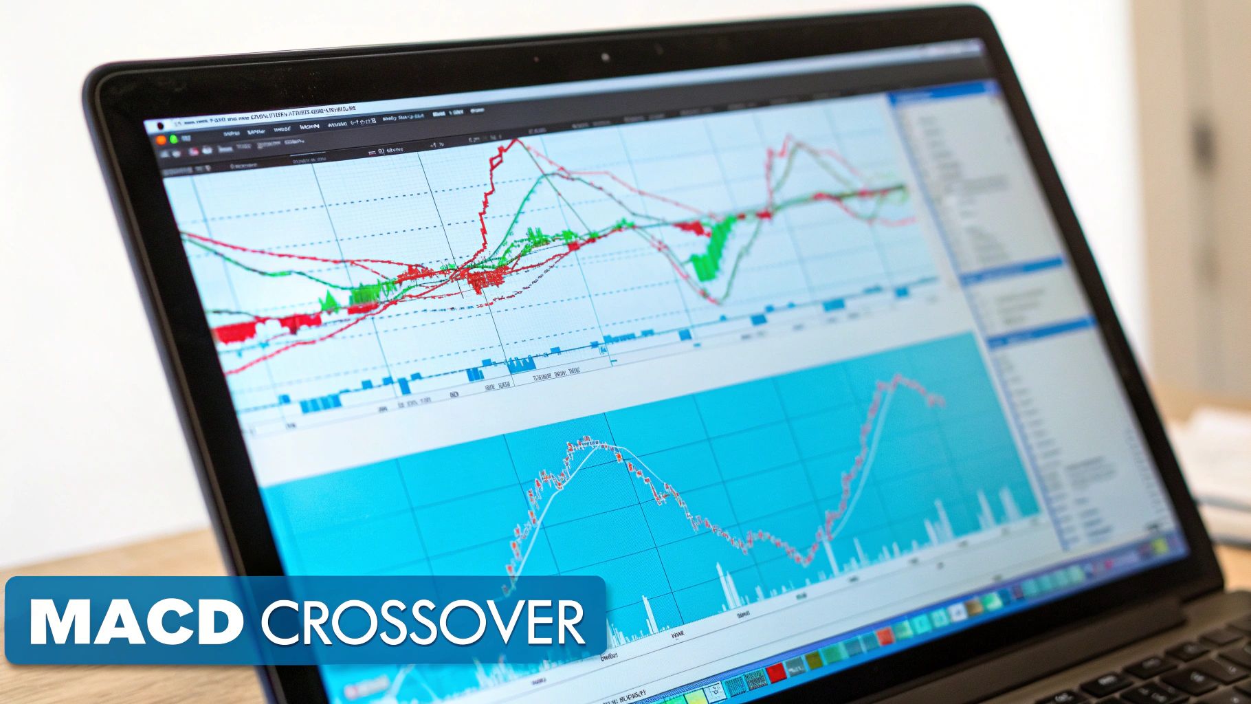
A primary buy signal occurs when the faster MACD line crosses above the slower signal line, suggesting upward momentum is building. Conversely, a sell signal is generated when the MACD line crosses below the signal line, indicating a potential shift to downward momentum. The histogram visually amplifies these shifts, growing larger as momentum increases and shrinking as it wanes.
Basic crossovers are a starting point, but the real power of the MACD lies in combining its components. For example, Tesla (TSLA) stock showed a clear bullish MACD crossover in November 2019. Traders who recognized this signal ahead of its massive 2020 rally were positioned for substantial gains. The histogram's behavior is also crucial; its compression toward the zero line often precedes major breakouts or breakdowns in assets like the S&P 500.
Another advanced strategy is identifying MACD divergence, similar to RSI. In August 2020, gold futures hit a new price high, but the MACD line formed a lower high. This bearish divergence signaled weakening upward momentum right before a significant price correction, offering a timely exit or short entry signal.
Developed by John Bollinger in the 1980s, Bollinger Bands are a volatility-based indicator that has become a cornerstone of technical analysis. They consist of a middle band, typically a 20-period simple moving average (SMA), and two outer bands set two standard deviations above and below it. These bands dynamically expand during high volatility and contract during periods of low volatility, making them one of the best entry and exit indicators for visualizing market conditions.
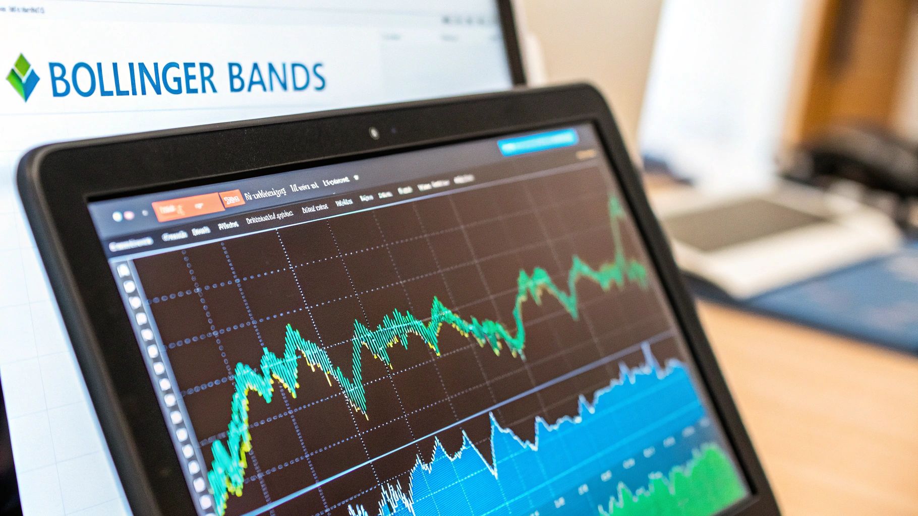
The primary function of Bollinger Bands is to measure relative price highs and lows. When the price touches the upper band, it may be considered overbought, signaling a potential exit or short entry. Conversely, when the price touches the lower band, it may be oversold, presenting a potential buying opportunity.
Simply buying at the lower band and selling at the upper band is a common mistake, especially in strong trends. The real value comes from interpreting the bands' behavior. For instance, the Bollinger Band Squeeze, where the bands narrow significantly, often precedes a major price breakout. Netflix (NFLX) stock displayed a classic squeeze in early 2020 just before its massive COVID-driven breakout.
Another powerful concept is the Band Walk. During a strong uptrend, the price can "walk" or consistently hug the upper band without reverting to the mean. Amazon (AMZN) demonstrated this phenomenon throughout its 2017-2018 uptrend, where selling at the first touch of the upper band would have been a costly error.
The Stochastic Oscillator is a popular momentum indicator developed by George Lane in the 1950s. It operates on the principle that an asset's closing price tends to trade near the high end of its recent price range during an uptrend and near the low end during a downtrend. This indicator compares a security's closing price to its price range over a specific period, making it one of the best entry and exit indicators for identifying momentum shifts.
The oscillator generates two lines, %K and %D, on a scale of 0 to 100. Readings above 80 signal that an asset is potentially overbought, while readings below 20 suggest it may be oversold. The interaction and position of these lines provide traders with clear signals for potential market reversals.
The classic overbought/oversold signals are useful, but their real strength is revealed in specific market conditions. For example, during range-bound trading in the USD/CAD currency pair, the 80 and 20 levels often act as reliable reversal points. However, relying solely on these levels in a strong trend can be misleading.
A more powerful application is identifying stochastic divergence. This occurs when the price action moves in one direction, but the stochastic indicator moves in the opposite direction. For instance, in March 2020, Alphabet (GOOGL) stock formed a lower low while the Stochastic Oscillator created a higher low, signaling a bullish divergence just before the price began a significant recovery.
The Volume Weighted Average Price, or VWAP, is a trading benchmark used by institutions and day traders to determine the average price a security has traded at throughout the day, based on both price and volume. Unlike a simple moving average, VWAP gives more weight to price points with higher trading volume, making it a powerful tool for gauging market sentiment and fair value during a single trading session. This emphasis on volume makes it one of the best entry and exit indicators for intraday analysis.
As a general rule, a price below VWAP is considered "cheap" or undervalued for the day, presenting a potential buying opportunity. A price above VWAP is considered "expensive" or overvalued, signaling a potential exit or short entry. The VWAP line often acts as a dynamic level of support or resistance.
Simply buying below VWAP and selling above it is not a complete strategy. The real insight comes from observing how the price interacts with the VWAP line. For instance, institutional algorithms are often programmed to execute large orders around the VWAP to minimize market impact. This is why you'll often see the SPY ETF bounce off or get rejected by its VWAP during high-volume sessions.
A more advanced application is using VWAP as a trend-confirmation tool. In a strong uptrend, pullbacks to the VWAP line often represent prime buying opportunities before the next leg up. Similarly, in a downtrend, rallies back to the VWAP can be ideal short-entry points. The price’s reaction at the VWAP level provides crucial information about the strength of the underlying trend.
The Parabolic SAR (Stop and Reverse), another creation of J. Welles Wilder Jr., is a dynamic trend-following indicator designed to identify potential trend reversals. It appears on a chart as a series of dots placed either above or below the price. This visual simplicity makes it one of the best entry and exit indicators for traders who want clear, at-a-glance signals for managing their positions.
When the dots are plotted below the price bars, it signals an uptrend, suggesting a potential buy or hold. Conversely, when the dots flip and appear above the price, it indicates a downtrend and a potential sell signal or exit point. The indicator's acceleration feature makes the dots move closer to the price as the trend matures, acting as a built-in trailing stop-loss.
The primary weakness of the Parabolic SAR is its tendency to generate false signals, or "whipsaws," in ranging or sideways markets. Therefore, it is most effective when applied to assets that are demonstrating a clear, sustained trend. For example, crude oil futures during the 2014-2015 bear market provided a textbook case where the SAR effectively tracked the downtrend, offering excellent trailing stop placements.
However, using it in a choppy market, like the EUR/USD pair during much of 2019, would have resulted in numerous premature entries and exits. The key is to first identify the market condition. If the market is trending, SAR is a powerful tool; if it's consolidating, it's best to switch it off or use it with extreme caution. Getting the timing right is a crucial part of knowing when to exit a trade.
The Average True Range (ATR), another masterpiece from J. Welles Wilder Jr., is purely a volatility indicator. Unlike momentum oscillators, it doesn't provide directional signals for entries or exits. Instead, it measures the average degree of price movement over a specified period, typically 14 days, making it one of the best entry and exit indicators for risk management and strategy refinement. ATR is indispensable for setting realistic stop-losses and profit targets based on an asset's recent volatility.
ATR is calculated by averaging the "true range" over a period. The true range is the greatest of the following: the current high minus the current low, the absolute value of the current high minus the previous close, or the absolute value of the current low minus the previous close. This ensures that price gaps are accounted for, providing a more accurate picture of volatility.
The primary power of ATR lies in its application to risk and position management. For instance, a trader might decide to risk a fixed percentage of their capital, like 1%, per trade. By using the ATR value, they can adjust their position size accordingly; a higher ATR means higher volatility and thus requires a smaller position size to maintain the same risk level, and vice versa.
Another powerful use is in volatility breakout strategies. A trader might look for a signal to enter a trade only when the price moves more than a multiple of the ATR, such as 1.5x ATR, away from a key level like the previous day's close. This helps filter out market noise and confirms that a move has significant momentum behind it.
The Ichimoku Cloud, or Ichimoku Kinko Hyo ("one-look equilibrium chart"), is a comprehensive technical analysis system that provides a complete picture of market dynamics in a single view. Developed by Goichi Hosoda in the late 1960s, it uses five distinct lines to define trend direction, momentum, and dynamic support and resistance levels. Its all-in-one nature makes it one of the best entry and exit indicators for traders seeking a holistic market perspective.
The system's core component is the "Kumo" or cloud, formed by two leading spans (Senkou Span A and B). When the price is above the cloud, the trend is considered bullish; when below, it's bearish. The other lines, including the Tenkan-sen (conversion line) and Kijun-sen (base line), provide faster-moving signals for potential entries and exits.
The strength of the Ichimoku Cloud lies in the alignment of its components. A truly strong bullish signal occurs when the price is above the cloud, the cloud itself is bullish (green), and the faster Tenkan-sen has crossed above the slower Kijun-sen. Relying on just one component, like a simple price break above the cloud, can lead to false signals.
For example, throughout the 2020-2021 Bitcoin bull run, the price remained consistently above the Kumo, which acted as a powerful support level on pullbacks, providing clear re-entry opportunities. Similarly, the Japanese Nikkei index often respects the cloud's boundaries, demonstrating its effectiveness in different markets. A key nuance is observing the cloud's thickness; a thicker cloud indicates stronger support or resistance, while a thin cloud signifies a weaker level.
The Ichimoku Cloud, or Ichimoku Kinko Hyo, is a comprehensive, all-in-one indicator that provides a wealth of information at a single glance. Developed by Japanese journalist Goichi Hosoda, it defines support and resistance levels, identifies trend direction, gauges momentum, and provides trading signals, making it one of the most versatile and best entry and exit indicators available. It consists of five lines that work together to paint a complete picture of the market.
This concept map visualizes how the Ichimoku Cloud's core components interact to generate trading signals.
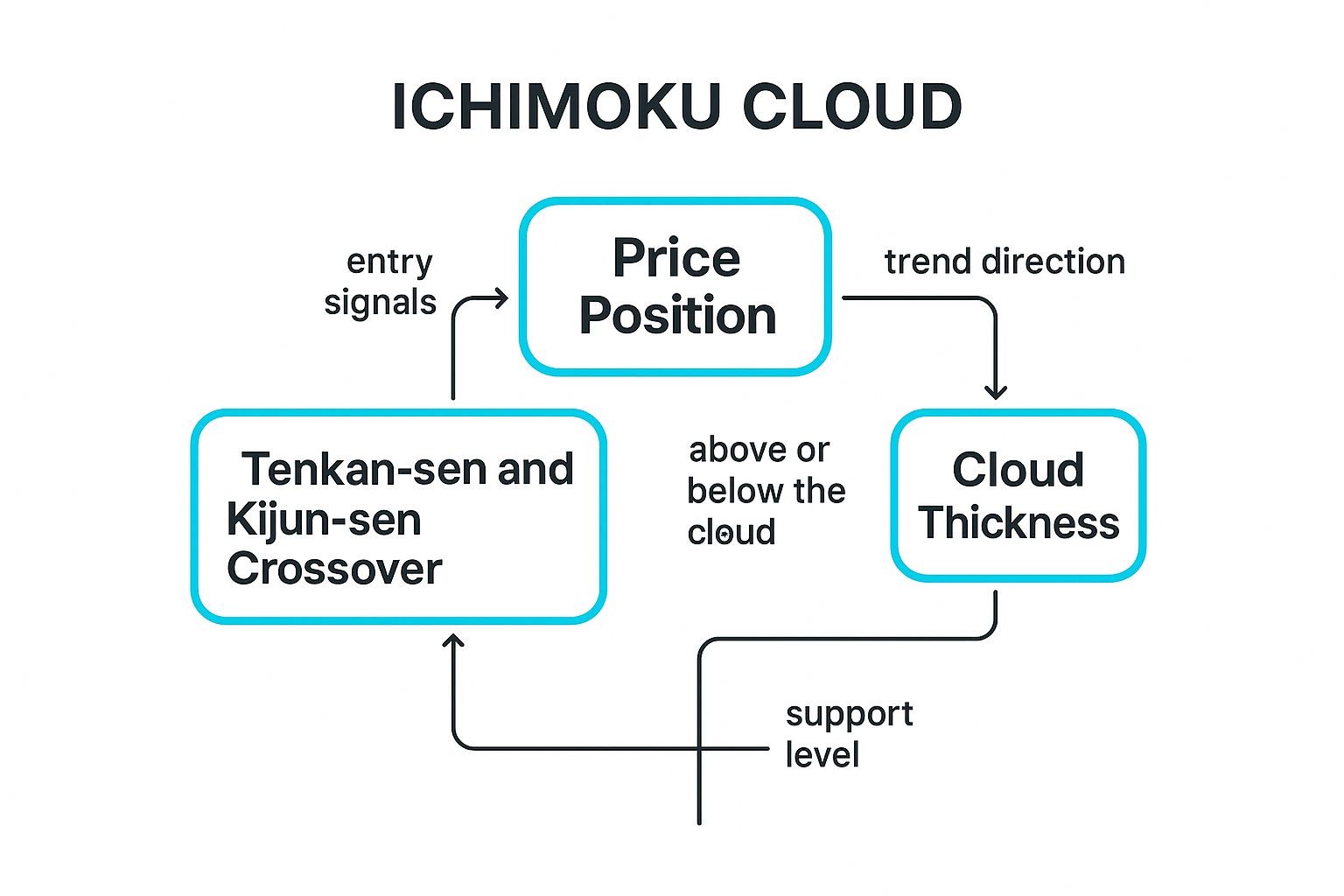
The visualization highlights how the relationship between these elements, from crossovers to cloud thickness, confirms trend strength and potential entry points.
The core of the Ichimoku system is the "Kumo," or the cloud itself. When the price is trading above the cloud, the overall trend is considered bullish, presenting buy opportunities. Conversely, when the price is below the cloud, the trend is bearish, signaling potential sell or short-entry points. The cloud also acts as dynamic support and resistance; a thicker cloud indicates stronger support or resistance, while a thinner one suggests weaker levels.
A key entry signal is the Tenkan-sen/Kijun-sen cross. The Tenkan-sen is a fast-moving average, while the Kijun-sen is slower. When the Tenkan-sen crosses above the Kijun-sen (a "golden cross"), it's a bullish signal, especially if it happens above the cloud. For example, in many major Forex pairs like EUR/USD, a bullish cross above a green cloud often precedes a sustained uptrend.
Navigating the financial markets without a clear strategy is like sailing without a compass. Throughout this guide, we've explored a powerful arsenal of the best entry and exit indicators, from the momentum-tracking prowess of the RSI and MACD to the volatility insights of Bollinger Bands and the Average True Range (ATR). We've seen how trend-followers can lean on the Ichimoku Cloud and Parabolic SAR, while day traders might anchor their decisions to the VWAP. Each indicator offers a unique lens through which to view market behavior, but their true power is never found in isolation.
The most critical takeaway is that no single indicator is a magic bullet. Professional traders build robust, resilient systems by combining several non-correlated indicators. This process of creating confluence, where multiple signals point to the same conclusion, is what transforms speculation into a high-probability strategy. It's the difference between guessing where the market will go and making an educated decision based on a convergence of evidence.
So, where do you go from here? The journey from understanding individual indicators to deploying a full-fledged system requires a structured approach. Your next steps should focus on integration and testing, not just accumulating more tools.
Mastering this process is what separates consistently profitable traders from the crowd. It moves you beyond simply reacting to flashing signals and empowers you to build a personalized system that you understand, trust, and can execute with confidence. The goal is to create a framework that filters out market noise and illuminates the high-probability opportunities, turning your knowledge of the best entry and exit indicators into tangible results.
Ready to stop juggling indicators and start seeing clear, actionable signals? The EzAlgo toolkit integrates these complex concepts into one powerful, easy-to-use system, providing optimized entry and exit signals directly on your chart. Elevate your trading and make confident decisions by visiting EzAlgo to see how our algorithms can streamline your strategy today.


%201.svg)