


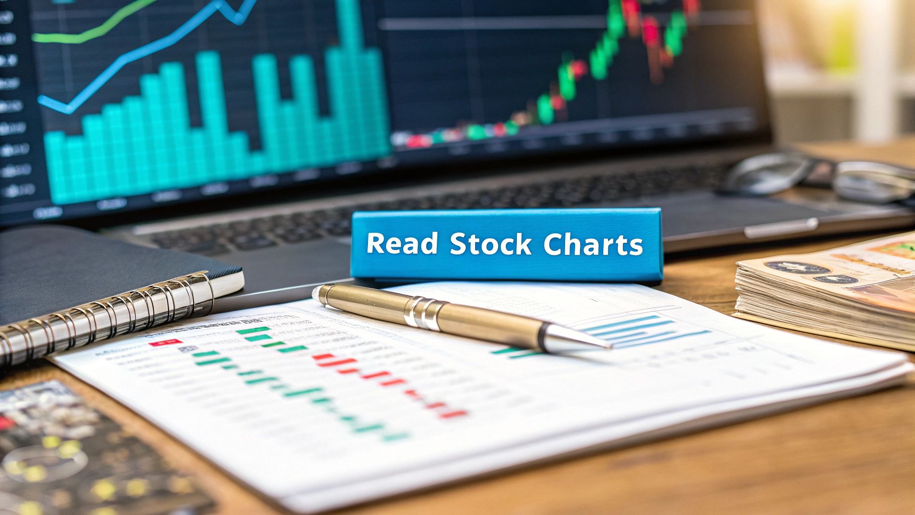
Learning to read stock market charts is all about turning that visual data into real, actionable trading ideas. It's a three-part skill: you need to see the overall trend, know what the candlestick patterns are telling you, and use indicators to get a feel for the market's momentum. Master this, and you'll be much better at spotting opportunities and keeping your risk in check.
Let's get one thing straight: reading charts isn't about having a crystal ball. It’s about stacking the odds in your favor. You're learning to make highly educated guesses based on historical price movements and classic patterns of human behavior.
Think of a stock chart as a visual story of the endless tug-of-war between buyers (demand) and sellers (supply). Once you learn this visual language, you're on a more level playing field. The same data a pro on Wall Street sees is right there on your screen, packed with clues about what other traders are thinking and feeling.
Every single tick up or down on a chart represents a decision made by thousands, sometimes millions, of people. Instead of getting bogged down by company reports or the latest news cycle, technical analysis lets you focus on one thing: what the price is actually doing. And that's huge, because price almost always moves before the headlines hit.
By looking at a chart, you can quickly get a handle on:
This isn't some new-age fad, either. The core ideas have been around for centuries, with roots in 17th-century Dutch markets and 18th-century Japanese rice trading—where candlestick charts were born. Later on, people like Charles Dow set the stage for modern trend analysis, and classic books like Technical Analysis of Stock Trends documented patterns we still rely on today. For anyone interested, the rich history of technical analysis shows just how deep these concepts go.
A stock chart is the footprint of money. It shows you where the big players have been, where they are now, and where they might be going next. Your job is to follow those prints, not to guess where they will lead.
Before we can get into the fancy patterns, we need to cover the basics. Every chart you’ll ever look at is built on the same foundation: it plots price against time. The vertical line (y-axis) is the stock’s price, and the horizontal line (x-axis) is time. You can set that time interval to whatever you want—a minute, an hour, a day, or even a month.
Now, you could just use a simple line chart. It’s clean, sure, but all it shows you is the closing price for each period. You miss out on the entire intraday battle between buyers and sellers, and trust me, that's where the real story unfolds.
For a much clearer picture, serious traders use charts that pack in four crucial data points for every single time period: the Open, High, Low, and Close (you'll see this called OHLC). Two chart types do this really well: Bar charts and Candlestick charts.
While they both display the same OHLC data, nearly every trader I know prefers Japanese Candlesticks. Why? Because their design makes the price action incredibly easy to read at a quick glance. The colors and shapes tell a story that a simple bar just can't.
This is where the real skill of reading the market begins.
To help you see the difference, here’s a quick breakdown of the three main chart types you'll encounter. While line charts have their place for a simple, long-term overview, you'll quickly see why candlesticks are the go-to for active traders.
As you can see, candlesticks give you the full OHLC picture in a format that’s built for rapid analysis, which is exactly what you need when markets are moving.
Let's zoom in on a single candlestick. Imagine you're looking at a daily chart for Apple (AAPL). One candle represents everything that happened during one full trading day.
Each candlestick has two parts you need to know:
So, if you see a long green candle with almost no wicks, you know buyers were in complete control from the opening bell to the close. On the flip side, a long red candle means the sellers dominated the entire session.
This simple visual language is the foundation for everything that comes next. Getting this down is the first step, and you can dive deeper by learning how to read trading charts in some of our other guides.
A single candlestick is a snapshot of market psychology. It visually captures the fear, greed, and indecision that drove price action within a specific timeframe, offering immediate clues about who won the day's battle—the buyers or the sellers.
So, you’ve got a handle on what individual candlesticks are telling you. The next step is to bring in some technical indicators. These are just tools that run calculations on a stock’s price and volume, then plot the results right on your chart. They help cut through the noise, confirm what you think you see, and flag potential turning points.
There are hundreds of indicators out there, and it’s easy to get overwhelmed. Let’s skip the clutter and focus on three workhorses that traders rely on every single day. Together, they’ll help you see the trend, measure its strength, and spot when it might be running out of gas.
First up is the Moving Average (MA), one of the simplest yet most powerful tools in your arsenal. It essentially smooths out the chaotic day-to-day price action into a single, easy-to-read line, giving you a much clearer view of the overall trend.
You'll mainly run into two types:
A classic strategy is the moving average crossover. When a shorter-term MA (like a 20-day EMA) crosses above a longer-term one (like a 50-day EMA), it's often seen as a bullish signal—the start of an uptrend. If it crosses below, it could be a warning that the bears are taking over. It’s a simple visual clue that can pack a lot of punch.
Moving averages show you the direction of the trend, but the Relative Strength Index (RSI) tells you about its momentum. Think of it as the gas pedal. This indicator bounces between 0 and 100, measuring how quickly and how much the price has changed.
Its main job is to signal overbought and oversold conditions.
The RSI is like a car's tachometer. It doesn't tell you how fast you're going (that's the price), but it shows how hard the engine is working. When it’s in the red, the engine might be about to overheat.
Generally, a reading above 70 suggests the market is overbought. The price has climbed very quickly, and it might be due for a rest or a pullback. On the flip side, a reading below 30 is considered oversold, hinting that the selling has been overdone and a bounce could be on the horizon. These aren't automatic buy or sell signals, but they’re big, flashing signs telling you to pay closer attention.
Volume is probably the most overlooked indicator, but it’s one of the most honest. It simply shows you how many shares changed hands in a given period, usually displayed as bars at the bottom of your chart. Volume is your conviction meter.
High volume behind a price move means a lot of people are jumping in, giving the move legitimacy. Low volume suggests nobody really cares, and the move might fizzle out.
Imagine a stock breaks out to a new all-time high. If it does so on a huge spike in volume, that’s powerful confirmation. But if the breakout happens on a trickle of volume, you should be skeptical. It’s a red flag. The bottom line is this: Volume should always confirm the trend.
Ultimately, using these indicators is about playing the odds. You're analyzing what happened in the past to make a more educated guess about the near future. Platforms today give you access to decades of rich historical data for stocks and markets, which you can explore on sites like Nasdaq to back-test these very concepts.
Beyond single candlesticks and technical indicators, the market tells its stories through chart patterns. Think of these as the market's "body language"—distinct shapes that price action carves out over time, revealing the tug-of-war between buyers and sellers. Learning to spot them gives you a massive edge because they often hint at what's coming next.
Broadly, these patterns fall into two camps: reversal and continuation. Reversal patterns are your warning signs that a trend is losing momentum and might be about to flip. On the other hand, continuation patterns suggest the market is just catching its breath before continuing in the same direction.
When a market has been running hard in one direction for a while, you need to be on the lookout for signs of exhaustion. Certain patterns are classic tells that the tide is about to turn. Two of the most reliable ones I've seen over the years are the Head and Shoulders and the Double Top/Bottom.
Head and Shoulders: This is one of the oldest and most trusted reversal patterns, and it looks just like its name implies. It shows up after a solid uptrend and features three peaks: a middle peak that's the highest (the head) and two smaller peaks on either side (the shoulders). If you draw a line connecting the lows between these peaks, you get the "neckline." A clean break below that neckline is a powerful bearish signal that the party is likely over for the bulls. The flip side, the Inverse Head and Shoulders, appears at the bottom of a downtrend and signals a potential blast-off to the upside.
Double Top and Double Bottom: A Double Top is a bearish pattern that looks like a big "M." It happens when the price pushes up to a high, pulls back, and then tries to rally to that same high again but gets rejected. That failure to make a new high is key—it tells you the buyers are running out of gas. A break below the low point between the two peaks often triggers a steep sell-off. The Double Bottom, its bullish twin, looks like a "W" and often marks the end of a painful downtrend.
A chart pattern is really just a picture of a fight between buyers and sellers. When a reversal pattern completes, it's a clear signal that one side has finally worn the other out, paving the way for a new move.
Not every pause is a sign of trouble. Sometimes, the market just needs to cool off and consolidate before making its next big move. These periods of consolidation create what we call continuation patterns.
Learning to spot these can keep you from bailing on a great trade too soon. The most common ones you'll see are Flags and Triangles.
Bull Flags and Bear Flags: A Bull Flag shows up during a powerful uptrend. It starts with a sharp, almost vertical price surge (the "flagpole"), followed by a brief, orderly pullback that drifts slightly downward (the "flag"). When the price breaks out of the top of that flag, it often triggers another explosive move up—many traders even project the length of the flagpole for their next target. A Bear Flag is the exact opposite and signals more downside ahead.
Triangles: These patterns appear when the trading range starts to squeeze tighter and tighter. An Ascending Triangle has a flat resistance level at the top and a rising trendline at the bottom, showing that buyers are getting more aggressive with each dip. A breakout above that flat top is a strong bullish signal. A Descending Triangle is the mirror image, with a flat support level and a falling trendline, signaling that sellers are in control and a breakdown is probably coming.
Looking for these patterns on major indices like the S&P 500 can be incredibly useful. For instance, the US500 index hit an all-time high around 6593.77 points in September of a recent year, a culmination of a major uptrend. Pulling up historical charts lets you see exactly how these patterns played out during big market cycles, which gives you invaluable context for making future trading decisions. You can dig into more historical data on global market performance and trends at Trading Economics.
All the theory in the world doesn't mean much until you put it into practice. Let's walk through how to actually analyze a chart from top to bottom. Think of this as a repeatable framework you can use every time you pull up a new stock.
First things first: what's the big picture? Is the stock trending up, down, or just chopping sideways? A quick glance at the 50-day and 200-day moving averages gives you an immediate feel for the long-term sentiment. If the price is holding above both MAs, and the shorter-term 50-day is above the 200-day, you're looking at a solid uptrend.
Next, I like to identify the key battlegrounds on the chart. Where have buyers consistently shown up to defend a price, and where have sellers slammed the door shut? These are your support and resistance levels. Drawing simple horizontal lines at these "price shelves" shows you exactly where the market has pivoted in the past, giving you a roadmap of areas to watch.
If you want to get really good at this, our guide on building a trading support and resistance strategy is a great next step.
Okay, so you’ve got the trend and your key levels mapped out. Now it's time to pull in some indicators for a bit of confirmation. Is the Relative Strength Index (RSI) screaming "overbought" above 70, or is it flashing "oversold" below 30? This helps you gauge whether the current move is running out of gas.
For example, a stock pushing up against a major resistance level while the RSI is overbought is a classic warning sign that the rally might be on its last legs.
The goal here isn't to predict the future with 100% certainty—that's impossible. Instead, you're building a high-probability case for what might happen next. Every element—trend, support, resistance, indicators—is another piece of evidence. The more evidence you have pointing in the same direction, the stronger your trade idea becomes.
The final piece of the puzzle is looking for classic chart patterns. Do you see a clean bull flag forming after a powerful move higher? Or maybe a dreaded double top is taking shape right at that resistance level you marked earlier? These patterns are the visual triggers that bring your whole analysis together and can signal a great time to enter a trade.
This simple infographic really nails the core flow of how I look at price action.
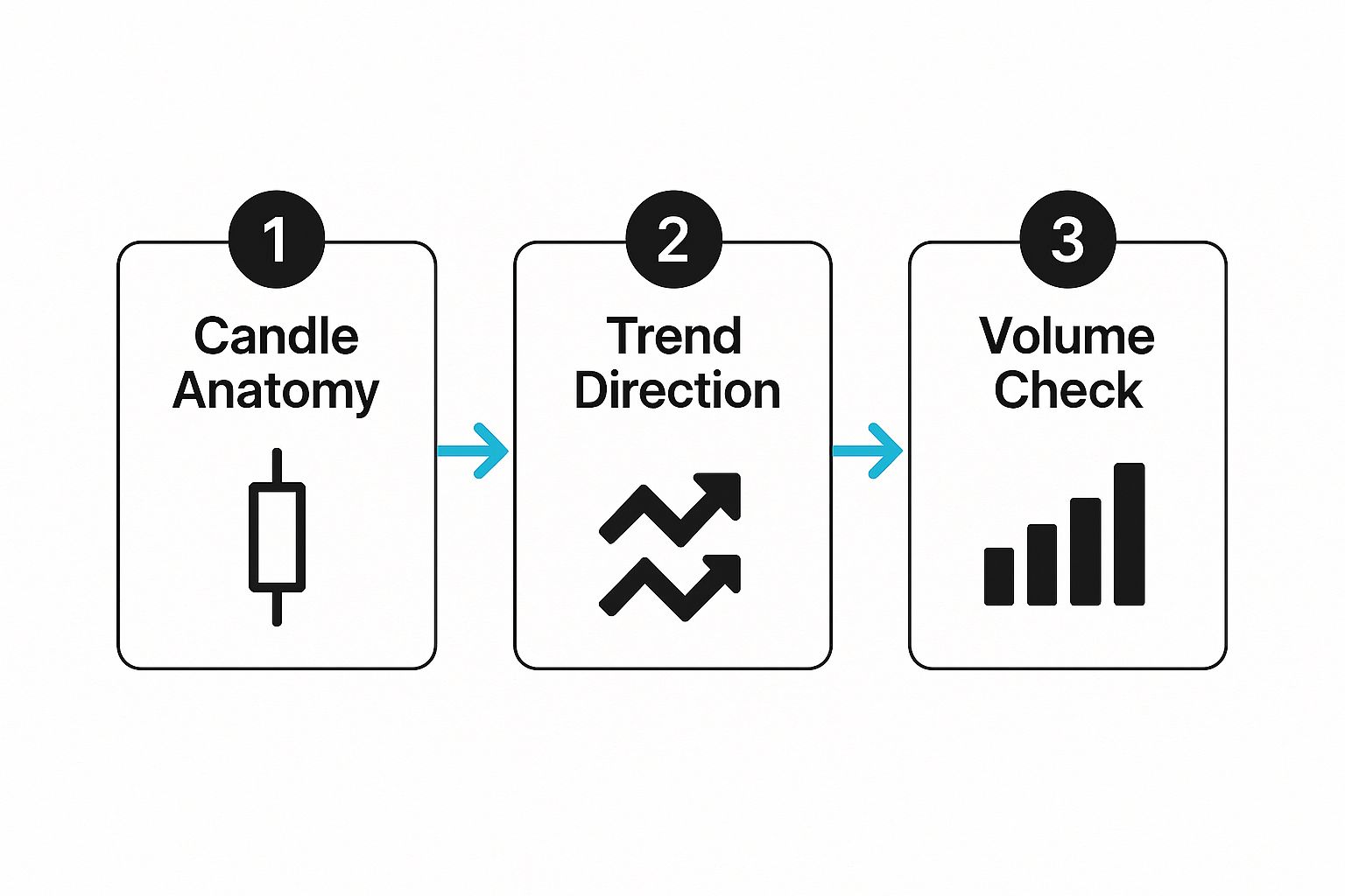
It shows a logical path from reading individual candles to identifying the overall trend and then confirming your idea with volume. It's a foundational checklist I run through for every chart I open. When you start combining these elements, you're no longer just staring at squiggly lines—you're reading the story the market is telling you.
As you dive into the world of technical analysis, you’ll find that a few questions always seem to surface. We've all been there. Getting these fundamentals straight is crucial for building the confidence to actually use what you're learning. Let's walk through some of the most common ones I hear.
This is easily the most popular question, and the real answer is... it depends entirely on you and your trading style. There's no magic one-size-fits-all time frame.
Your approach to the market dictates the lens you should be looking through.
Here’s a pro tip: use multiple time frames together. I often find the main trend on a daily chart, then drill down to a 1-hour chart to find a much better entry point that lines up with that bigger picture. It's a powerful way to add context to your trades.
It’s tempting to think of indicators and patterns as crystal balls, but it’s much healthier to see them as tools that measure probability. They aren't foolproof. Their reliability can shift quite a bit with market conditions—they work wonders in a strong, trending market but can give you a lot of false signals when things get choppy and sideways.
Remember, no single indicator is 100% accurate. That's why seasoned traders always look for confluence.
Confluence is when several different signals all point to the same outcome. For instance, if a stock is bumping up against a major resistance level, the RSI is screaming "overbought," and a bearish candlestick pattern forms... that’s a far more powerful signal than any of those things happening on their own. Always back up your analysis with solid risk management, like setting a stop-loss.
Yes, absolutely. You don’t need to drop a ton of cash on fancy software to get good at reading charts. In fact, some of the best platforms out there offer incredible tools for free.
Services like TradingView and Yahoo Finance provide powerful charting packages right out of the box. They’re loaded with indicators, drawing tools, and all the historical data you could need. Your own online broker probably has some great charting tools built-in, too.
You can master all the core skills—price action, trend analysis, and pattern recognition—without spending a dime. Start with the free resources. You may find you never need anything else.
Take the guesswork out of your analysis and let EzAlgo do the heavy lifting. Our AI-driven indicators for TradingView auto-generate key support and resistance levels, provide clear buy and sell signals, and help you trade with confidence. Upgrade your charting at EzAlgo.ai.


%201.svg)